kage

Design analysis
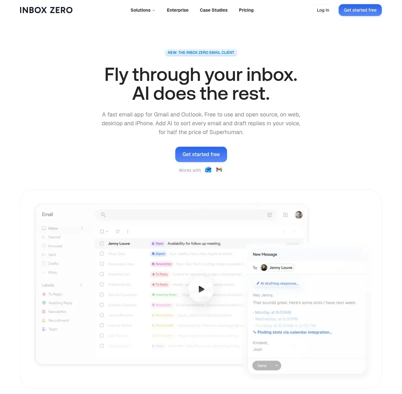
A light, app-mockup-driven SaaS landing page on a pure white canvas with a single saturated blue accent reserved for CTAs, links and the highlighted pricing tier. Oversized geometric display type carries six centred section statements down the page, each followed by a denser cluster: card triads containing functional micro-UI (keycaps, a command palette, a GitHub repo card), a before/after email scatter, a hub-and-spoke integration diagram, and a trust row of colourful seals. The lower half shifts to conversion — a three-tier pricing grid with a blue-ringed "Popular" plan, two slim full-width CTA banners, a two-column FAQ of soft gray cards, and a dense multi-column footer — while rhythm is held by generous ~100px section spacing and consistent 1px-bordered, large-radius cards.
Prompt preview
## Reference images

Study these alongside the description below: hierarchy, rhythm, spacing, colour. Build for the product you are asked about, using this design language.

- Full page: https://kage-design-assets.t3.tigrisfiles.io/screenshots/inbox-zero/752b92b1-2db1-4db8-be4f-72f48a430ed6-1792389697138-full.webp
- Above the fold: https://kage-design-assets.t3.tigrisfiles.io/screenshots/inbox-zero/752b92b1-2db1-4db8-be4f-72f48a430ed6-1792389689900.webp
- Design on Kage: https://kage.design/designs/inbox-zero-landing-page

## Before you start
Ask the user what they are building, who it is for, and what brand assets they already have (product name, brand colours, typeface, existing copy). Wait for their answers. Everything below is a design language to apply to *their* product, not a template of the reference.

## Page structure
Build a single long marketing page with these sections, top to bottom:

1. **Sticky top nav** — wordmark left; centre links (one with a dropdown chevron); right side a text "Log in" link and one solid pill CTA. Thin 1px bottom border on a white bar.
2. **Hero** — a small tinted pill badge announcing the new product/feature, a two-line display headline, a 3–4 line muted supporting paragraph, one solid accent pill CTA, and a tiny "works with" row of integration glyphs.
3. **Hero app screenshot** — a large rounded frame with a 1px border showing the real product UI (three-pane app: sidebar, list rows with coloured status chips, detail/compose panel). Keep a centred play affordance if they have a demo video.
4. **Logo bar** — one-line caption ("Join N professionals, including people at:") above a row of grayscale customer wordmarks.
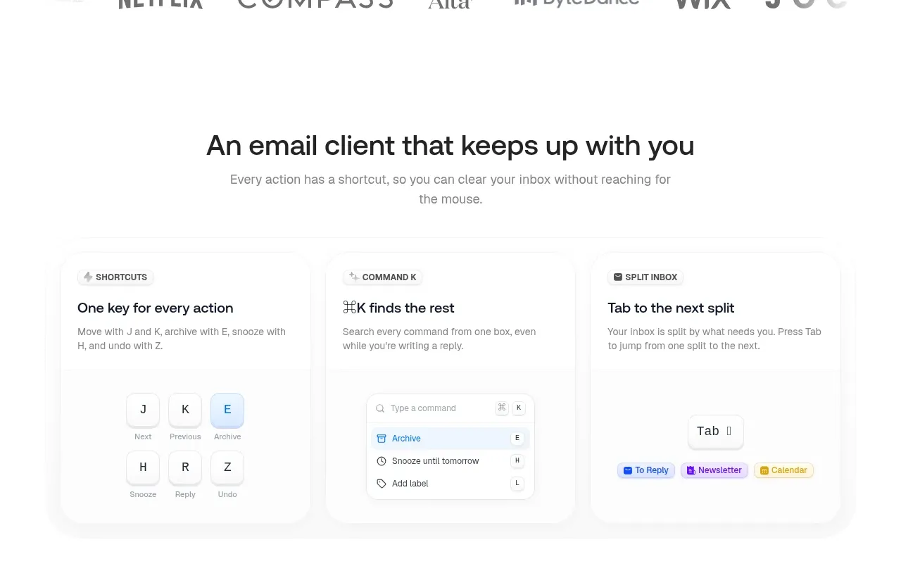
5. **Feature cluster A** — centred section headline + one supporting paragraph, then three equal cards. Each card: a tiny labelled chip, a bold 2–5 word title, a 2–3 line body, and a *functional micro-mockup* (e.g. keyboard keycaps, a command-palette row list, a key + result chips).
6. **Before/After section** — centred two-line headline + paragraph, then a side-by-side comparison: left labelled "Before" with messy overlapping item cards, right labelled "After" with the same items tidily stacked under pastel category chips.
7. **Integration hub** — centred headline + paragraph, then one central card (e.g. a compose/draft window with a status chip and send button) ringed by six app icons connected with dotted connector lines.
8. **Feature cluster B** — three more cards in the same chip + title + body + micro-mockup pattern (e.g. account icons, a comment-thread fragment, a repo/code card with metadata).
9. **Platforms row** — centred headline + paragraph, then five outlined circles with icons and labels (web, desktop, mobile, alerts).
10. **Trust/badges row** — headline + reassurance paragraph, then four columns, each a colourful seal/graphic, a bold caption and a one-line grey caption.
11. **Pricing** — centred headline ("Try for free…") + "no hidden fees" line, an annual/monthly segmented toggle, then three tier cards: plan name, description, large price + `/user/month`, trial CTA, and a check-listed feature list. The middle tier is the visual anchor: accent-coloured border ring, a "Popular" chip, and the only solid CTA; side tiers use outlined CTAs.
12. **Two full-width CTA banners** — slim rounded rows: one for the product ("New" chip + CTA) and one for enterprise/sales with an outlined button.
13. **FAQ** — centred headline, then a two-column grid of six Q&A cards: soft grey fill, large radius, bold question, muted answer with inline accent-coloured links.
14. **Final CTA** — big two-line headline ("Get back an hour a day…"-style outcome statement), one muted line, primary + secondary buttons.
15. **Footer** — dense multi-column link grid (product, use cases, industries, support, free tools, company, legal, compare) in muted grey, an oversized wordmark bottom-left, social icons bottom-right.

## Design language
- **Canvas**: pure white `#FFFFFF` end to end; panels and FAQ cards in near-white grey `#F7F8FA`; ink `#111827`; secondary text `#6B7280`; all borders `#E5E7EB` at 1px. No dark sections, no gradients.
- **One accent rule**: a single saturated blue (~`#2F6BFF`) is used *only* for primary CTAs, text links, the active toggle, and the highlighted pricing ring. Category/status chips use pastel tints with darker text of the same hue (lavender `#EEF0FF`/`#4F46E5`, amber `#FEF3C7`/`#B45309`, sky `#E0F2FE`/`#0369A1`, rose `#FFE4E6`/`#BE123C`). Never introduce a second saturated brand colour.
- **Type**: one geometric rounded sans throughout. Display is medium weight (500–600) with tight leading: hero ~56–64px, section headlines ~36–44px, card titles 16–18px semibold, body 14–15px at 1.6, chips/labels 11–12px. Hierarchy comes from size steps, not weight jumps or serifs.
- **Hierarchy rhythm**: the page alternates "statement" moments (large centred type with lots of air, ~96–128px vertical padding) with "cluster" moments (dense card grids and mockups). Feature clusters repeat the same three-card grid so the page feels systematic, not episodic.
- **Cards**: white, 1px border, 16–24px radius, no drop shadows (at most a whisper of shadow on the hero mockup). Inner mockups reuse the same border and radius language so everything nests cleanly.
- **Micro-mockups over illustration**: every feature card shows a believable, working-looking UI fragment (keycaps with letters and labels, a command palette with icon rows and shortcut hints, a repo card with stars and license) instead of abstract art.
- **Buttons**: fully rounded pills, ~40px tall; solid accent primary, white with grey border secondary; sentence case, no icons in nav CTAs.
- **Motion**: restrained — subtle hover lift/border darkening on cards and buttons, gentle fade/slide on scroll for section reveals; nothing springy or flashy.
- **Density curve**: airy from hero through platforms and trust, then intentionally denser at pricing, CTA banners and footer to drive conversion.

## Never
- No logos, wordmarks, product names, headlines, copy, illustrations, badges or icon sets from the reference (no "Inbox Zero" name, no Netflix/Wix/Google/Slack logos copied into the page).
- Never present the result as the reference product; apply the language to the user's own brand, name and colours.
- Don't reuse the reference's claims, pricing numbers, FAQ wording or customer names.
Components from this page
All components
 Minimal product navigation
Inbox Zero · Navigation
 Email client hero with product preview
Inbox Zero · Hero
 Trusted by professional teams
Inbox Zero · Logo cloud
 Keyboard-first inbox shortcuts
Inbox Zero · Feature grid
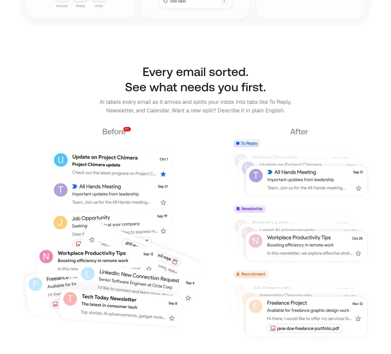 Automatically sorted inbox
Inbox Zero · Feature grid
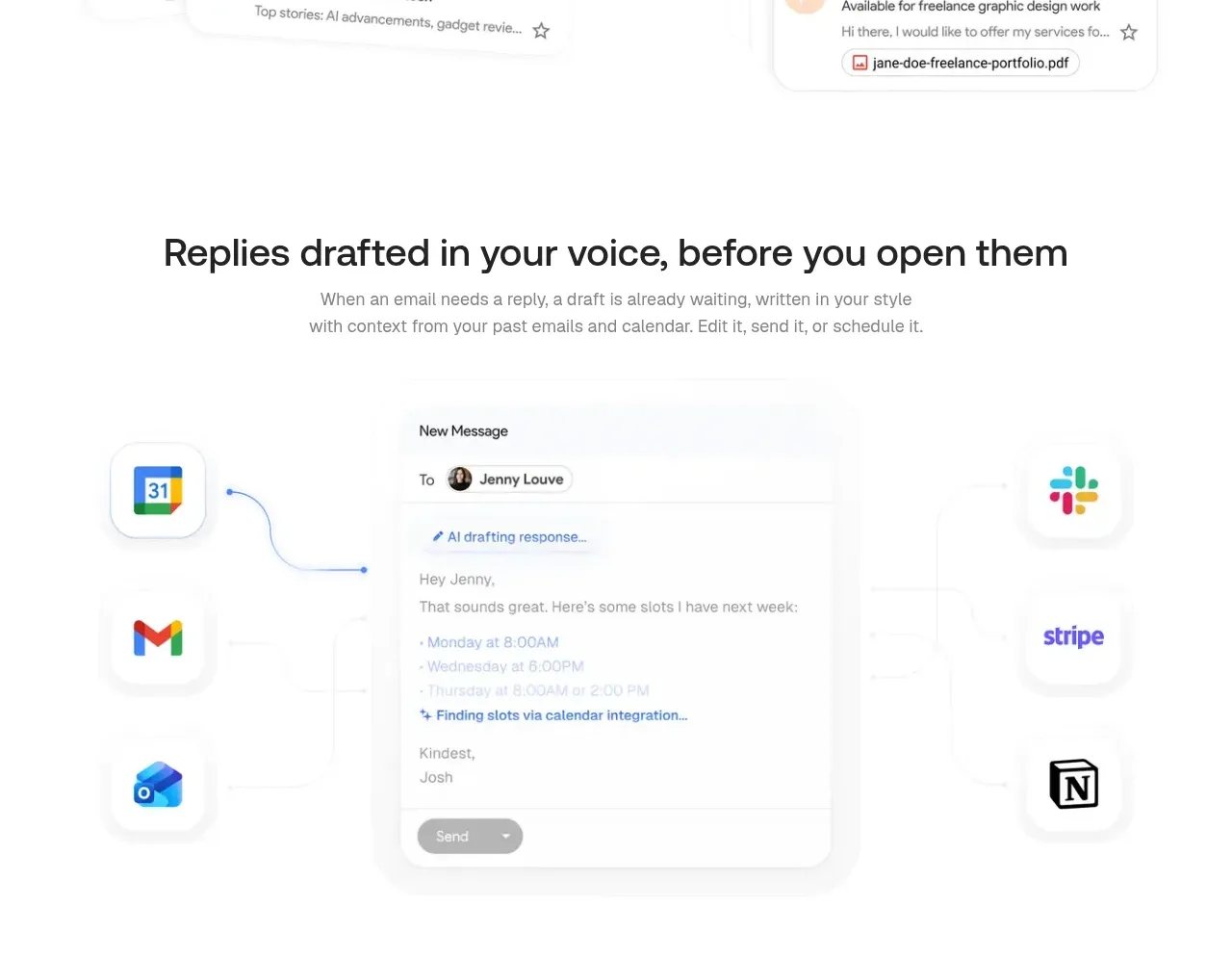 Replies drafted in your voice
Inbox Zero · Feature grid
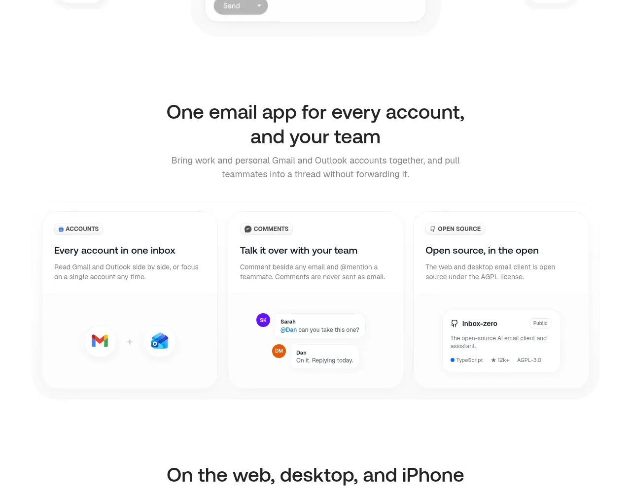 Accounts, teamwork, and open source
Inbox Zero · Feature grid
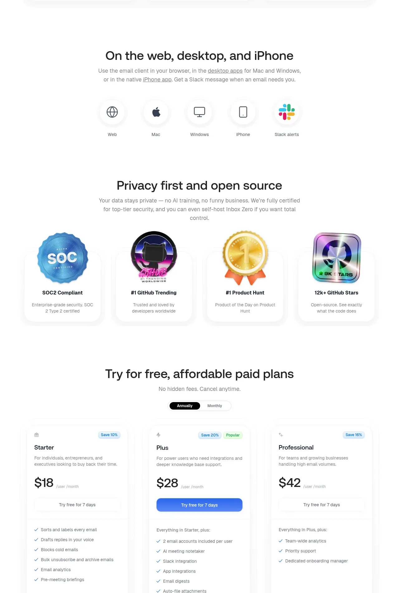 Everywhere access and privacy proof
Inbox Zero · Feature grid
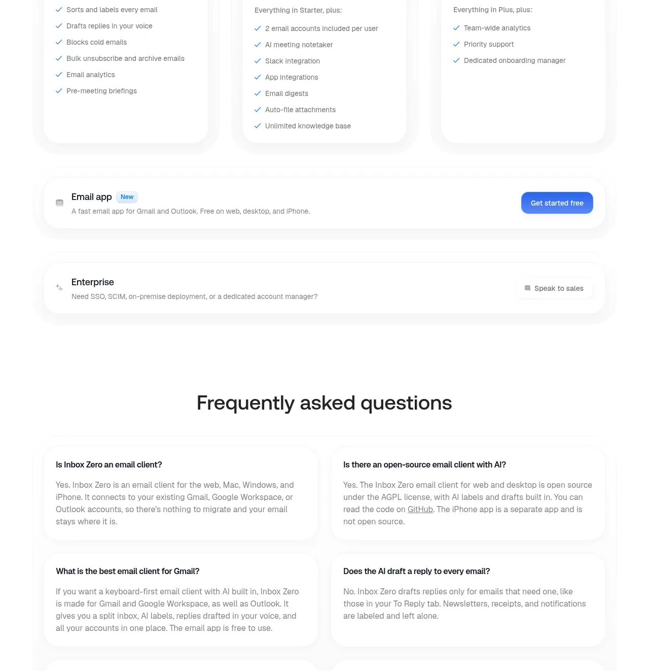 Free trial pricing plans
Inbox Zero · Pricing table
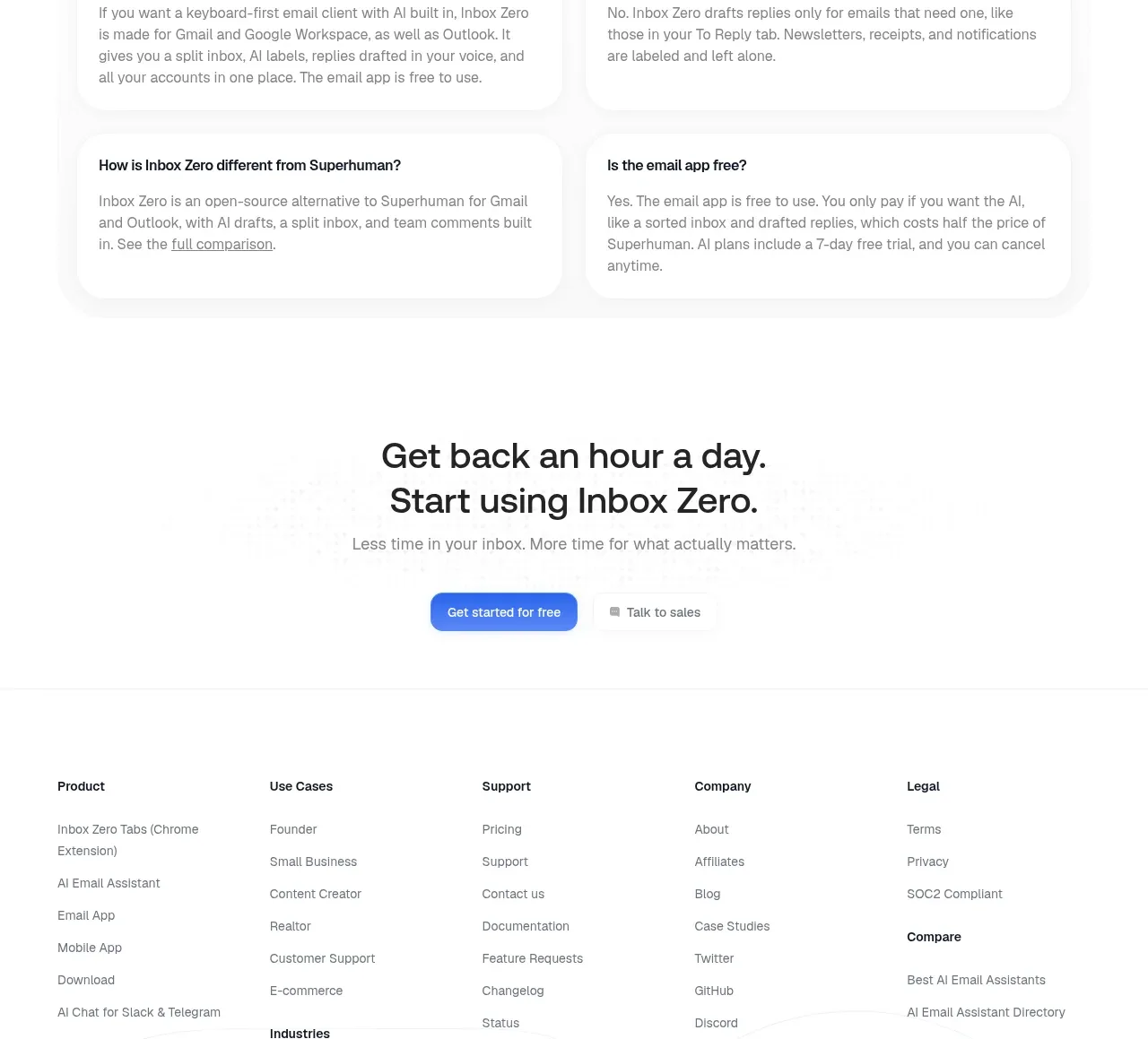 Frequently asked questions
Inbox Zero · FAQ
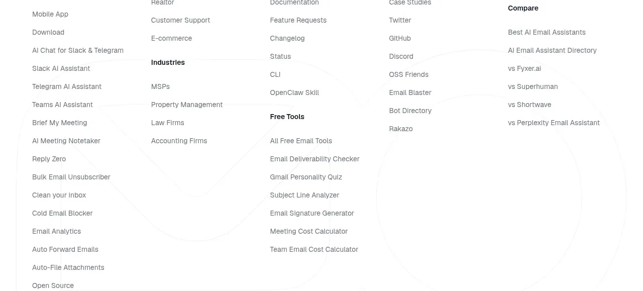 Final conversion call to action
Inbox Zero · Call to action
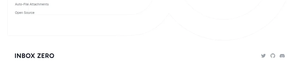 Multi-column product footer
Inbox Zero · Footer