 kage
getinboxzero.com
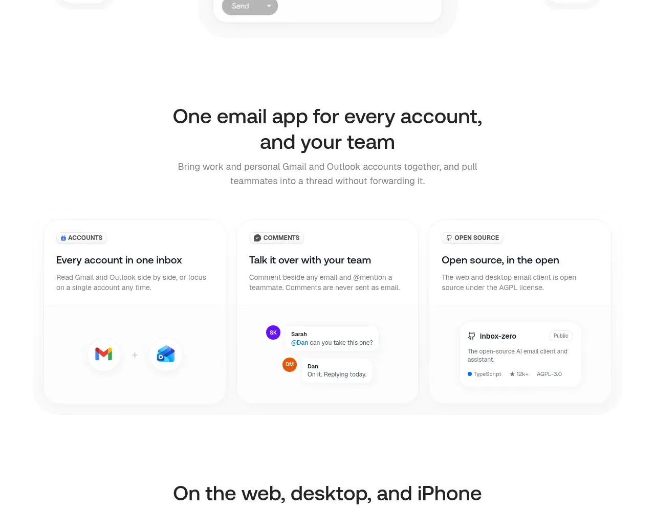
Design analysis
Three aligned cards explain unified accounts, collaborative comments, and transparency, each supported by a small interface detail.
Prompt preview
## Reference images

Study these alongside the description below: hierarchy, rhythm, spacing, colour. Build for the product you are asked about, using this design language.

- Component: https://kage-design-assets.t3.tigrisfiles.io/components/inbox-zero/752b92b1-2db1-4db8-be4f-72f48a430ed6-1792389759-6.webp
- Full page it was cut from: https://kage-design-assets.t3.tigrisfiles.io/screenshots/inbox-zero/752b92b1-2db1-4db8-be4f-72f48a430ed6-1792389697138-full.webp
- Component on Kage: https://kage.design/component/inbox-zero-feature-grid-4

## Before you start
Ask what the user's product and brand are, then apply the principles below to that product rather than reproducing this reference.

Build a three-column feature grid about account unification, team collaboration, and product transparency. Begin with a centered heading and one sentence of supporting copy, then use equal-height cards with small category labels, bold benefit titles, short descriptions, and a compact UI detail at the bottom. Use a white canvas, #f4f4f4 borders, 16–20px radius, faint shadows, 24px padding, and a 30px grid gap. Add restrained colored avatars, badges, or account icons as functional examples. Use a 36px heading, 18px card titles, and 14px gray body copy; stack cards on mobile.

Never use the reference's logo, product name, copy, illustrations, or imagery.
More components
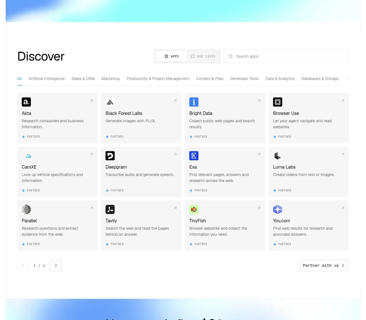
 Discover app directory
Composio Instant · Feature grid
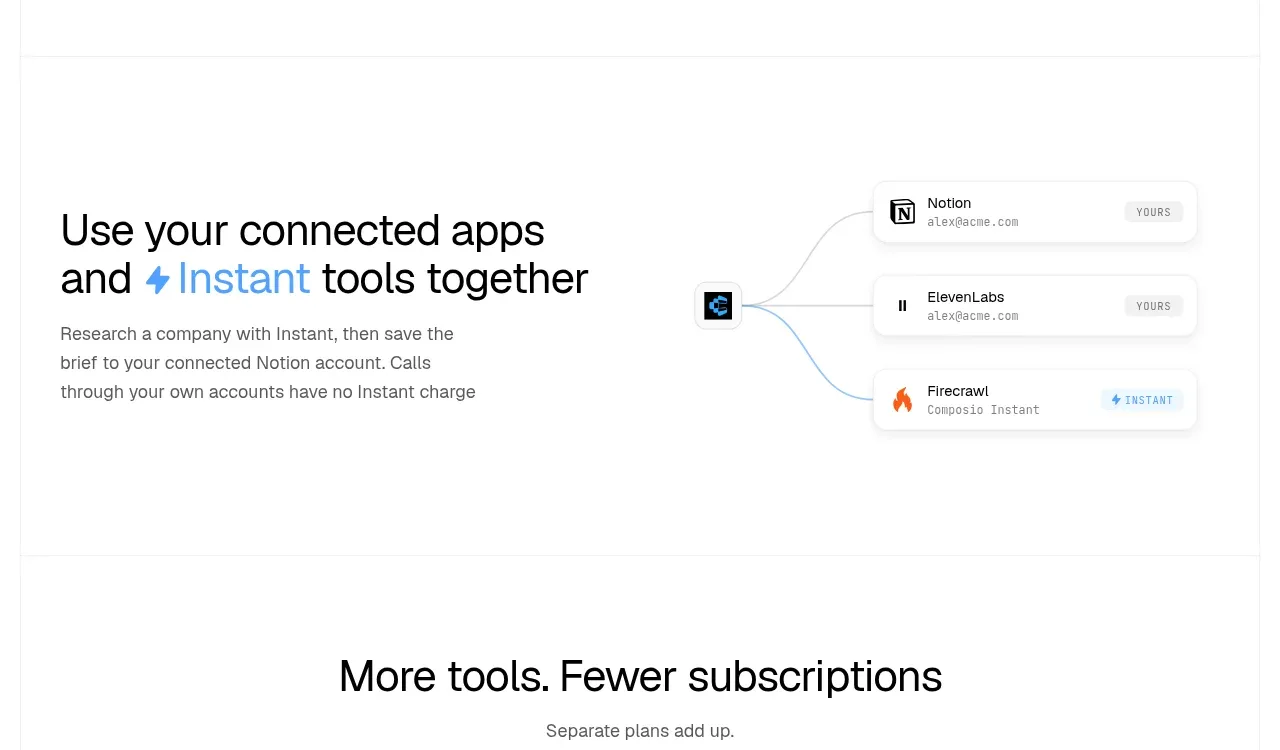 Connected apps workflow
Composio Instant · Feature grid
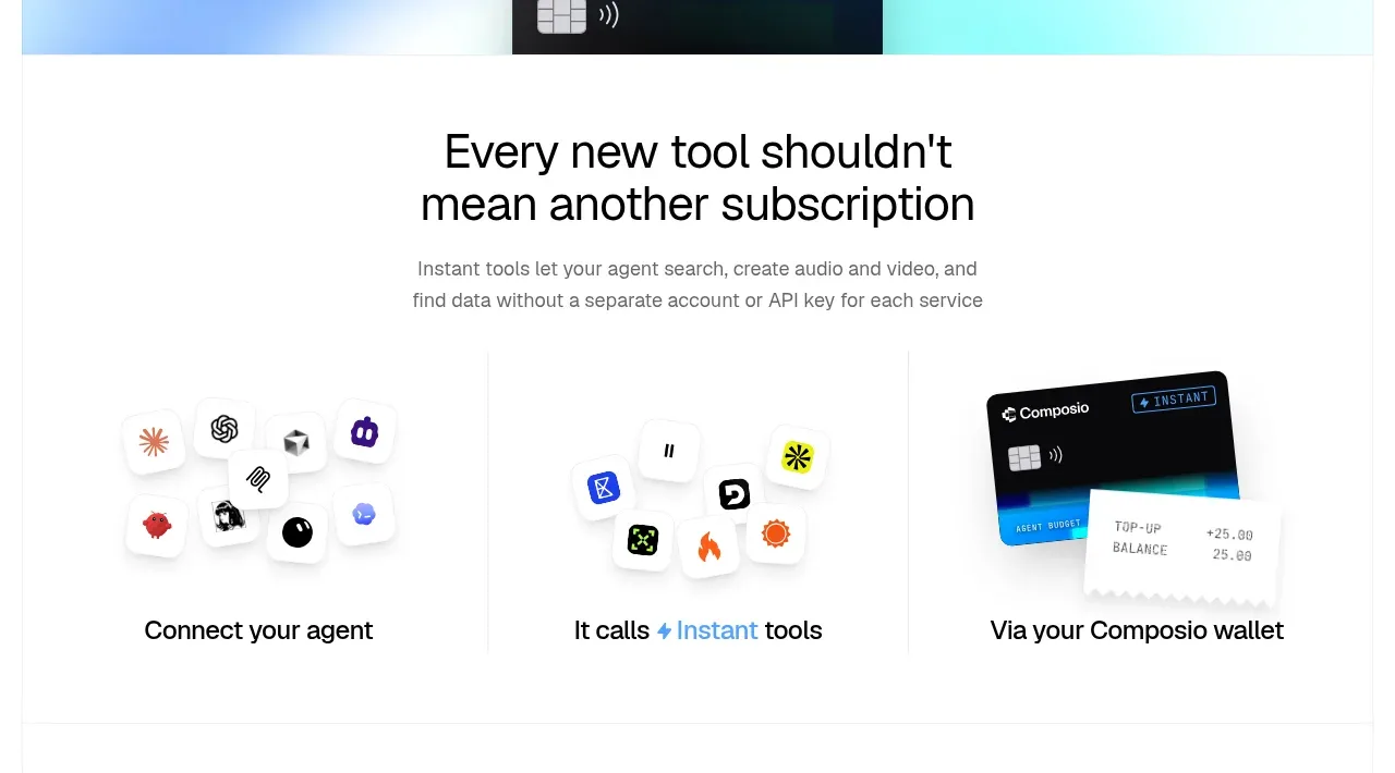 Three-part product workflow
Composio Instant · Feature grid
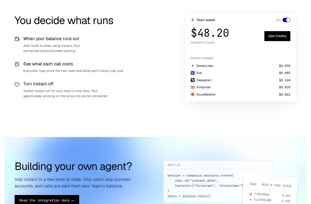 Spending controls
Composio Instant · Feature grid
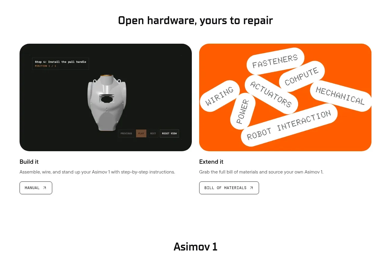
 Open hardware pathways
Asimov 1 · Feature grid
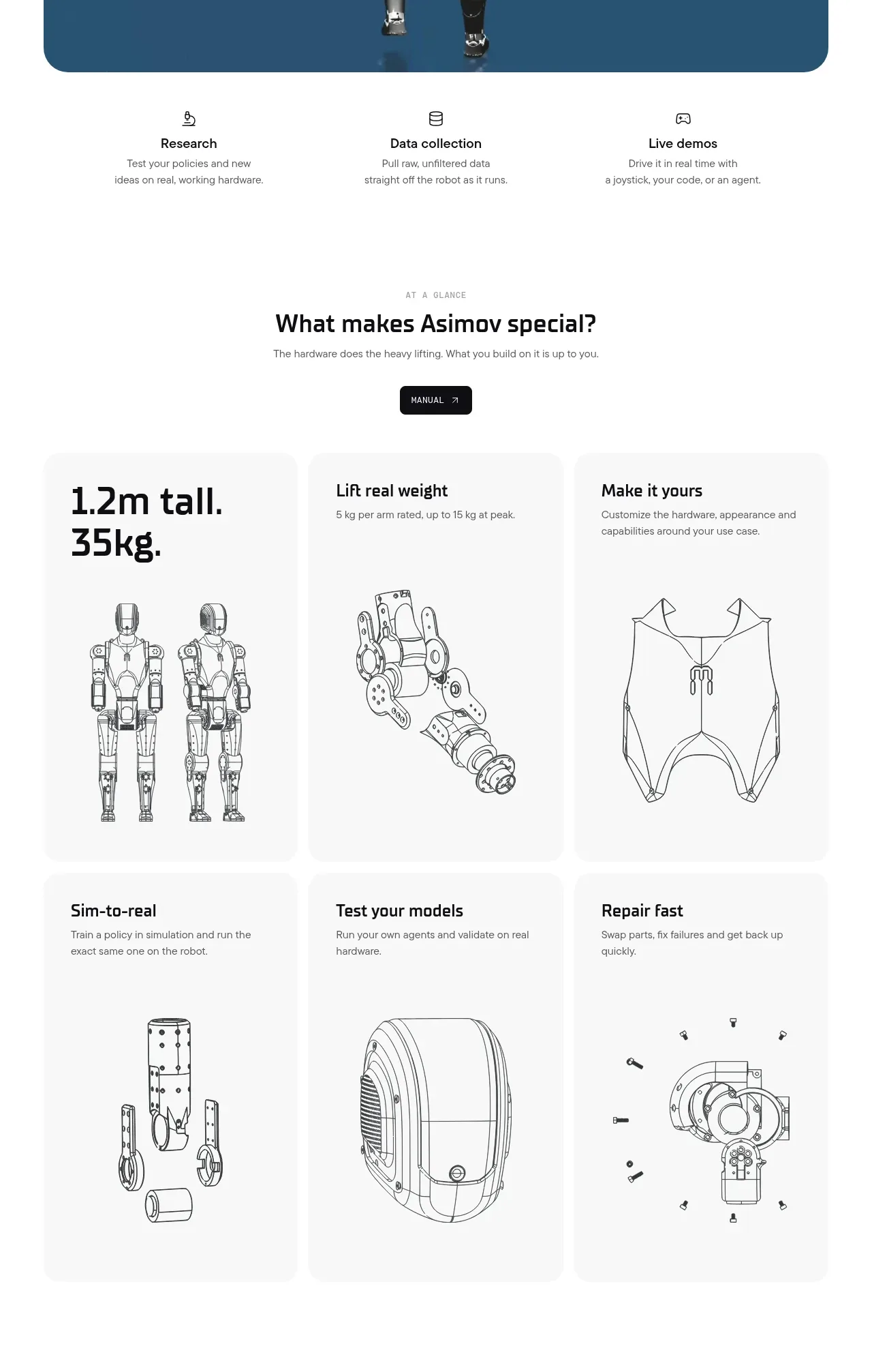 Capability overview and specification cards
Asimov 1 · Feature grid