 kage
kage
incredible.one

Design analysis
The hero uses a large centered promise, short explanatory copy, two contrasting actions, social proof, and a wide product visual to establish the value proposition quickly.
Prompt preview
## Reference images

Study these alongside the description below: hierarchy, rhythm, spacing, colour. Build for the product you are asked about, using this design language.

- Component: https://kage-design-assets.t3.tigrisfiles.io/components/incredible/a967b774-2b17-4a91-b40d-fd5f367a0b1c-1791353134-2.webp
- Component on Kage: https://kage.design/component/incredible-hero

## Before you start
Ask what the user's product does, who the ideal customer is, and what action the hero should drive. Apply the principles below to that product and brand.

Create a centered hero directly below the navigation. Use a white-to-very-subtle-warm background (#ffffff to #faf9f7), a constrained text column, and a large two-line headline around 42–52px on desktop with tight line-height (roughly 0.98–1.05), bold sans-serif weight, and near-black text (#050505). Place concise supporting copy below in 15–17px muted gray, with a maximum width that keeps lines short. Put a primary black pill button beside a lighter outlined or tinted secondary button, then optionally add a compact third-party credibility badge or trust signal without letting it dominate. Below the copy, show a wide rounded product screenshot or browser/app preview spanning most of the container width; give it a soft shadow, dark frame, and carefully clipped corners. Preserve generous vertical rhythm: headline, copy, actions, then visual. On small screens stack the actions and scale the preview without horizontal overflow.

Never: use the reference's product name, exact headline, exact supporting copy, exact CTA labels, screenshot, logos, illustrations, imagery, or brand assets.
More components
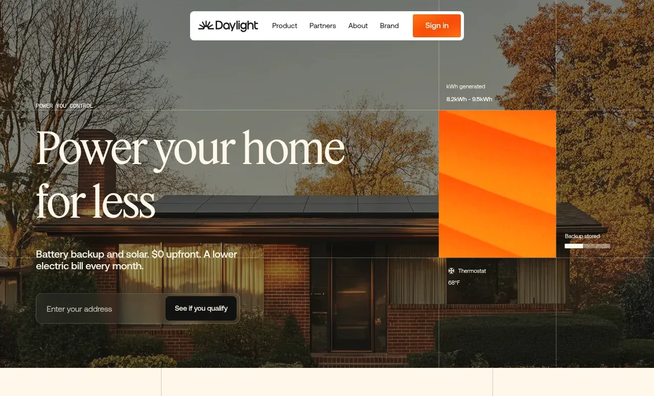
 Photographic power-home hero
godaylight.com · Hero
Photographic power-home hero
godaylight.com · Hero
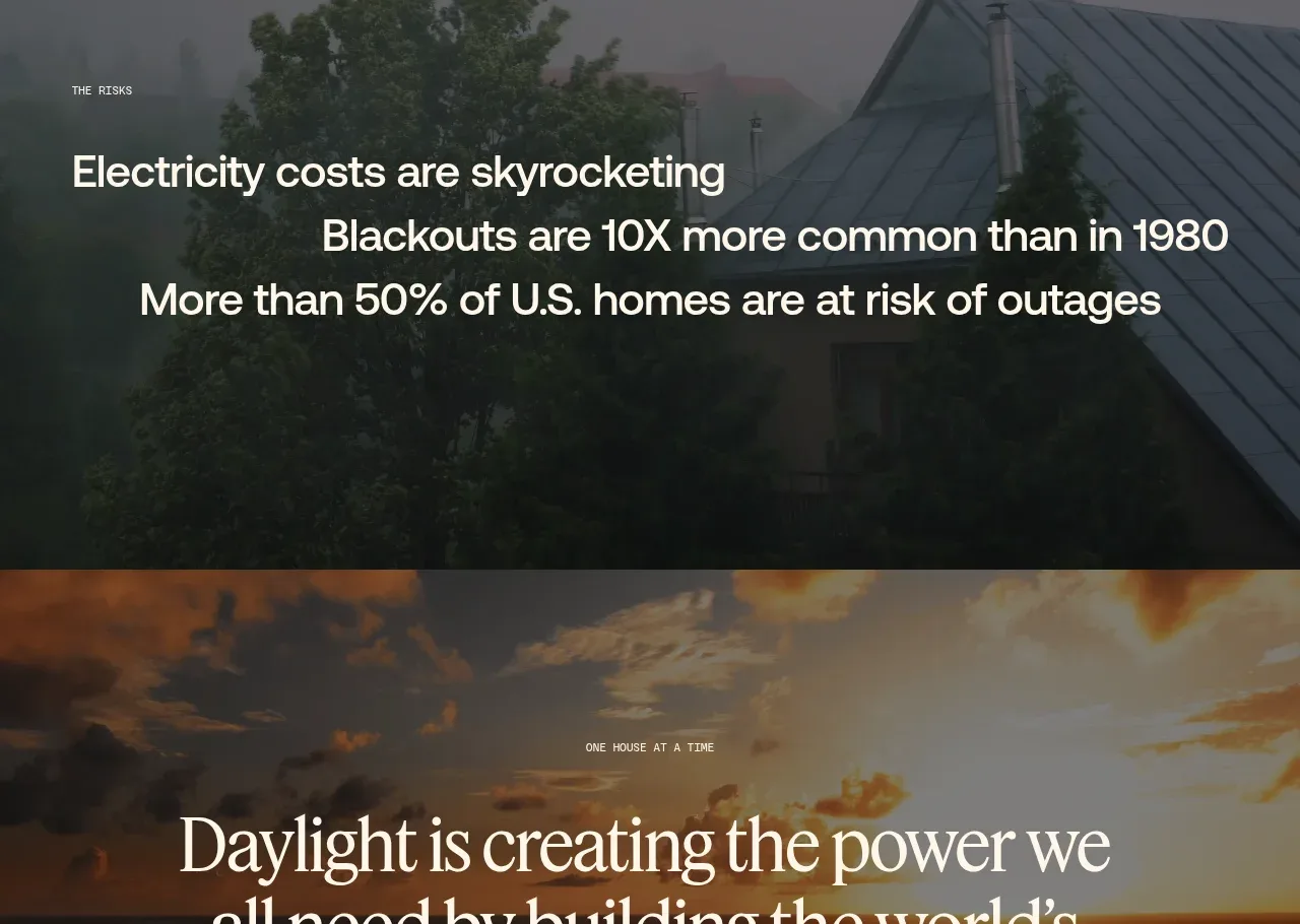 Decentralized energy statement
godaylight.com · Hero
Decentralized energy statement
godaylight.com · Hero
 Grid problem statement
godaylight.com · Hero
Grid problem statement
godaylight.com · Hero
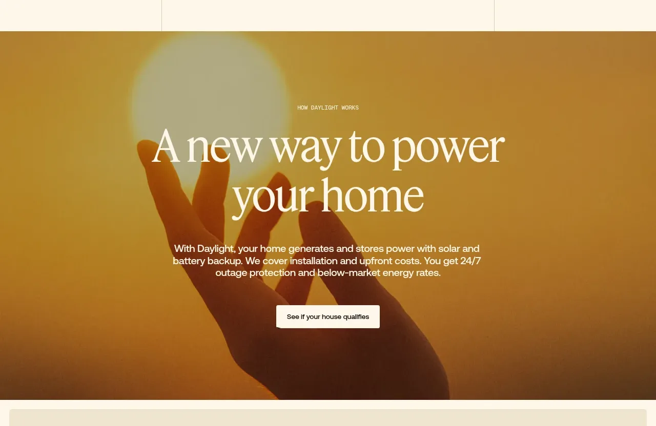 Warm mission statement panel
godaylight.com · Hero
Warm mission statement panel
godaylight.com · Hero
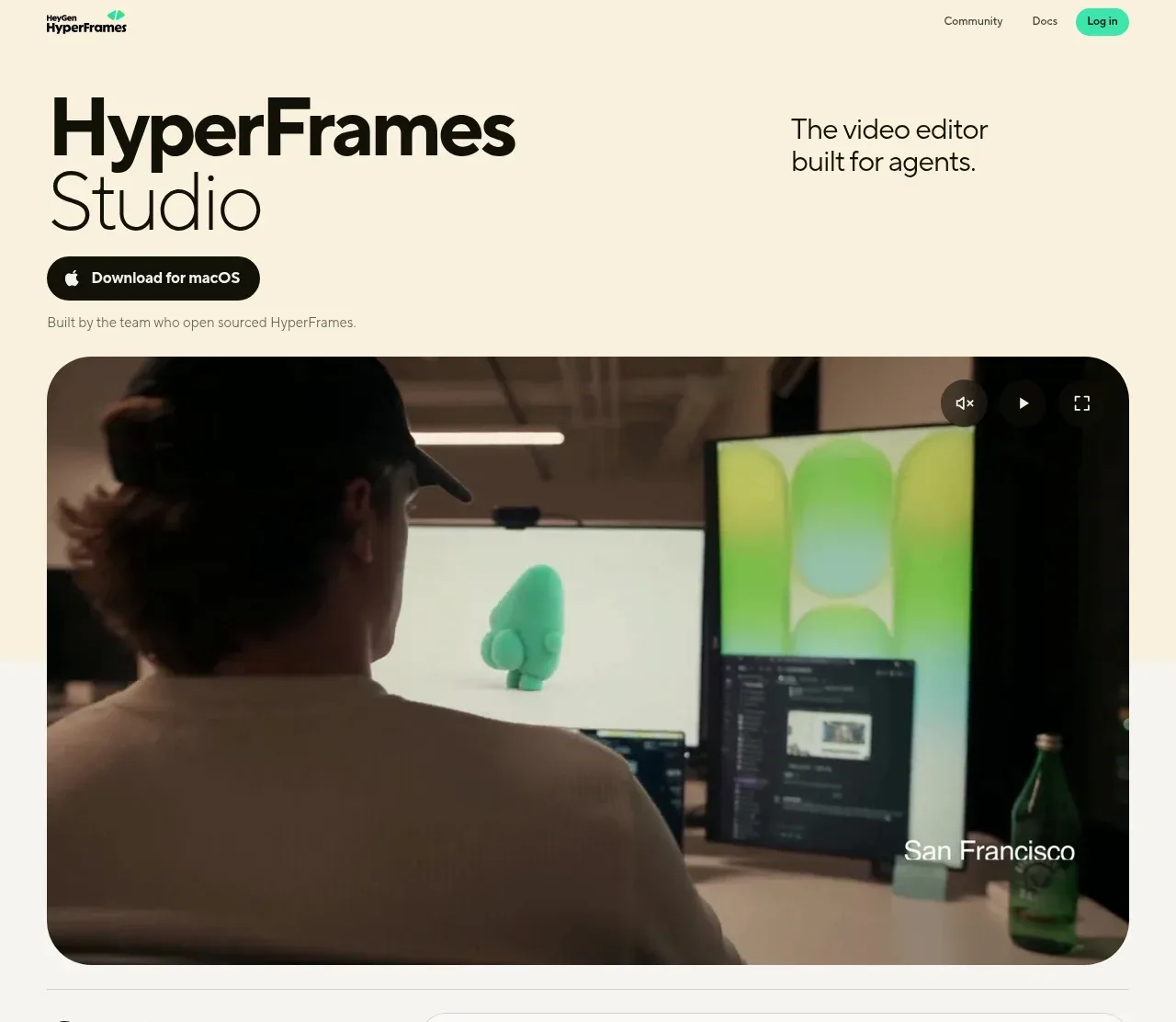
 Product hero with download action and video
HyperFrames Studio (Desktop) · Hero
Product hero with download action and video
HyperFrames Studio (Desktop) · Hero
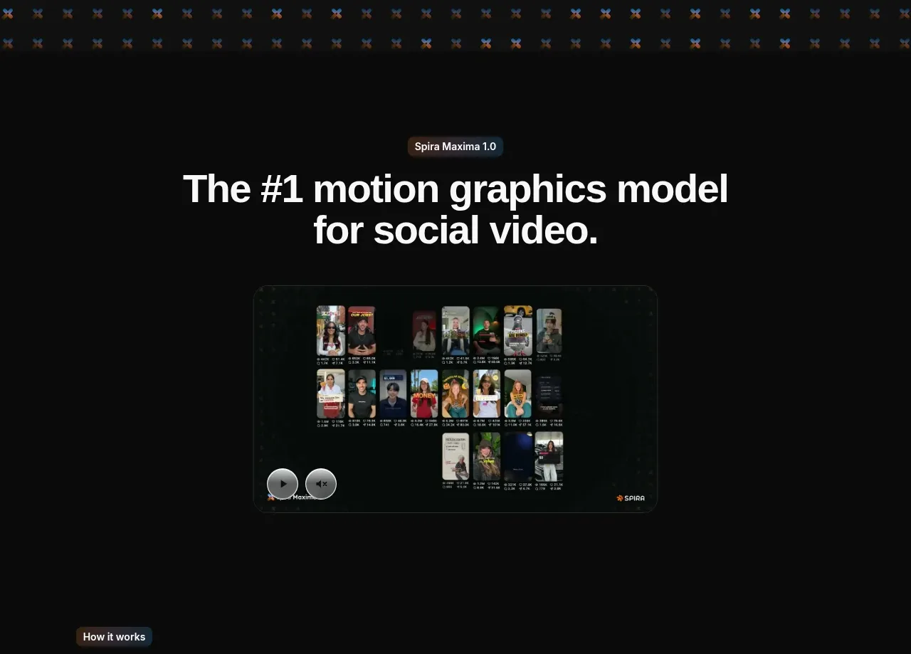
 Model introduction and demo
Spira Maxima · Hero
Model introduction and demo
Spira Maxima · Hero