kage
kage
incredible.one
Design analysis
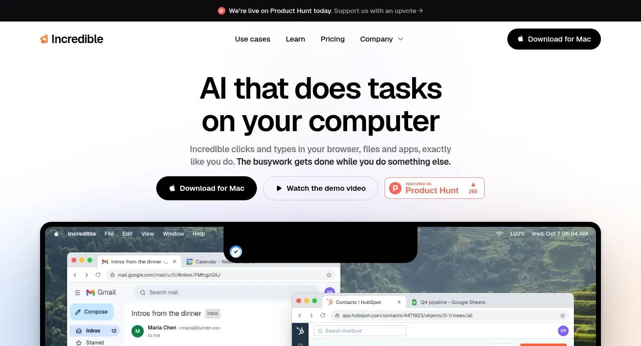
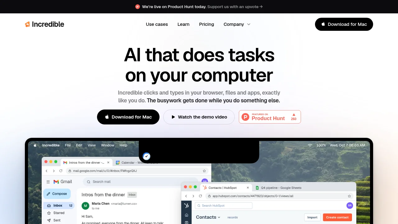
A near-black announcement strip frames a stark white hero where a two-line, tightly tracked ~80px headline does almost all the work. Hierarchy is built through type alone — gray subcopy whose second sentence flips to semibold black — followed by a three-step CTA row descending in weight from solid black pill to ghost button to a Product Hunt badge that carries the only red besides the orange logo spark. The fold is broken by a full-width macOS mockup of real Gmail, HubSpot and Sheets windows, shifting the rhythm from airy centered text to dense, recognizable UI that proves the product claim.
Prompt preview
## Reference images

Study these alongside the description below: hierarchy, rhythm, spacing, colour. Build for the product you are asked about, using this design language.

- Screenshot: https://kage-design-assets.t3.tigrisfiles.io/screenshots/incredible/a967b774-2b17-4a91-b40d-fd5f367a0b1c-1791353050909.webp
- Design on Kage: https://kage.design/designs/incredible-landing-page

# Landing page in the style of a clean, type-led AI product site

## Before you start
Ask the user these questions and wait for the answers before writing any code:
- What product are you building and what does it do in one sentence?
- Who is it for (engineers, consumers, a specific profession)?
- What brand assets exist: product name, logo, brand colours, and any preferred typeface?
- What is the single primary action a visitor should take (download, signup, demo)?
Apply everything below to *their* product, brand and copy — not to the reference site.

## Page structure
1. **Announcement bar** — full-width near-black strip at the very top, one centered line of small text with a tiny icon and an inline arrow link. Dismissable or permanent, ~40px tall.
2. **Header** — slim, no border: logo (small glyph + wordmark) at left, 4 centered nav links (one may have a dropdown chevron), and a solid black pill CTA button at the right.
3. **Hero** — centered column ~640px wide: a two-line headline at display size, then 2 lines of supporting copy where the second sentence is bolded for emphasis, then a centered row of three calls to action.
4. **CTA row** — three items side by side with ~12px gaps: (a) solid dark pill button with an OS/device icon, (b) light pill with a 1px hairline border and a play-triangle icon for a demo video, (c) a small badge card (e.g. review-site or launch-badge) with a tiny eyebrow label, brand-red wordmark and a number — the only place a third-party accent colour appears.
5. **Product proof mockup** — full-width desktop screenshot in a macOS-style frame showing the product working inside real, overlapping app windows (browser, productivity tools). It crops off the bottom edge of the viewport to signal the page continues.

## Design language
- **Type does the hierarchy.** One modern grotesque sans throughout (Inter/Söhne-like). Headline at 72–88px, letter-spacing around -0.03em, line-height ~1.02, near-black #111111. Subcopy 18–20px in gray #757575, with the key sentence in #111 semibold. Nav 15–16px.
- **Rhythm: airy top, dense bottom.** Generous vertical padding (~96–120px) around the hero, everything centered on a narrow measure; the density jumps only when the full-bleed product mockup arrives, creating a deliberate contrast between calm text and busy, believable UI.
- **Colour discipline.** White #ffffff page, near-black #111111 for bar, buttons and headline, gray #757575 for secondary text, plus exactly one warm accent (orange, ~#ff4a00) reserved for the logo glyph and tiny highlights; a badge may introduce its own brand red (~#ff6154). Optionally a very faint warm tint (#faf6f2) washes in near the mockup.
- **Shape and borders.** Fully rounded pill buttons (~999px radius) ~52px tall; cards and the mockup frame at 12–16px radius; 1px hairline borders in #e8e8e8; no drop shadows except a soft ambient shadow on the device mockup.
- **Buttons step down in weight.** Primary = solid #111 pill with white text and an icon; secondary = white/ghost pill with hairline border and an icon; tertiary = outlined badge card. Never more than one solid button per view.
- **Interaction stays quiet.** Hover = slight opacity dim or underline on links, a subtle darkening on buttons; no elaborate motion. If anything animates, keep it to a gentle fade/scale-in of the hero and mockup.
- **Mockups must look real.** Render the OS menu bar, traffic-light window dots, tab bars and authentic-looking app chrome; overlap two or three windows at slight offsets so the screenshot reads as a genuine working session, cropped at the fold.

## Never
- Do not reuse the reference product's name, wordmark, logo glyph, headline copy, subcopy, button labels, or its Product Hunt badge/imagery.
- Do not copy the Gmail/HubSpot/Sheets screenshots or any real third-party app UI or logos; build neutral, plausible app-window mockups instead.
- Do not present the result as the reference product or imply any endorsement.