 kage
inflight.co
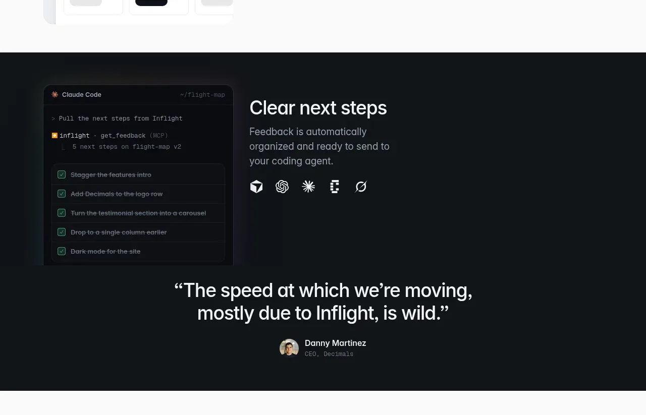
Design analysis
A dark feature band highlights the final handoff to a coding agent with a product panel, concise explanation, and small integration icons.
Prompt preview
## Reference images

Study these alongside the description below: hierarchy, rhythm, spacing, colour. Build for the product you are asked about, using this design language.

- Component: https://kage-design-assets.t3.tigrisfiles.io/components/inflight/ac6190d7-6ca0-4ac1-9ff1-df4f4b5185a3-1792562738-5.webp
- Full page it was cut from: https://kage-design-assets.t3.tigrisfiles.io/screenshots/inflight/ac6190d7-6ca0-4ac1-9ff1-df4f4b5185a3-1792562711335-full.webp
- Component on Kage: https://kage.design/component/inflight-feature-grid-2

## Before you start
Ask what the user's product is and what its brand personality should be, then apply the principles below to that product.

Create a dark feature section that explains how feedback becomes actionable work for a downstream tool or agent. Use a two-column layout with a dark code/task-panel visual on the left and a heading, short paragraph, and a row of small generic integration indicators on the right. Use #101417 or similar background, white heading text, muted #92979d body copy, restrained borders around #252b30, and 14px radii. Keep the visual hierarchy simple and let the task panel communicate organization through rows, check states, and subtle monospace accents. Stack columns on mobile.

Never: use logos, product names, copy, illustrations, or imagery from the reference.
More components
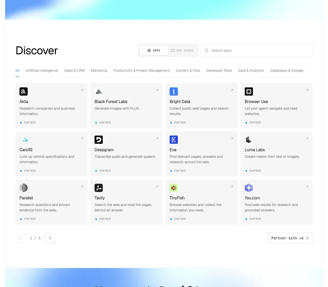
 Discover app directory
Composio Instant · Feature grid
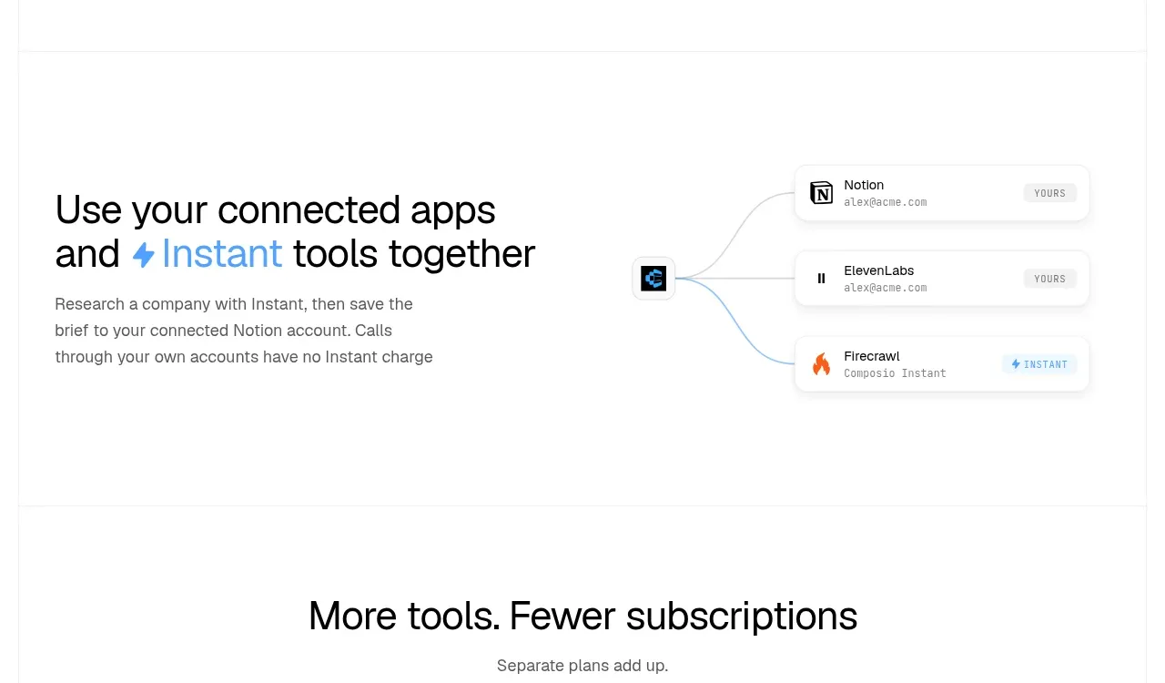 Connected apps workflow
Composio Instant · Feature grid
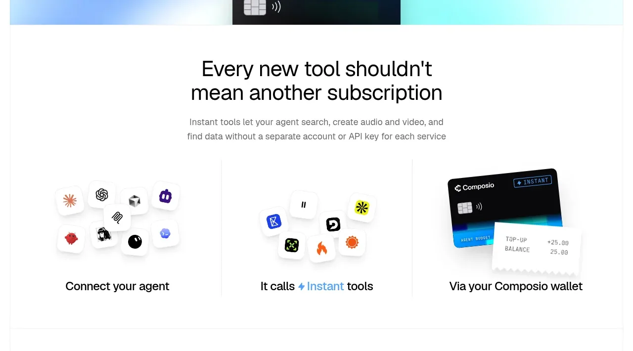 Three-part product workflow
Composio Instant · Feature grid
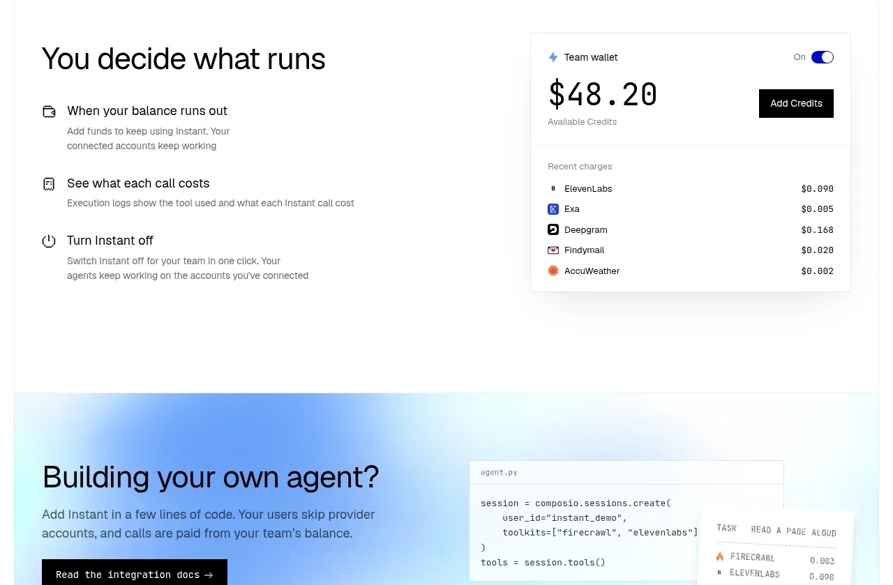 Spending controls
Composio Instant · Feature grid
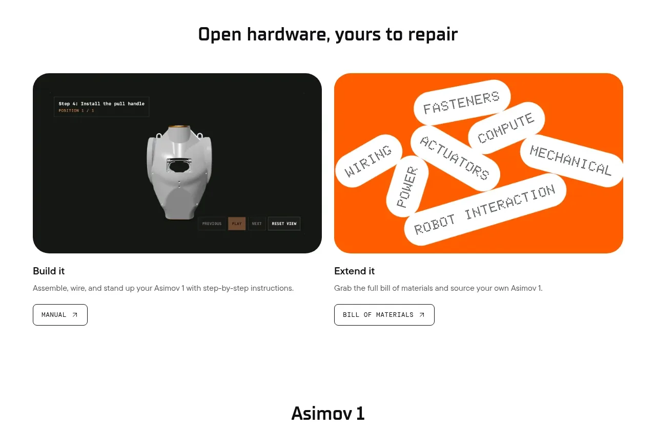
 Open hardware pathways
Asimov 1 · Feature grid
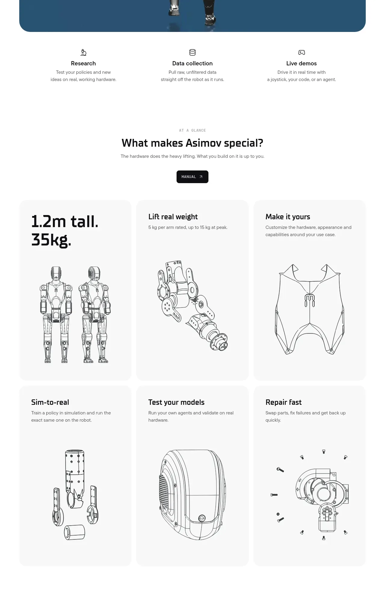 Capability overview and specification cards
Asimov 1 · Feature grid