 kage
kage
inngest.com

Design analysis
A high-contrast, vertically staged feature section that pairs numbered tab content with abstract technical visuals. The oversized typography, generous negative space, and restrained electric-blue accent make each step feel like part of a guided product narrative rather than a conventional tab panel.
Prompt preview
## Reference images

Study these alongside the description below: hierarchy, rhythm, spacing, colour. Build for the product you are asked about, using this design language.

- Component: https://kage-design-assets.t3.tigrisfiles.io/components/inngest-com/085d18d8-47d3-43b1-92ae-d8bd045a677d-1789074884-9.webp
- Full page it was cut from: https://kage-design-assets.t3.tigrisfiles.io/screenshots/inngest-com/085d18d8-47d3-43b1-92ae-d8bd045a677d-1789074849550-full.webp
- Component on Kage: https://kage.design/component/inngest-tabs-2

## Before you start
Ask the user what their product is, who it is for, and what visual brand it uses. Then apply the principles below to create an original version for that product—not a copy of the reference.

## Build this component
Create a full-width, dark editorial feature-tabs section for a technical software product. It should communicate a sequence of capabilities or product steps through a set of numbered tabs, with the active tab presenting a title and supporting description alongside abstract system-oriented visuals.

### Design language

- **Overall composition:** Use a near-black, subtly textured background across the section. Create a large, calm composition with generous vertical negative space. Organize the content as a horizontal split on desktop: an abstract visual zone on the left and the active tab’s copy on the right. Add a second, lighter abstract line motif toward the far right or lower edge to give the section a wide, engineered feel.
- **Alignment logic:** Align the copy to a consistent central content column rather than centering it in the viewport. Keep the visual and copy areas optically balanced, with the active content beginning around the middle of the section. Numbered tabs should sit directly above the active title and align to the same left edge. On small screens, stack the visual above the copy and preserve the same reading order.
- **Typography hierarchy:** Use a clean contemporary sans-serif. Make the active feature title large but controlled—approximately 30–40px on desktop, with a medium or semibold weight. Supporting text should be 16–18px, relaxed line height around 1.55, and a muted gray. Number labels should be compact and technical, with a small blue square or marker followed by a two-digit index. Avoid overly decorative type; let scale and spacing create the editorial character.
- **Tabs:** Represent the steps as a horizontal or subtly vertical sequence of compact numbered controls, depending on the available width. The active tab uses the electric-blue marker and bright text; inactive tabs use dim gray text and thin, low-contrast dividers or rules. Clicking a tab should replace the title, description, and primary abstract visual without shifting the overall section geometry.
- **Colour:** Use approximately `#0A0A0A` or `#101010` for the background, `#F5F5F3` for primary text, `#A3A3A0` for supporting copy, `#555555` for inactive rules, and a vivid electric blue around `#174BFF` or `#1555FF` for active markers and small highlights. Keep blue sparse so it functions as a navigational signal.
- **Borders and radius:** Prefer thin 1px lines in off-white or muted gray for diagrams and tab separators. Use square or minimally rounded geometry for technical visual elements. If controls need a background, use a subtle 2–4px radius rather than pill-shaped cards. Any circular navigation control may use a full radius and a white surface with a dark icon.
- **Abstract visuals:** Use original CSS/SVG-style diagrams, grids, funnels, connected nodes, event flows, or modular blocks. Keep strokes thin, monochrome, and schematic. These visuals should suggest infrastructure and orchestration without requiring literal illustrations. Add restrained blue blocks or bars only to indicate an active state. Never allow the visual to compete with the active copy.
- **Texture:** A very subtle grain or noise treatment is acceptable over the black background, but it must remain low contrast and accessible. Do not use heavy gradients, glassmorphism, or bright glow effects.
- **Interaction:** Support keyboard-accessible tabs with proper `role="tablist"`, `role="tab"`, and `role="tabpanel"` semantics. Provide visible focus states, arrow-key navigation where appropriate, and maintain the active tab with a clear blue indicator. Animate panel changes with a short opacity/translate transition of roughly 180–260ms, while avoiding layout jumps. Respect `prefers-reduced-motion`.
- **Responsive behavior:** On tablet and mobile, reduce the oversized whitespace, stack the diagram and text, make the tab controls horizontally scrollable or wrap cleanly, and keep touch targets at least 44px high. Ensure long titles and descriptions remain readable without clipping.

### Content guidance
Use placeholder content tied to the user’s product. Provide 3–5 sequential items, each with a concise title, one or two sentences of explanation, and a distinct abstract diagram state. The section should feel like a guided progression from setup to operation, but the exact sequence must match the product.

### Never
- Never use the reference’s logos, product names, brand assets, or exact copy.
- Never reproduce the reference’s diagrams, illustrations, imagery, or exact layout proportions.
- Never hard-code the reference product or its content; ask for the user’s product and brand first.
- Never make inactive tabs indistinguishable from the active tab.
- Never sacrifice keyboard accessibility, responsive behavior, or text contrast for visual similarity.
More components

 Directory filters and sorting
The Brains · Tabs & steps
Directory filters and sorting
The Brains · Tabs & steps
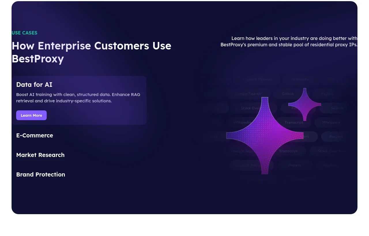
 Enterprise use cases
bestproxy.com · Tabs & steps
Enterprise use cases
bestproxy.com · Tabs & steps
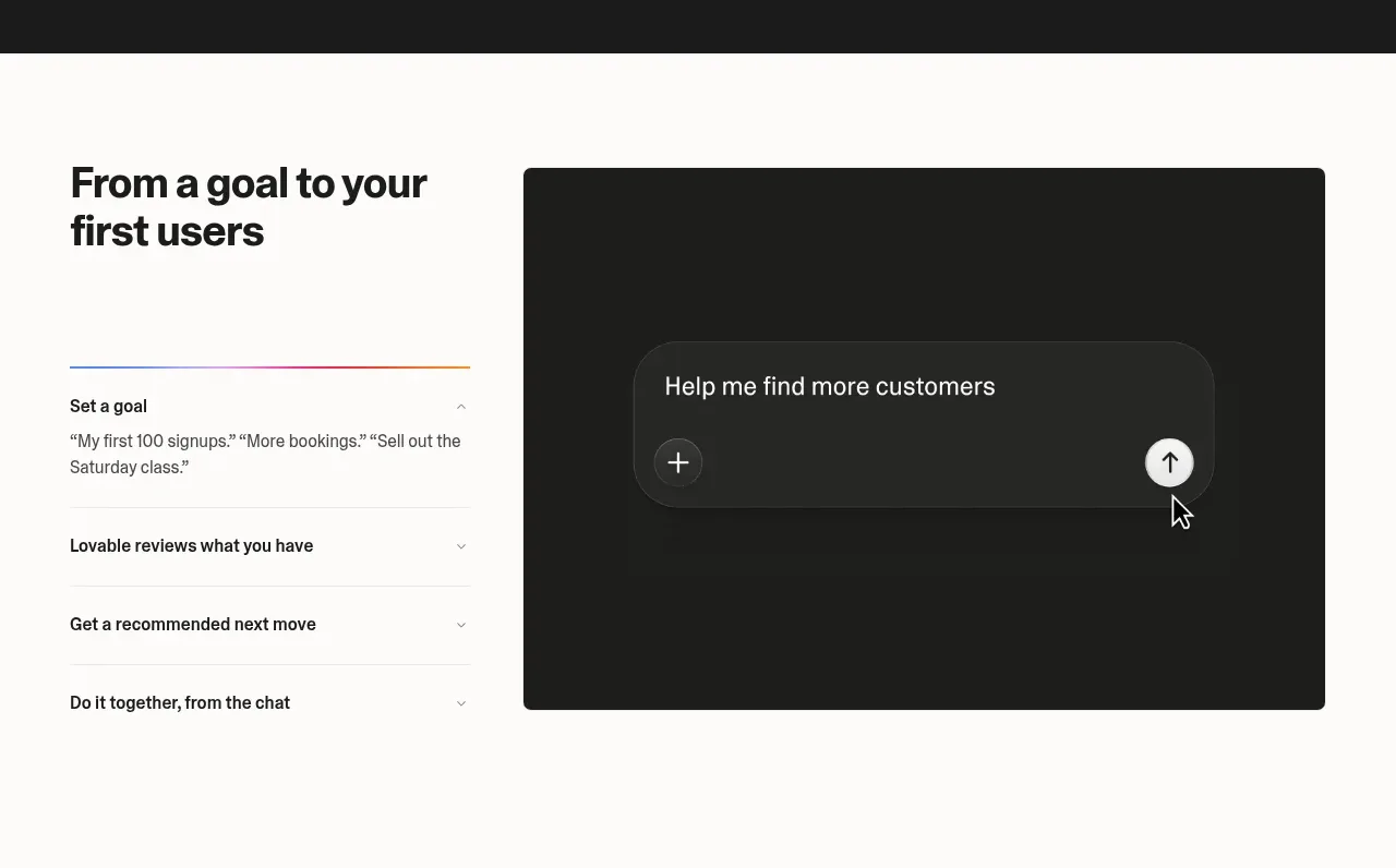
 Goal-to-first-users assistant
Lovable Growth Tools · Tabs & steps
Goal-to-first-users assistant
Lovable Growth Tools · Tabs & steps
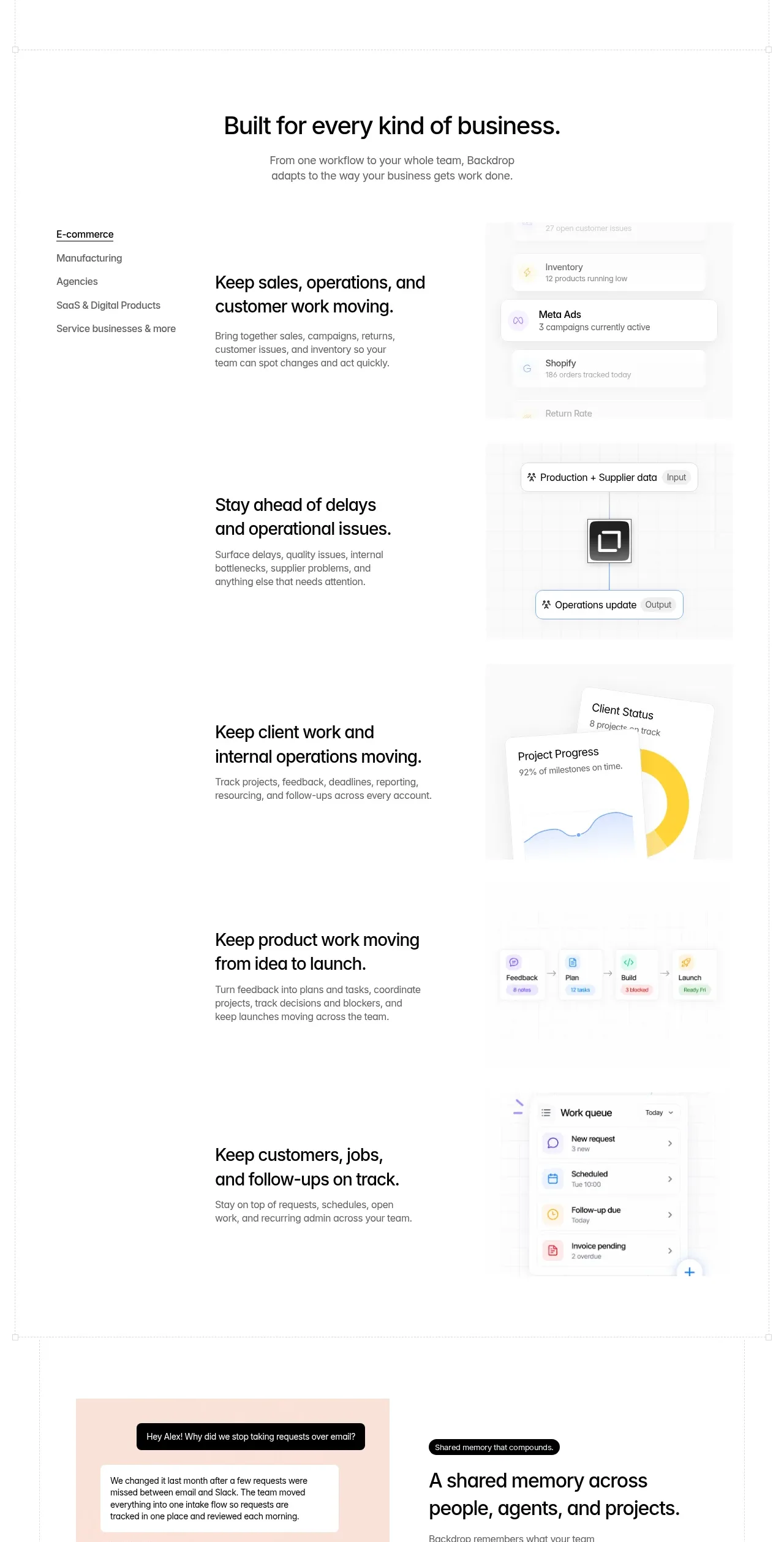
 Business use cases tabs
Backdrop · Tabs & steps
Business use cases tabs
Backdrop · Tabs & steps
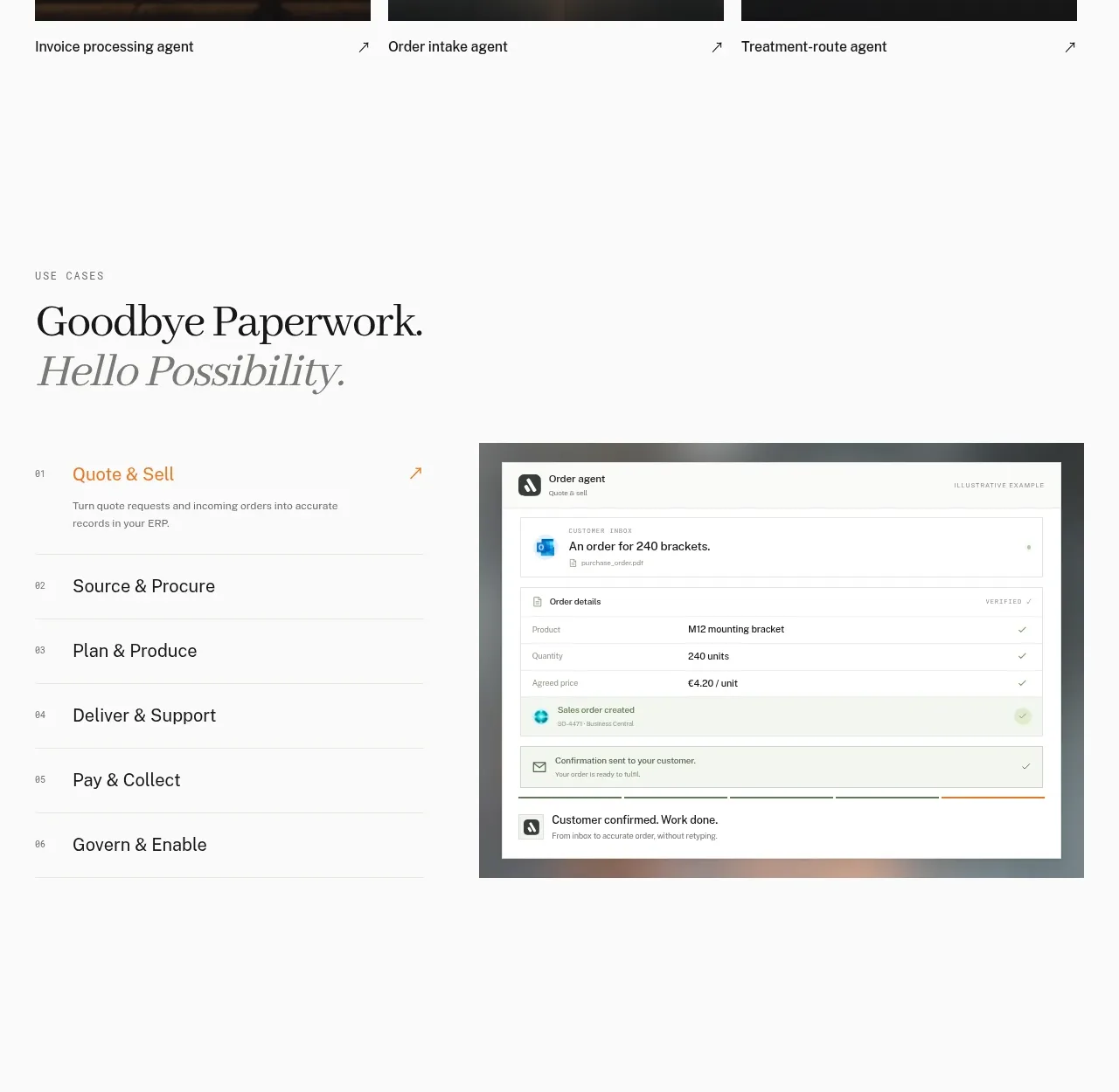
 Workflow stages with product preview
Lleverage · Tabs & steps
Workflow stages with product preview
Lleverage · Tabs & steps
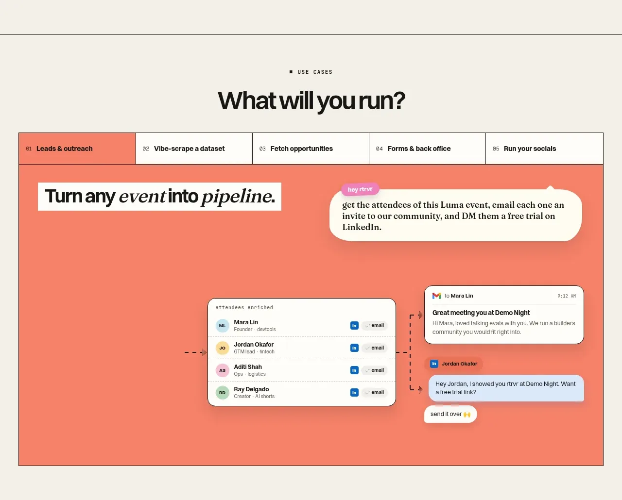
 Use-case selector and interactive showcase
Retriever AI · Tabs & steps
Use-case selector and interactive showcase
Retriever AI · Tabs & steps