kage
kage
intellagents.io
Design analysis
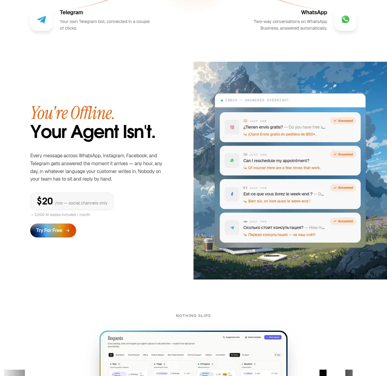
A split feature card combines persuasive copy and a price/value cue with a contextual conversation visual, showing that the agent continues working away from the primary interface.
Prompt preview
## Reference images

Study these alongside the description below: hierarchy, rhythm, spacing, colour. Build for the product you are asked about, using this design language.

- Component: https://kage-design-assets.t3.tigrisfiles.io/components/intellagents-io/be3df101-c546-4853-b3d0-99c345832561-1790316247-7.webp
- Full page it was cut from: https://kage-design-assets.t3.tigrisfiles.io/screenshots/intellagents-io/be3df101-c546-4853-b3d0-99c345832561-1790316161493-full.webp
- Component on Kage: https://kage.design/component/intellagents-card

## Before you start
Ask what happens when the user's customers are offline, unavailable, or outside normal operating conditions. Build a feature card around that real continuity promise.

Create a wide split-layout feature section: copy on the left and a contextual product visual on the right. Use an editorial accent line, a bold headline, a short paragraph, a compact proof or pricing badge, and one primary CTA. The visual should be a framed conversation or state preview over a subtle contextual background, not a generic illustration. Keep the split balanced, with generous padding and a clear focal point.

Use #FFFFFF background, #111111 headings, #6C6C6C body text, a pale warm badge background, and blue/orange accents in the visual. Use 48–72px section padding, 50/50 or 45/55 columns, 20–28px radius, and stack copy above media on mobile.

### Never
- Never copy logos, product names, copy, illustrations, or imagery from the reference.
- Never imply autonomous behavior the product cannot provide.
- Never let the supporting visual overpower the promise.