 kage
kage
intellagents.io
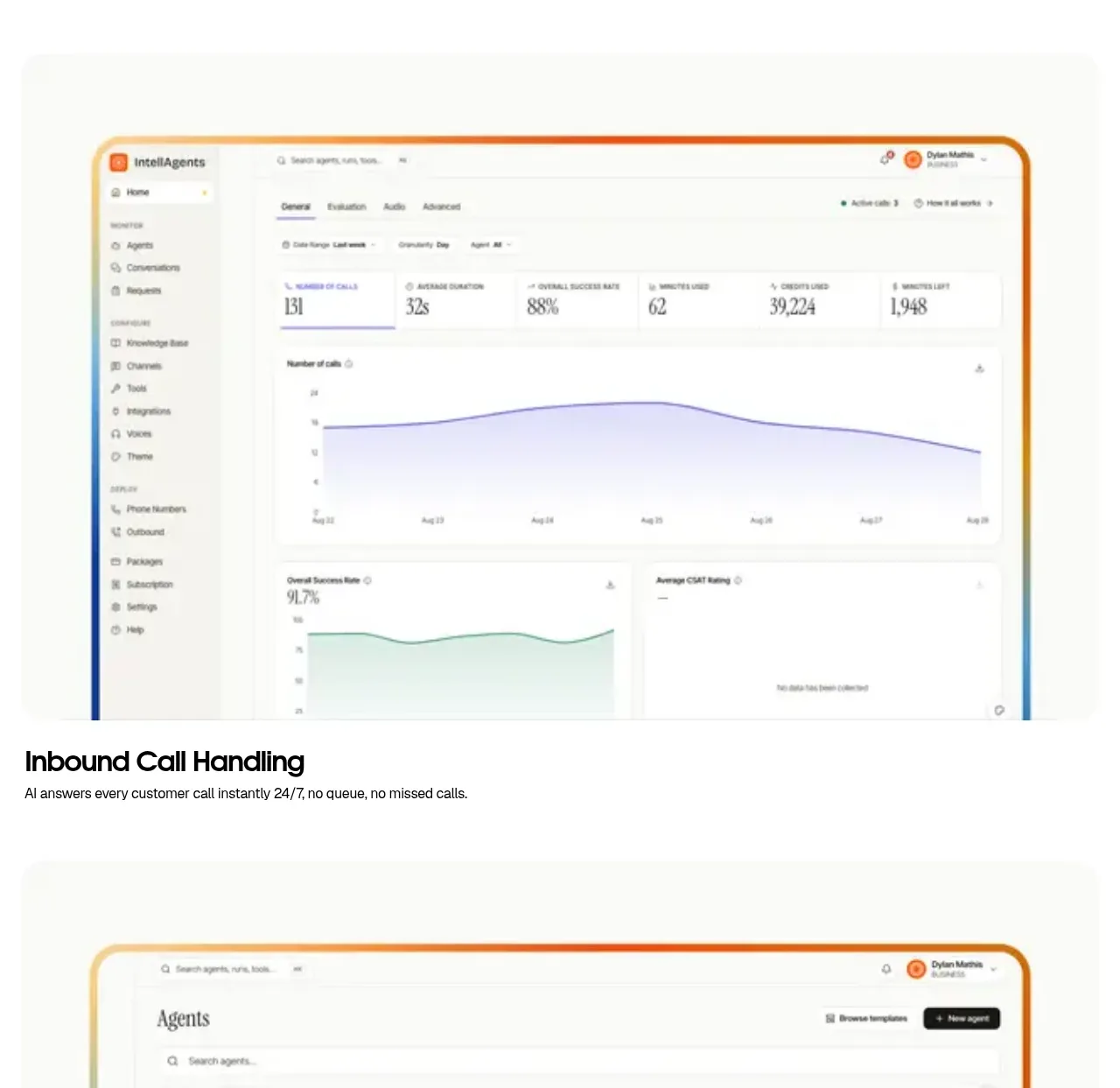
Design analysis
The first product capability is demonstrated with a large framed dashboard visual followed by a short, highly scannable feature title and explanation.
Prompt preview
## Reference images

Study these alongside the description below: hierarchy, rhythm, spacing, colour. Build for the product you are asked about, using this design language.

- Component: https://kage-design-assets.t3.tigrisfiles.io/components/intellagents-io/be3df101-c546-4853-b3d0-99c345832561-1790316246-3.webp
- Full page it was cut from: https://kage-design-assets.t3.tigrisfiles.io/screenshots/intellagents-io/be3df101-c546-4853-b3d0-99c345832561-1790316161493-full.webp
- Component on Kage: https://kage.design/component/intellagents-feature-grid

## Before you start
Ask what core workflow your product should demonstrate first and what evidence makes it credible. Then build this feature section around that workflow.

Create a feature showcase band with a large centered product UI image above a compact text block. Give the image a rounded 20–28px frame, a subtle warm-to-cool border accent, and enough surrounding white space that it reads as the hero of the section. Below it, use a bold 20–28px feature heading and one concise sentence. Include a small uppercase eyebrow if useful. Keep the visual wider than the text and align both to the same centered container.

Use #FAFAF8 or white, #111111 text, #707070 supporting text, and restrained #F0A23A/#55B7D9 edge accents. Use 72px top padding, 24px visual-to-copy spacing, and 18–24px bottom padding. Add subtle image hover elevation only when appropriate.

### Never
- Never copy logos, product names, copy, illustrations, or imagery from the reference.
- Never use a fake dashboard that does not reflect the user's product.
- Never overload the caption with feature specifications.
More components

 Spend visibility and daily-cost breakdown
Subscrr · Feature grid
Spend visibility and daily-cost breakdown
Subscrr · Feature grid
 Reminders and simple setup flow
Subscrr · Feature grid
Reminders and simple setup flow
Subscrr · Feature grid

 Interactive product demonstration
NotchPop · Feature grid
Interactive product demonstration
NotchPop · Feature grid
 Quiet information cards
NotchPop · Feature grid
Quiet information cards
NotchPop · Feature grid
 Focused feature cards
NotchPop · Feature grid
Focused feature cards
NotchPop · Feature grid
 Security and permissions cards
NotchPop · Feature grid
Security and permissions cards
NotchPop · Feature grid