 kage
kage
intellagents.io
Design analysis
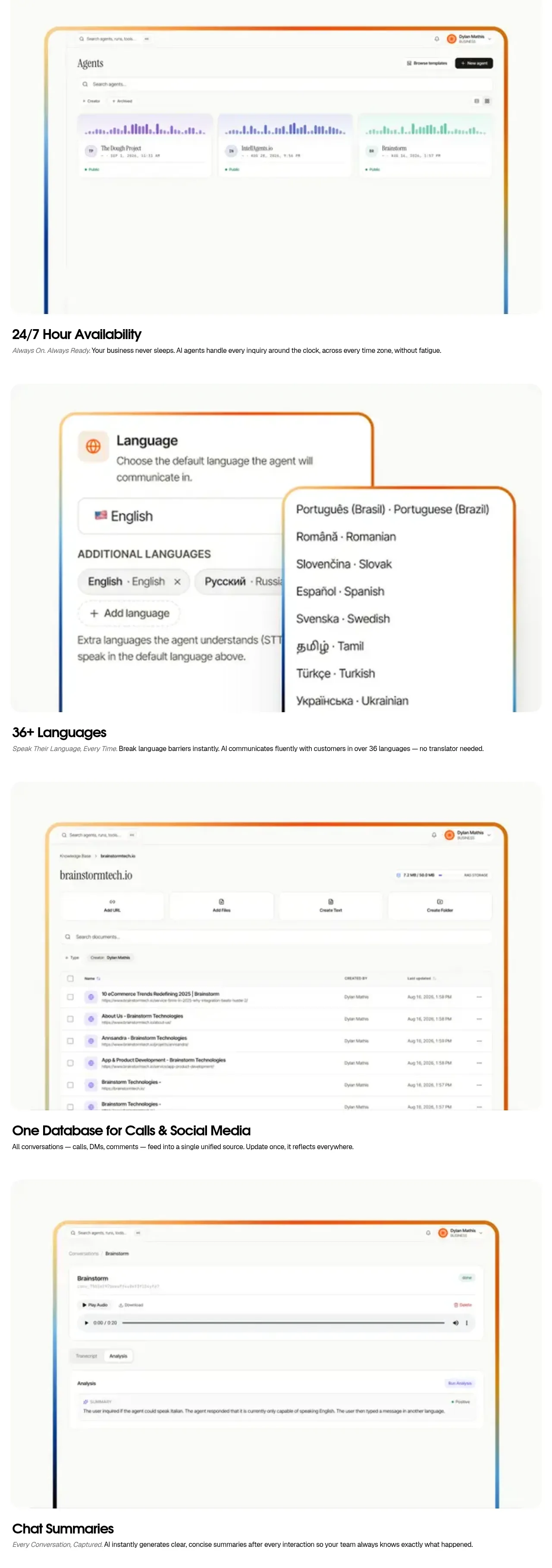
A sequence of similarly structured capability bands creates a visual rhythm: product screenshot, short title, and one-line explanation for availability, languages, unified data, and summaries.
Prompt preview
## Reference images

Study these alongside the description below: hierarchy, rhythm, spacing, colour. Build for the product you are asked about, using this design language.

- Component: https://kage-design-assets.t3.tigrisfiles.io/components/intellagents-io/be3df101-c546-4853-b3d0-99c345832561-1790316246-4.webp
- Full page it was cut from: https://kage-design-assets.t3.tigrisfiles.io/screenshots/intellagents-io/be3df101-c546-4853-b3d0-99c345832561-1790316161493-full.webp
- Component on Kage: https://kage.design/component/intellagents-feature-grid-2

## Before you start
Ask which 3–5 capabilities matter most to the user's product and which order tells the clearest story. Apply the system below to those capabilities.

Build a vertically stacked feature showcase system using repeated bands rather than a dense card grid. Each band contains one large centered product visual with a soft rounded frame, followed by a short title and one-sentence explanation. Alternate image alignment or visual treatment occasionally to avoid monotony, but preserve a consistent reading rhythm. Use descriptive section labels, strong whitespace, and a maximum content width around 600–900px depending on viewport. Let screenshots or diagrams carry the evidence while copy remains brief.

Use an off-white #FBFBF9 background alternating with #FFFFFF, #111111 headings, #6F6F6F body text, very light #EDEDED dividers, and subtle orange/blue gradient accents around visuals. Use 64–96px vertical spacing per band, 20–28px image radius, and responsive full-bleed visuals on mobile. Add lazy loading and accessible captions.

### Never
- Never copy logos, product names, copy, illustrations, or imagery from the reference.
- Never present four identical cards with no narrative order.
- Never use screenshots as decoration without explaining the user outcome.
More components

 Spend visibility and daily-cost breakdown
Subscrr · Feature grid
Spend visibility and daily-cost breakdown
Subscrr · Feature grid
 Reminders and simple setup flow
Subscrr · Feature grid
Reminders and simple setup flow
Subscrr · Feature grid

 Interactive product demonstration
NotchPop · Feature grid
Interactive product demonstration
NotchPop · Feature grid
 Quiet information cards
NotchPop · Feature grid
Quiet information cards
NotchPop · Feature grid
 Focused feature cards
NotchPop · Feature grid
Focused feature cards
NotchPop · Feature grid
 Security and permissions cards
NotchPop · Feature grid
Security and permissions cards
NotchPop · Feature grid