 kage
kage
intellagents.io
Design analysis
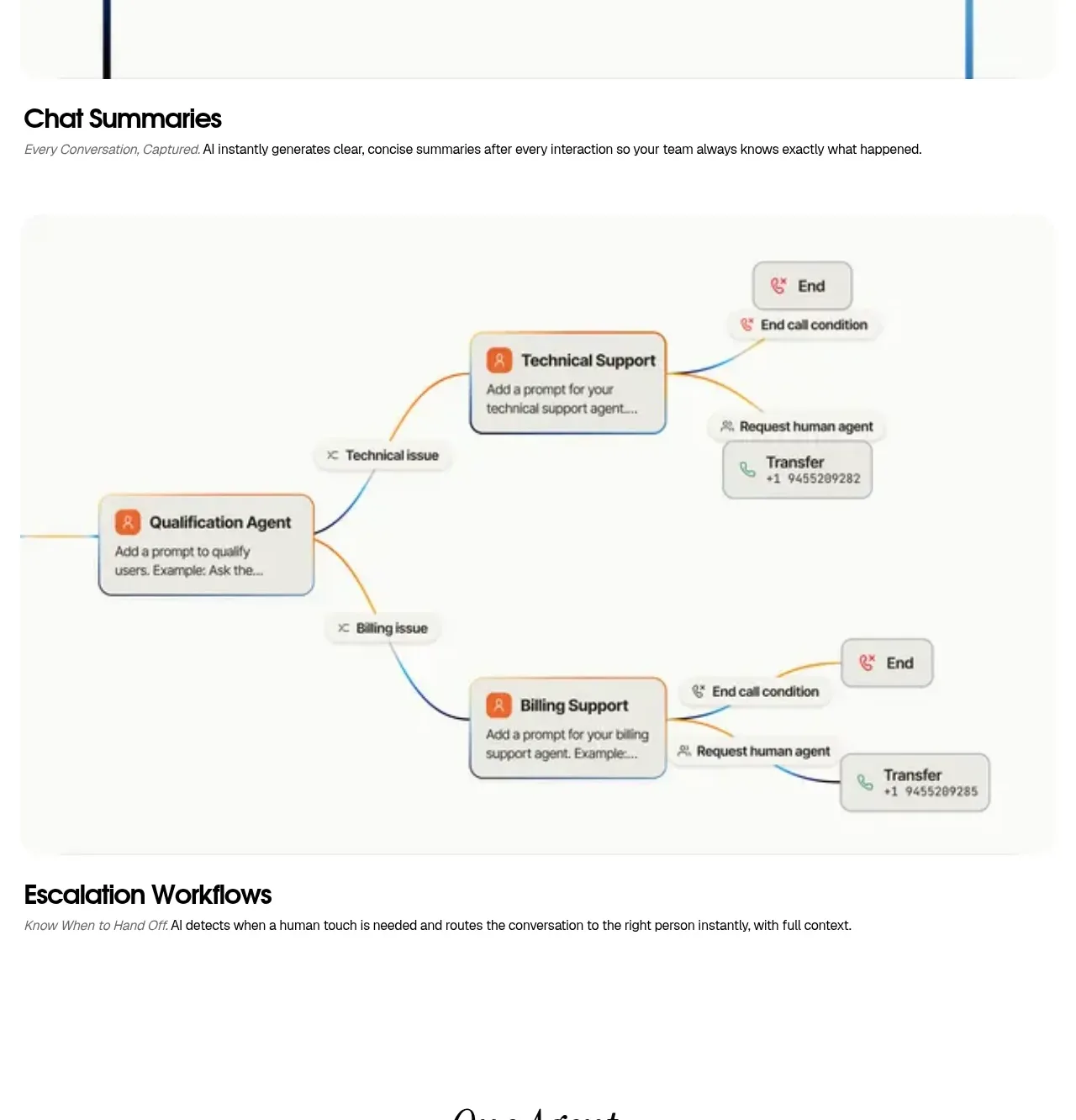
A branching workflow visual explains how conversations move between qualification, technical support, billing, transfer, and end states before the section caption names the benefit.
Prompt preview
## Reference images

Study these alongside the description below: hierarchy, rhythm, spacing, colour. Build for the product you are asked about, using this design language.

- Component: https://kage-design-assets.t3.tigrisfiles.io/components/intellagents-io/be3df101-c546-4853-b3d0-99c345832561-1790316247-5.webp
- Full page it was cut from: https://kage-design-assets.t3.tigrisfiles.io/screenshots/intellagents-io/be3df101-c546-4853-b3d0-99c345832561-1790316161493-full.webp
- Component on Kage: https://kage.design/component/intellagents-feature-grid-3

## Before you start
Ask what decisions, handoffs, and escalation states exist in the user's product. Use those real states to design a readable workflow story.

Create a workflow section with a large, low-noise diagram centered inside a pale canvas, followed by a bold heading and concise explanatory line. Use rounded rectangular nodes, clear directional connectors, semantic colors for success, escalation, and termination, and enough whitespace that branches do not collide. On mobile, convert the diagram into a vertical step flow or horizontally scrollable accessible diagram. Keep the caption visually subordinate to the diagram.

Use #FFFFFF or #FAFAF8 canvas, #111111 labels, #6E6E6E descriptions, muted blue and orange connectors, pale green for successful transfer, and pale rose for end states. Use 12–16px node radius, 1–2px connectors, and 56–80px section padding.

### Never
- Never copy logos, product names, copy, illustrations, or imagery from the reference.
- Never use connector lines that cross labels ambiguously.
- Never make color the only indicator of workflow state.
More components

 Spend visibility and daily-cost breakdown
Subscrr · Feature grid
Spend visibility and daily-cost breakdown
Subscrr · Feature grid
 Reminders and simple setup flow
Subscrr · Feature grid
Reminders and simple setup flow
Subscrr · Feature grid

 Interactive product demonstration
NotchPop · Feature grid
Interactive product demonstration
NotchPop · Feature grid
 Quiet information cards
NotchPop · Feature grid
Quiet information cards
NotchPop · Feature grid
 Focused feature cards
NotchPop · Feature grid
Focused feature cards
NotchPop · Feature grid
 Security and permissions cards
NotchPop · Feature grid
Security and permissions cards
NotchPop · Feature grid