 kage
kage
intellagents.io
Design analysis
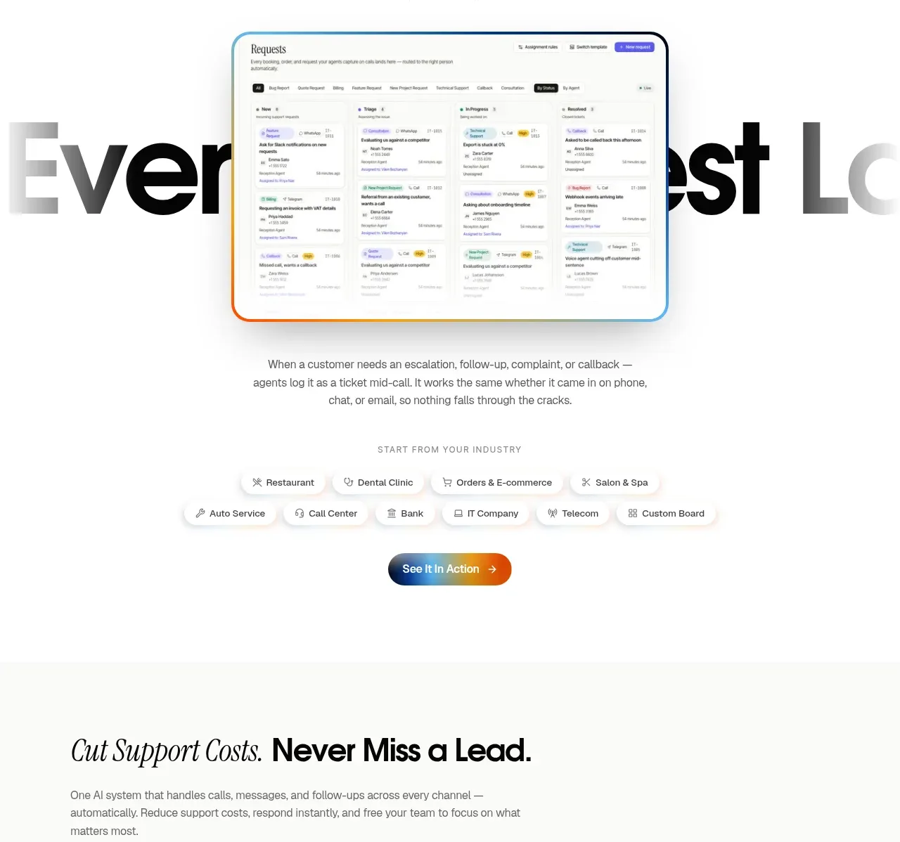
A large request-board preview demonstrates follow-up visibility, while industry chips and a centered CTA make the workflow relevant to multiple operational contexts.
Prompt preview
## Reference images

Study these alongside the description below: hierarchy, rhythm, spacing, colour. Build for the product you are asked about, using this design language.

- Component: https://kage-design-assets.t3.tigrisfiles.io/components/intellagents-io/be3df101-c546-4853-b3d0-99c345832561-1790316248-8.webp
- Full page it was cut from: https://kage-design-assets.t3.tigrisfiles.io/screenshots/intellagents-io/be3df101-c546-4853-b3d0-99c345832561-1790316161493-full.webp
- Component on Kage: https://kage.design/component/intellagents-feature-grid-5

## Before you start
Ask what requests, tasks, or records the user's customers need tracked and which industries or roles use them. Adapt the evidence and filters accordingly.

Build a centered operational proof section with an eyebrow, an oversized statement about preventing missed work, and a large inbox/board preview overlapping the typography slightly. Follow it with a short explanatory paragraph, a row of compact industry or use-case chips, and a centered action button. Keep the board screenshot legible enough to suggest structure without relying on tiny unreadable text. Use layered depth sparingly.

Use #FFFFFF background, #111111 headline, #777777 paragraph, #F5F5F2 chips, and a subtle blue/orange border around the board. Use 18–24px chip radius, 20–28px visual radius, 72px vertical padding, and responsive overflow for chips. Add hover states to chips only if they filter content.

### Never
- Never copy logos, product names, copy, illustrations, or imagery from the reference.
- Never claim zero missed work unless it can be substantiated.
- Never use illegible microcopy as the primary proof.
More components

 Spend visibility and daily-cost breakdown
Subscrr · Feature grid
Spend visibility and daily-cost breakdown
Subscrr · Feature grid
 Reminders and simple setup flow
Subscrr · Feature grid
Reminders and simple setup flow
Subscrr · Feature grid

 Interactive product demonstration
NotchPop · Feature grid
Interactive product demonstration
NotchPop · Feature grid
 Quiet information cards
NotchPop · Feature grid
Quiet information cards
NotchPop · Feature grid
 Focused feature cards
NotchPop · Feature grid
Focused feature cards
NotchPop · Feature grid
 Security and permissions cards
NotchPop · Feature grid
Security and permissions cards
NotchPop · Feature grid