 kage
kage
intellagents.io
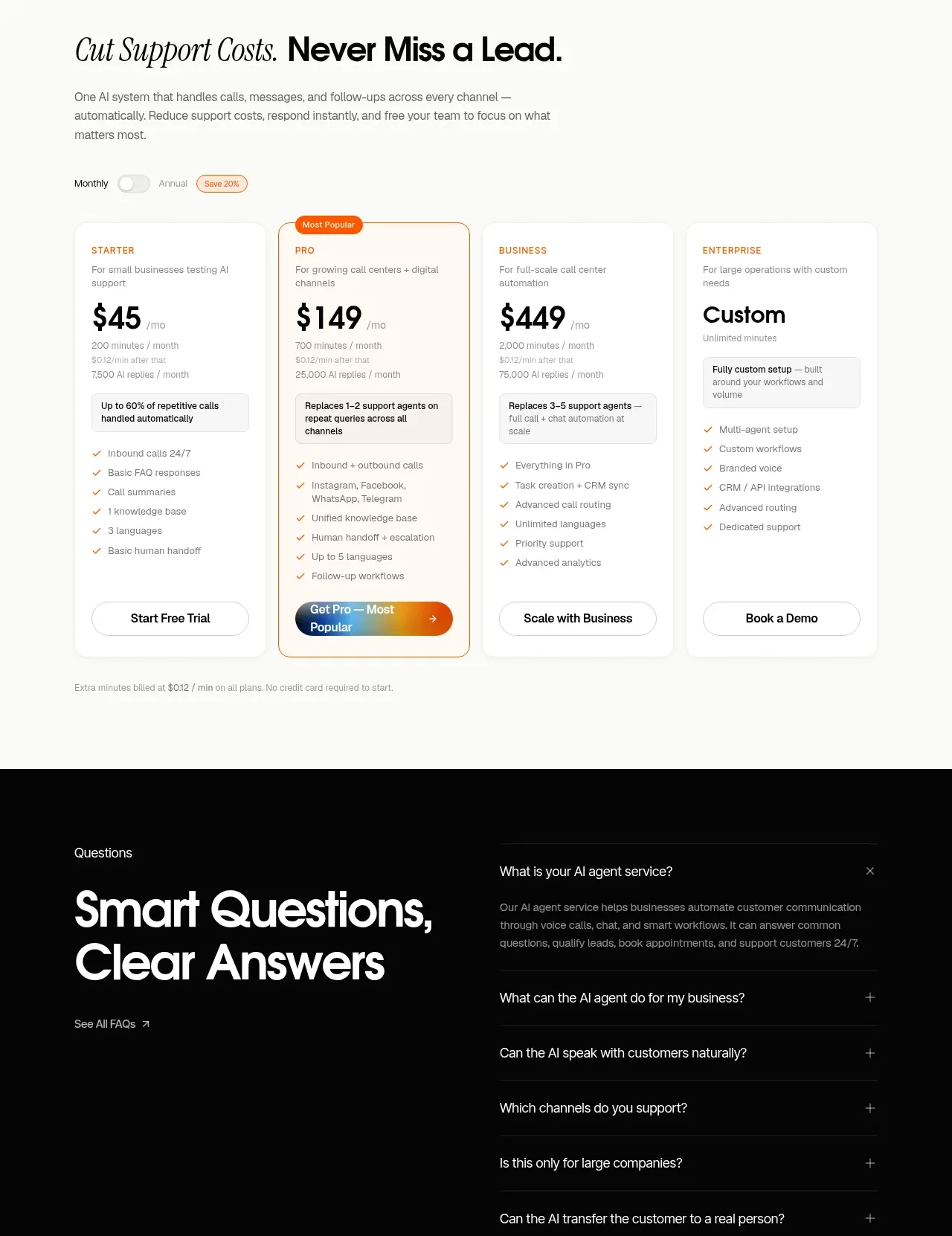
Design analysis
A four-tier pricing table uses a simple monthly/annual switch, a highlighted recommended tier, feature checklists, and bottom-aligned actions for quick comparison.
Prompt preview
## Reference images

Study these alongside the description below: hierarchy, rhythm, spacing, colour. Build for the product you are asked about, using this design language.

- Component: https://kage-design-assets.t3.tigrisfiles.io/components/intellagents-io/be3df101-c546-4853-b3d0-99c345832561-1790316248-9.webp
- Full page it was cut from: https://kage-design-assets.t3.tigrisfiles.io/screenshots/intellagents-io/be3df101-c546-4853-b3d0-99c345832561-1790316161493-full.webp
- Component on Kage: https://kage.design/component/intellagents-pricing-table

## Before you start
Ask for the user's actual plans, billing model, pricing constraints, included limits, and preferred conversion action. Then structure a truthful comparison using these principles.

Create a pricing section with a strong editorial heading and short explanatory copy, followed by a monthly/annual toggle with a visible savings cue. Use four responsive plan cards in one row on desktop, with the recommended plan visually emphasized by a warm outline, a small badge, and a gradient CTA. Each card should have plan name, price, billing qualifier, one-line audience description, a compact checklist, and an action pinned near the bottom so columns compare cleanly. Include a small footnote about taxes, limits, or trial terms.

Use #FAFAF8 background, white cards, #111111 headings, #777777 body, #E8E8E8 borders, and #F1A23A plus #0B78B7 accents. Use 16–20px card radius, 24px internal padding, 1px borders, and a strong but accessible selected state. Make the toggle keyboard accessible and stack cards on mobile.

### Never
- Never copy logos, product names, copy, illustrations, or imagery from the reference.
- Never invent prices or promise features not supplied by the user.
- Never make the recommended plan visually misleading or inaccessible.
More components
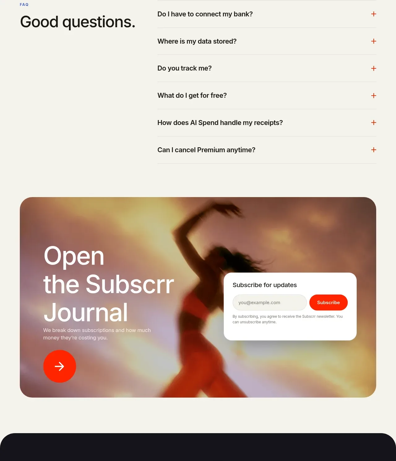
 Free and premium pricing comparison
Subscrr · Pricing table
Free and premium pricing comparison
Subscrr · Pricing table
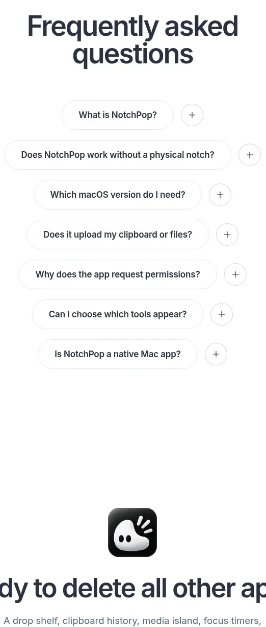
 One-time purchase pricing
NotchPop · Pricing table
One-time purchase pricing
NotchPop · Pricing table
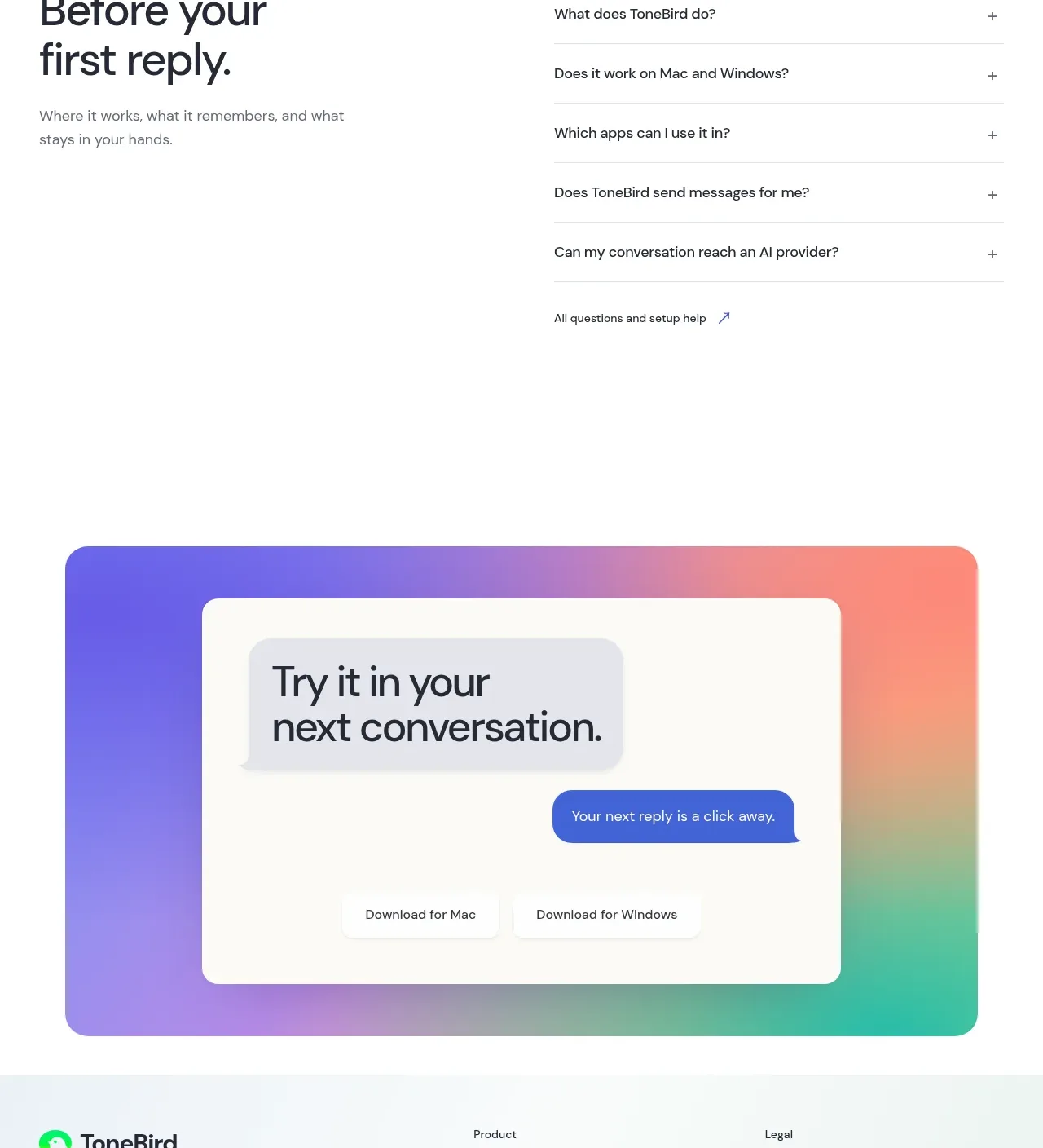
 Four-tier pricing table
ToneBird · Pricing table
Four-tier pricing table
ToneBird · Pricing table
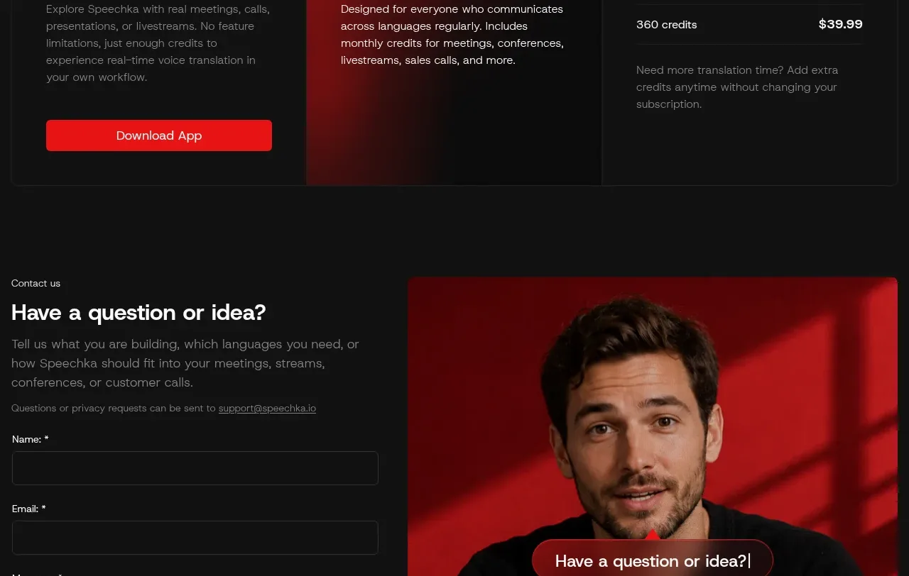
 Trial and subscription plans
Speechka · Pricing table
Trial and subscription plans
Speechka · Pricing table
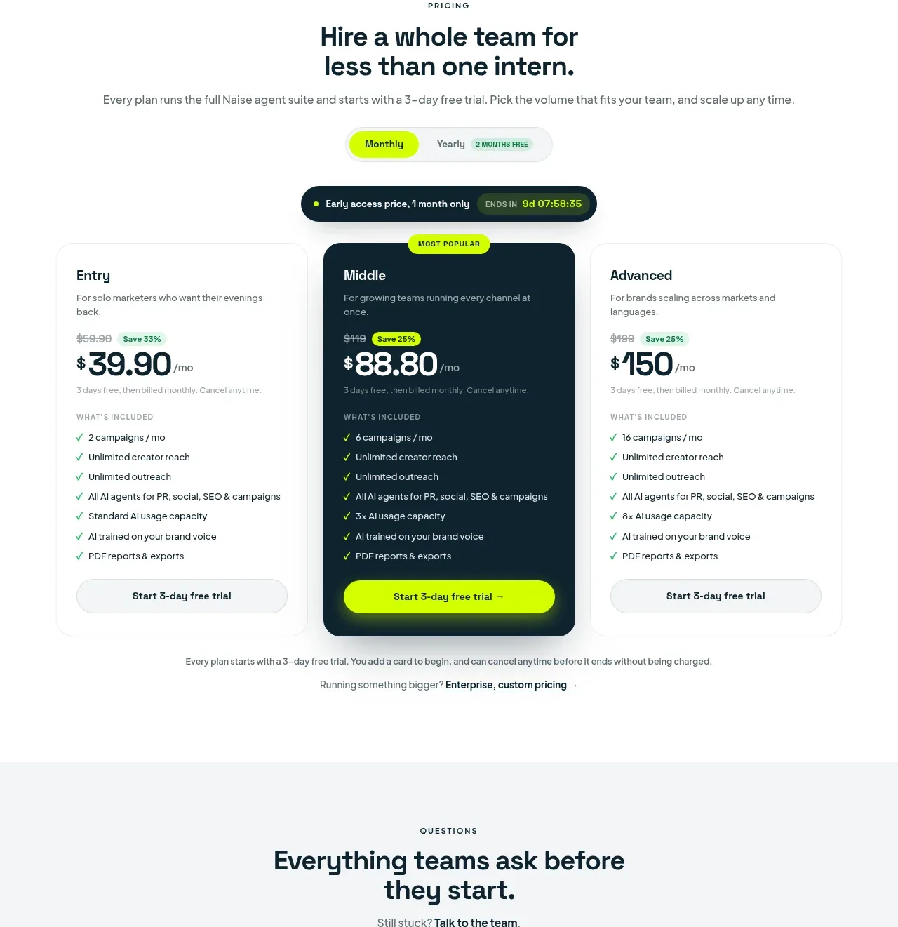
 Three-tier pricing plans
Naise AI · Pricing table
Three-tier pricing plans
Naise AI · Pricing table
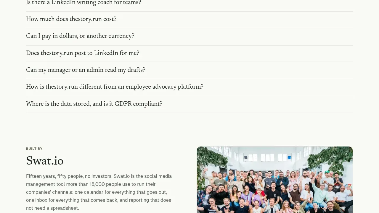
 Simple usage-based pricing
thestory.run · Pricing table
Simple usage-based pricing
thestory.run · Pricing table