 kage
kage
intercom.com

Design analysis
A parallel section introduces the AI agent with a contrasting orange category marker, then uses a split layout: editorial copy and art above, followed by a large media-and-bullets panel.
Prompt preview
## Reference images

Study these alongside the description below: hierarchy, rhythm, spacing, colour. Build for the product you are asked about, using this design language.

- Component: https://kage-design-assets.t3.tigrisfiles.io/components/intercom-com/1643b347-46d4-4b8f-b100-4d586237bab2-1789906751-5.webp
- Full page it was cut from: https://kage-design-assets.t3.tigrisfiles.io/screenshots/intercom-com/1643b347-46d4-4b8f-b100-4d586237bab2-1789906717325-full.webp
- Component on Kage: https://kage.design/component/intercom-feature-grid-2

## Before you start
Ask what the user's product, brand, and AI capabilities are, then apply these design rules to that product.

Build a feature section that mirrors the previous section's rhythm but uses a clearly distinct accent color. Start with a two-column introduction: category label and large headline plus paragraph and CTAs on the left, expressive abstract product-adjacent artwork on the right. Below, create a large bordered panel with a media area on the left and a vertically stacked list of three capabilities on the right. Each list item gets a small square marker, heading, and explanatory copy.

Use white #ffffff for the main section, dark text #111111, body gray #666761, and orange accent #e87518. Use 48–64px top spacing, a 732px max-width, 1px #deded8 borders, and 0–4px corner radii. Keep headline type at 40–48px with 0.95 line-height and use 14px body text. The capability list should have 28–36px row gaps and a faint divider between items. On mobile, stack the visual above the list and preserve clear reading order.

Never: use logos, product names, copy, illustrations, or imagery from the reference.
More components

 AI-powered helpdesk feature section
intercom.com · Feature grid
AI-powered helpdesk feature section
intercom.com · Feature grid
 Integrations and ecosystem section
intercom.com · Feature grid
Integrations and ecosystem section
intercom.com · Feature grid
 Unified support experience overview
intercom.com · Feature grid
Unified support experience overview
intercom.com · Feature grid

 Audience and trade types
sendinvo.com · Feature grid
Audience and trade types
sendinvo.com · Feature grid
 Core invoicing capabilities
sendinvo.com · Feature grid
Core invoicing capabilities
sendinvo.com · Feature grid
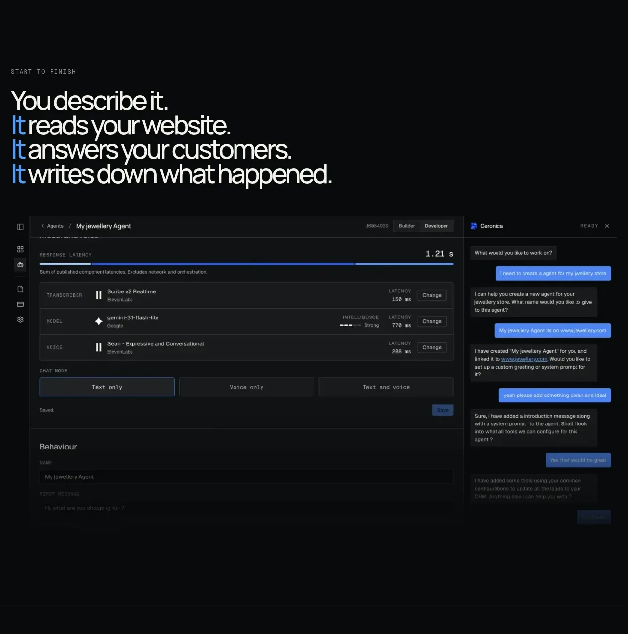
 End-to-end product workflow
Duvi · Feature grid
End-to-end product workflow
Duvi · Feature grid