 kage
kage
intercom.com

Design analysis
A broader platform story combines a strong headline with a three-card row covering collaboration, self-improvement, and centralized knowledge. Each card uses a media strip and explanatory text.
Prompt preview
## Reference images

Study these alongside the description below: hierarchy, rhythm, spacing, colour. Build for the product you are asked about, using this design language.

- Component: https://kage-design-assets.t3.tigrisfiles.io/components/intercom-com/1643b347-46d4-4b8f-b100-4d586237bab2-1789906752-6.webp
- Full page it was cut from: https://kage-design-assets.t3.tigrisfiles.io/screenshots/intercom-com/1643b347-46d4-4b8f-b100-4d586237bab2-1789906717325-full.webp
- Component on Kage: https://kage.design/component/intercom-feature-grid-3

## Before you start
Ask what the user's product and brand are, then apply these principles to the user's platform story.

Create a platform overview section with two small category labels, a large left-aligned headline, supporting paragraph, and CTA pair. Beneath it, place three equal-width cards in one row. Each card has a compact product/UI visual on top, a clear title, and a paragraph describing the workflow benefit. Keep cards visually connected as one system rather than as unrelated marketing tiles.

Use #fafaf7 background, #111111 headings, #666862 body copy, and small blue/orange category accents near the eyebrow. Set a 732px max-width, 28px card gaps, and 16–24px card text padding. Media areas should have a subtle #eeeeea background and 1px border; card radius can be 2–6px. Headline is 40–48px; card titles 17–19px; body 13–14px. Use responsive horizontal scrolling or a stacked layout below 700px, with visible focus and hover treatment.

Never: use logos, product names, copy, illustrations, or imagery from the reference.
More components

 AI-powered helpdesk feature section
intercom.com · Feature grid
AI-powered helpdesk feature section
intercom.com · Feature grid
 Integrations and ecosystem section
intercom.com · Feature grid
Integrations and ecosystem section
intercom.com · Feature grid
 AI agent capabilities section
intercom.com · Feature grid
AI agent capabilities section
intercom.com · Feature grid

 Audience and trade types
sendinvo.com · Feature grid
Audience and trade types
sendinvo.com · Feature grid
 Core invoicing capabilities
sendinvo.com · Feature grid
Core invoicing capabilities
sendinvo.com · Feature grid
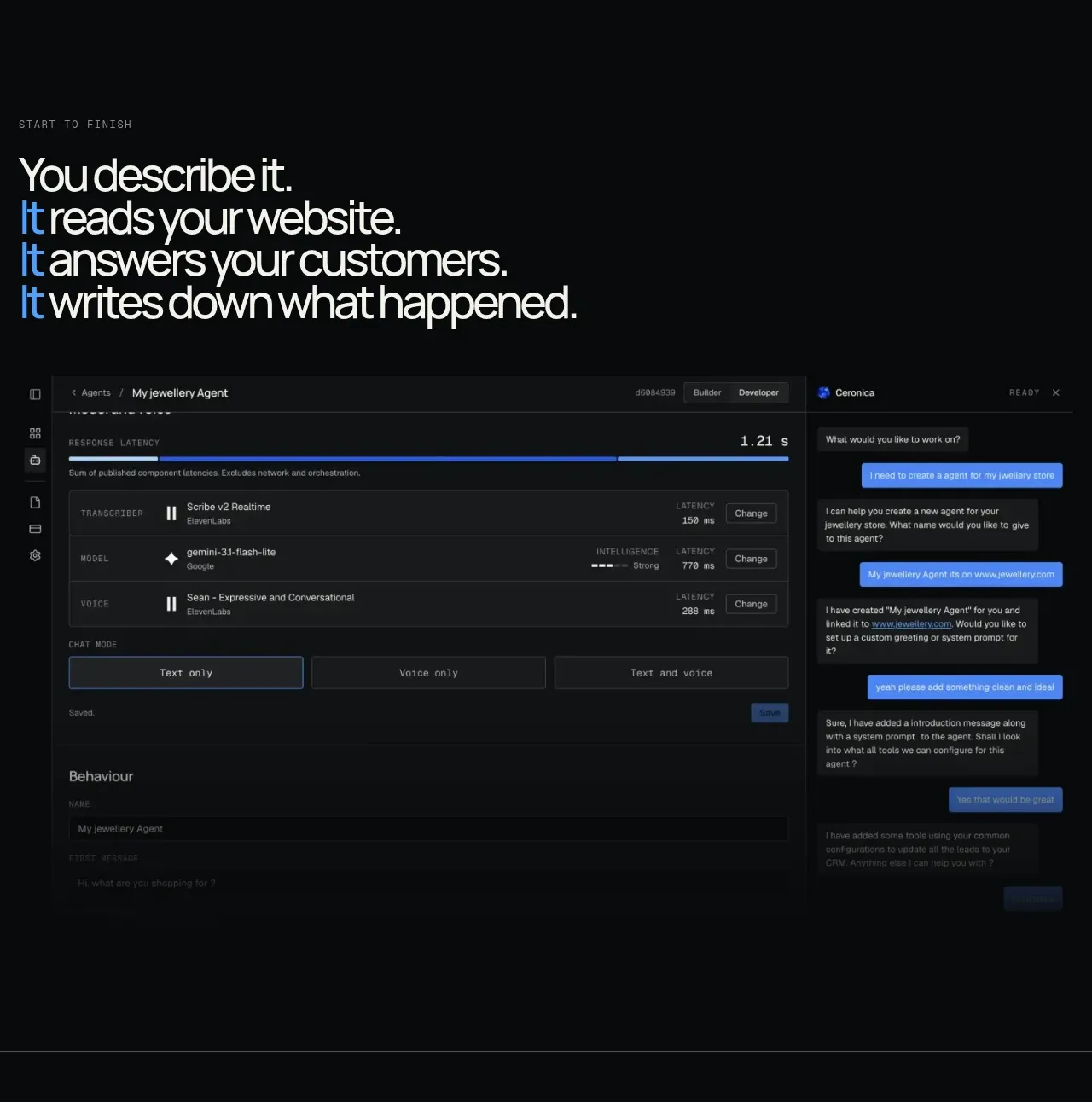
 End-to-end product workflow
Duvi · Feature grid
End-to-end product workflow
Duvi · Feature grid