 kage
kage
intercom.com

Design analysis
A concise headline and paragraph sit beside a dense grid of integration tiles. The section communicates breadth while retaining the same editorial CTA pattern.
Prompt preview
## Reference images

Study these alongside the description below: hierarchy, rhythm, spacing, colour. Build for the product you are asked about, using this design language.

- Component: https://kage-design-assets.t3.tigrisfiles.io/components/intercom-com/1643b347-46d4-4b8f-b100-4d586237bab2-1789906752-8.webp
- Full page it was cut from: https://kage-design-assets.t3.tigrisfiles.io/screenshots/intercom-com/1643b347-46d4-4b8f-b100-4d586237bab2-1789906717325-full.webp
- Component on Kage: https://kage.design/component/intercom-feature-grid-4

## Before you start
Ask what the user's product, brand, and important integrations are, then apply these rules to that ecosystem.

Create a two-column integrations section: editorial content on the left with a small category label, large headline, paragraph, and two CTAs; a compact grid of integration tiles on the right. Give every tile the same dimensions and a calm border so the varied marks feel organized. Use 3 columns on desktop and 2 on mobile.

Use #ffffff background, #111111 type, #686b65 body copy, and #e0e1dc tile borders. Headline is 38–46px with tight line-height; body 14px; tiles use 12–14px labels or accessible icons. Set 12–16px tile gaps, 12px tile padding, 4px radius, and a very soft shadow on hover. Keep the overall module max-width about 732px and align the grid vertically with the editorial block.

Never: use logos, product names, copy, illustrations, or imagery from the reference.
More components

 AI-powered helpdesk feature section
intercom.com · Feature grid
AI-powered helpdesk feature section
intercom.com · Feature grid
 Unified support experience overview
intercom.com · Feature grid
Unified support experience overview
intercom.com · Feature grid
 AI agent capabilities section
intercom.com · Feature grid
AI agent capabilities section
intercom.com · Feature grid

 Audience and trade types
sendinvo.com · Feature grid
Audience and trade types
sendinvo.com · Feature grid
 Core invoicing capabilities
sendinvo.com · Feature grid
Core invoicing capabilities
sendinvo.com · Feature grid
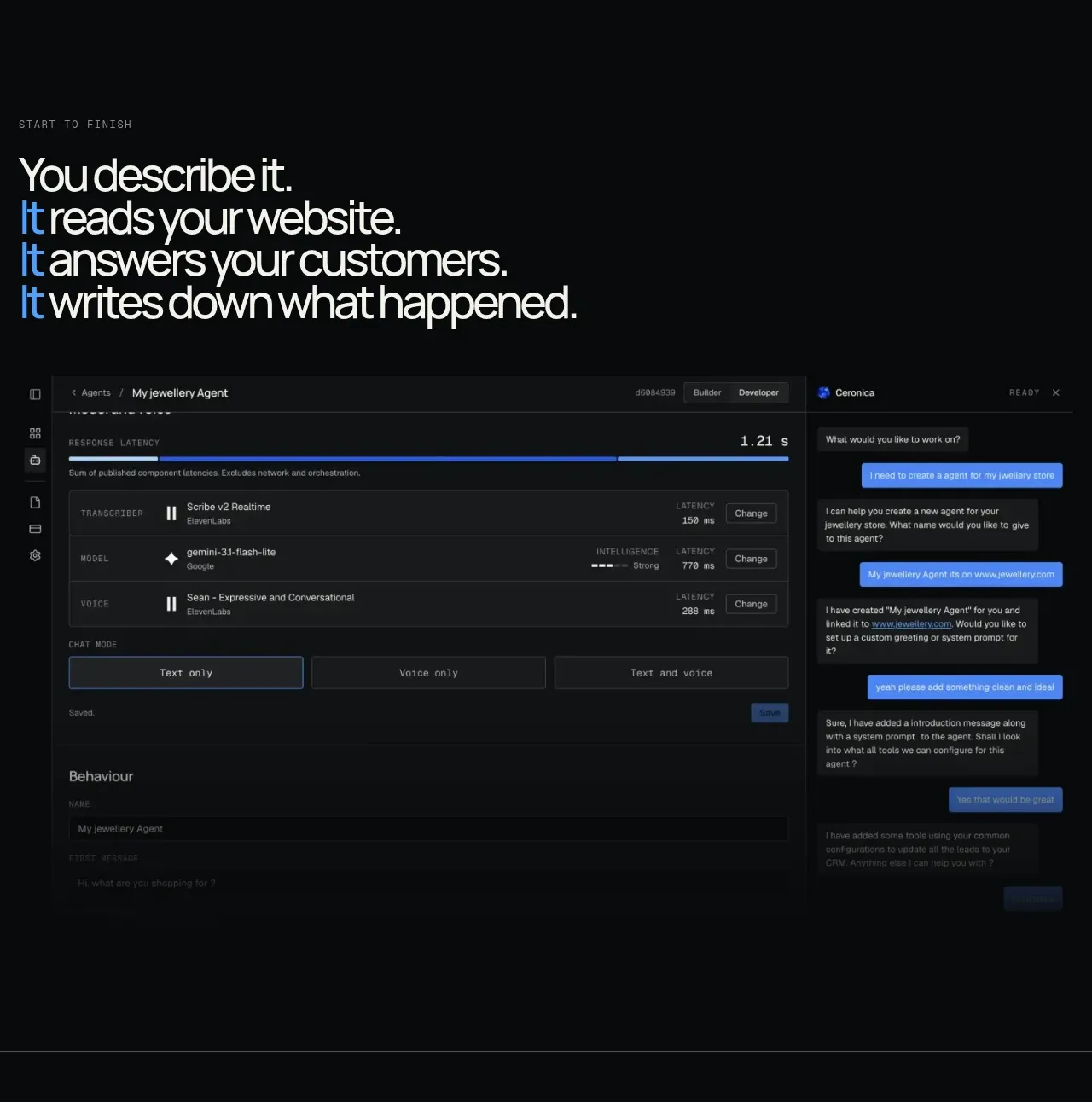
 End-to-end product workflow
Duvi · Feature grid
End-to-end product workflow
Duvi · Feature grid