kage
kage
intercom.com
Design analysis
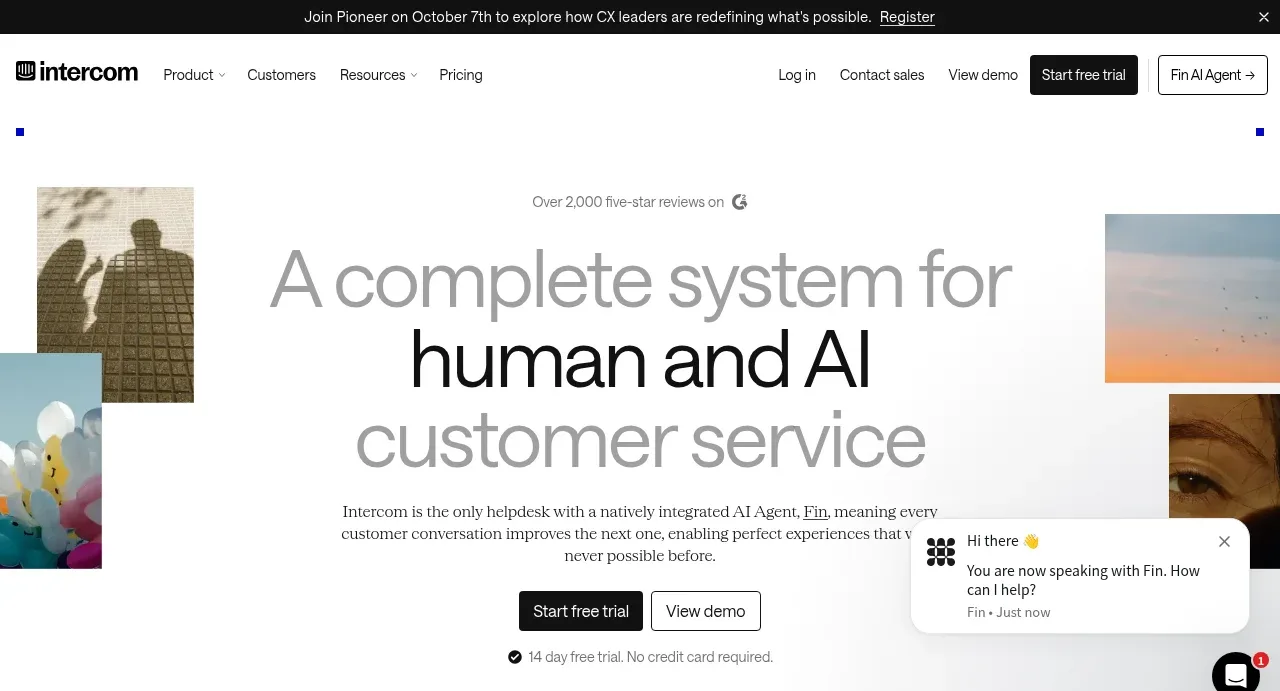
The hero uses oversized centered typography, restrained editorial copy, two CTAs, and a subtle collage of image tiles at the edges. A floating support chat preview reinforces the product category without competing with the headline.
Prompt preview
## Reference images

Study these alongside the description below: hierarchy, rhythm, spacing, colour. Build for the product you are asked about, using this design language.

- Component: https://kage-design-assets.t3.tigrisfiles.io/components/intercom-com/1643b347-46d4-4b8f-b100-4d586237bab2-1789906750-1.webp
- Full page it was cut from: https://kage-design-assets.t3.tigrisfiles.io/screenshots/intercom-com/1643b347-46d4-4b8f-b100-4d586237bab2-1789906717325-full.webp
- Component on Kage: https://kage.design/component/intercom-hero

## Before you start
Ask what the user's product and brand are, then apply these principles to create a distinctive hero for that product.

Build a full-width hero below the header with a centered content column and decorative image tiles positioned at the far left and right edges. Use a three-line headline with the middle line in darker black and surrounding lines in a softer gray to create a visual cadence. Place a short centered paragraph beneath it, followed by a filled primary CTA and outlined secondary CTA. Include a small trust/reassurance line under the buttons. Add a compact floating chat preview near the lower-right as an optional product cue, but keep it subordinate to the headline.

Use a warm white #fbfbf8 background, black #111111, and muted gray #8d8d8d. Headline typography should be a light grotesk around 54–64px desktop with 0.92 line-height and responsive reduction to 38px; paragraph is 14–16px with generous line-height. Keep the content max-width near 650px, use 24–32px vertical gaps, and use 8px button radii. Edge imagery should be cropped, irregularly sized, and low-contrast with plenty of negative space. The chat card should have a white surface, subtle #dddddd border/shadow, 14px radius, and a close affordance.

Never: use logos, product names, copy, illustrations, or imagery from the reference.