 kage
kage
intercom.com
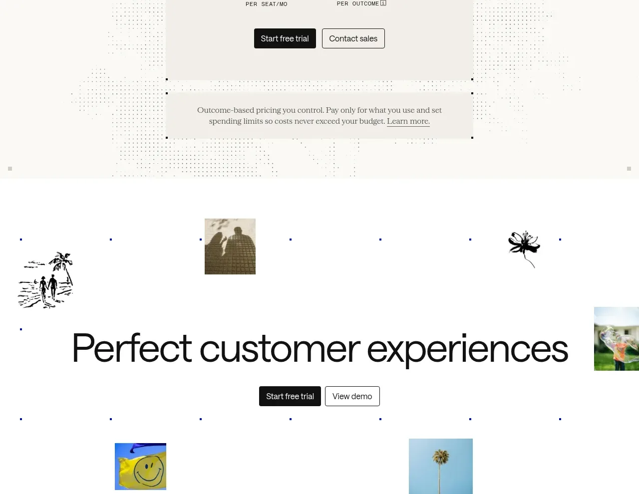
Design analysis
A centered pricing heading leads into one prominent pricing card with a simple formula, two actions, and a secondary note about usage-based control. The surrounding dotted texture adds atmosphere without obscuring information.
Prompt preview
## Reference images

Study these alongside the description below: hierarchy, rhythm, spacing, colour. Build for the product you are asked about, using this design language.

- Component: https://kage-design-assets.t3.tigrisfiles.io/components/intercom-com/1643b347-46d4-4b8f-b100-4d586237bab2-1789906753-9.webp
- Full page it was cut from: https://kage-design-assets.t3.tigrisfiles.io/screenshots/intercom-com/1643b347-46d4-4b8f-b100-4d586237bab2-1789906717325-full.webp
- Component on Kage: https://kage.design/component/intercom-pricing-table

## Before you start
Ask what the user's product, brand, pricing model, and billing units are, then apply these principles to create a clear original pricing section.

Build a pricing section with a centered heading and one highlighted pricing card rather than a dense comparison table. Explain the plan in one line, show the pricing formula in very large type, label each billing unit directly beneath its amount, and provide primary and sales/contact actions. Add a separate low-emphasis note below explaining usage limits or budget control. Use subtle decorative texture behind the card only if it does not affect legibility.

Use #fafaf7 background, #111111 text, #f2f0ea card surface, and #777a73 secondary text. The card should be 430–470px wide on desktop, have 1px #d8d7d0 border, 0–4px radius, and 44–56px padding. Price type is 38–48px; explanatory text 13–15px. Keep the heading around 40px, center all content, and make the card responsive. Ensure currency, period, taxes, and usage definitions are explicit and accessible.

Never: use logos, product names, copy, illustrations, or imagery from the reference.
More components
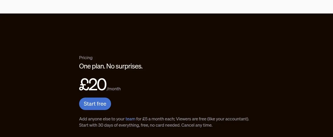
 Single-plan pricing offer
sendinvo.com · Pricing table
Single-plan pricing offer
sendinvo.com · Pricing table
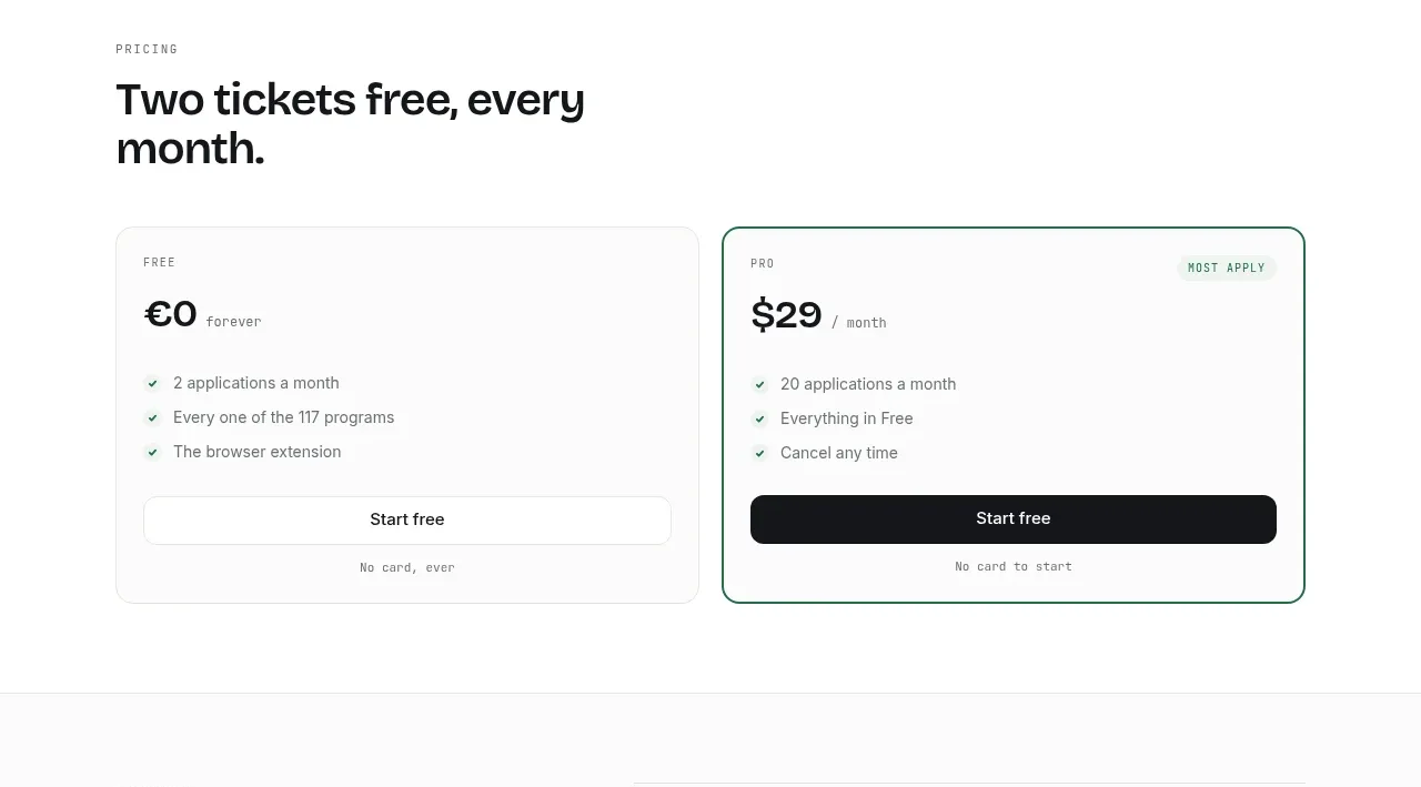
 Two-tier pricing table
ApplySeed · Pricing table
Two-tier pricing table
ApplySeed · Pricing table
F
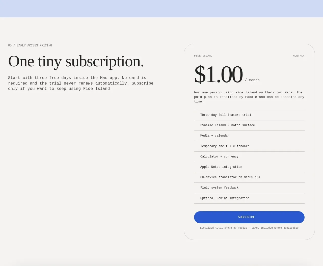
Single-plan early access pricing
Fide Island · Pricing table
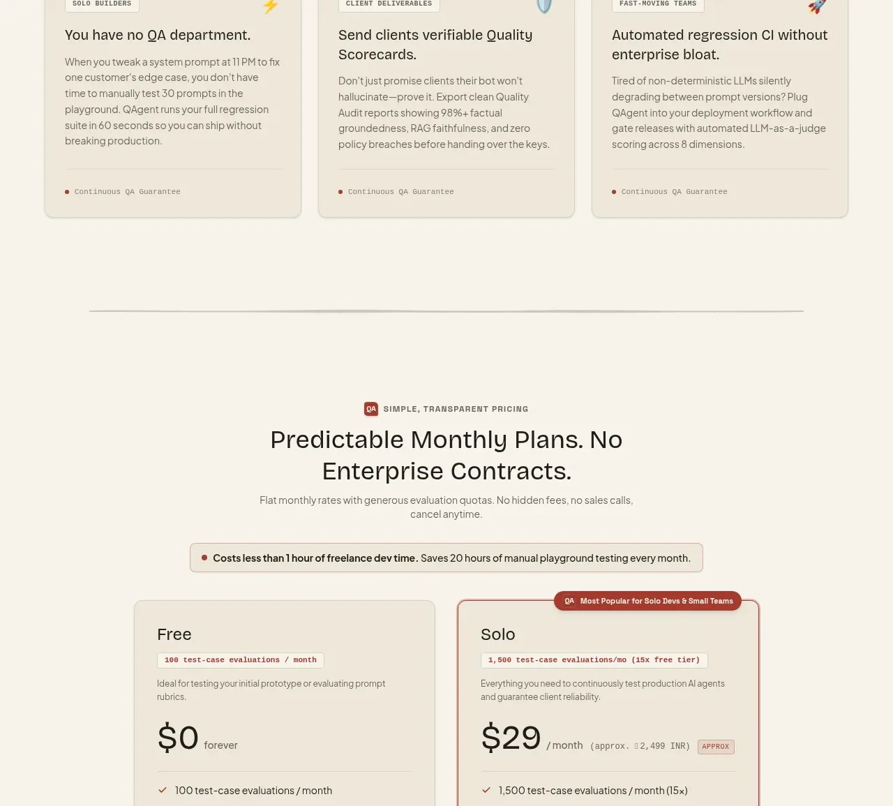
 Two-tier pricing table
QAgent · Pricing table
Two-tier pricing table
QAgent · Pricing table
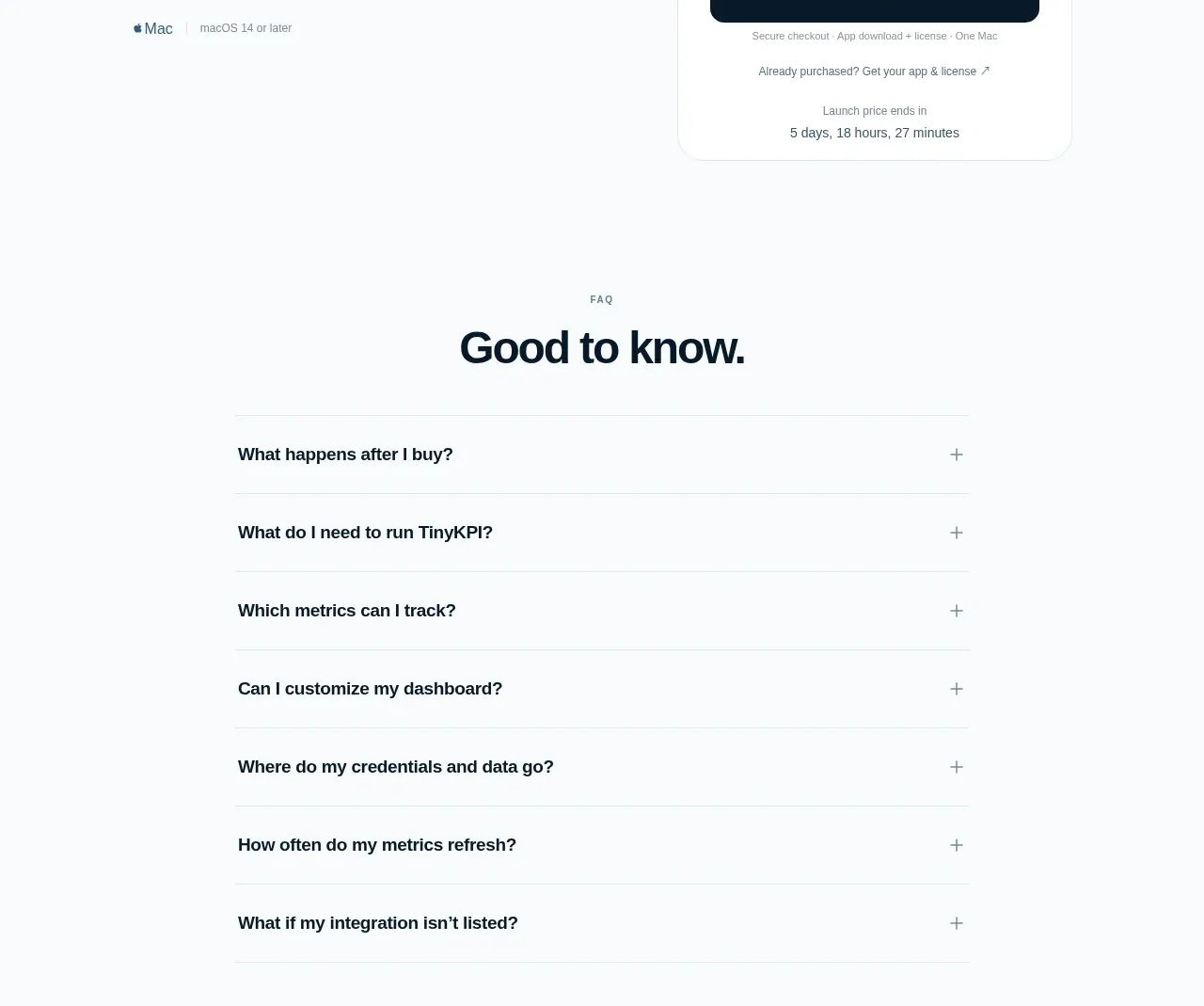
 Single launch price offer
TinyKPI · Pricing table
Single launch price offer
TinyKPI · Pricing table
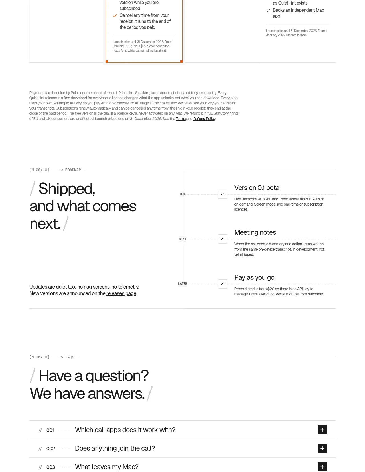
 Flexible four-plan pricing
QuietHint® · Pricing table
Flexible four-plan pricing
QuietHint® · Pricing table