kage
kage
intercom.com
Design analysis
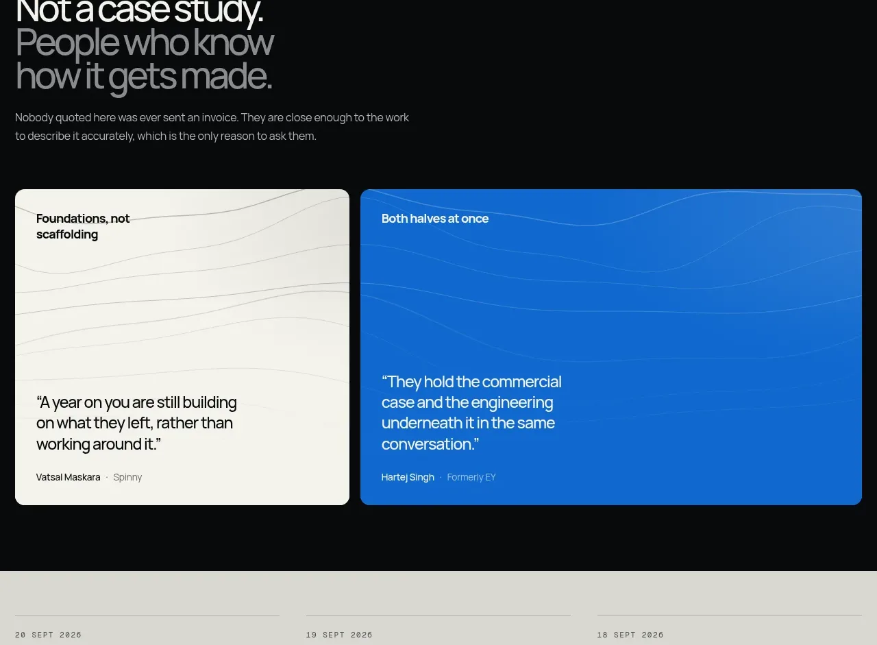
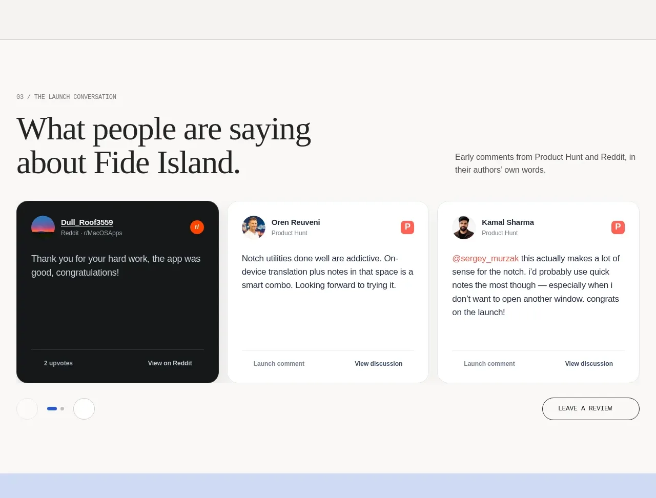
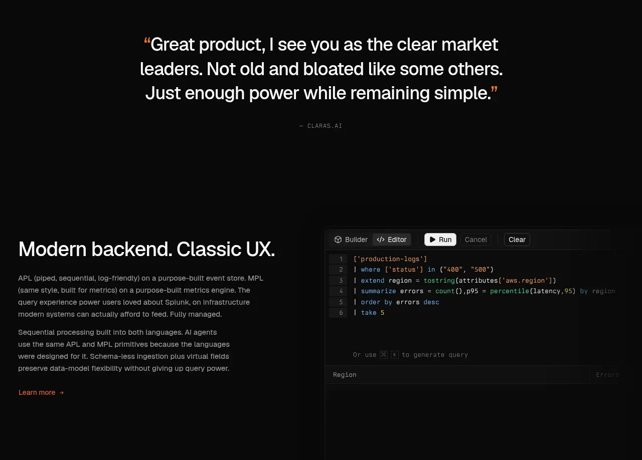
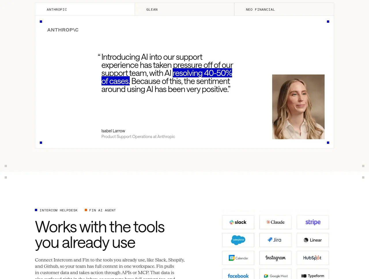
A tabbed testimonial panel places a large quote inside a generous bordered card, with attribution and a portrait aligned near the bottom. Tabs make several customer stories available without adding vertical bulk.
Prompt preview
## Reference images

Study these alongside the description below: hierarchy, rhythm, spacing, colour. Build for the product you are asked about, using this design language.

- Component: https://kage-design-assets.t3.tigrisfiles.io/components/intercom-com/1643b347-46d4-4b8f-b100-4d586237bab2-1789906752-7.webp
- Full page it was cut from: https://kage-design-assets.t3.tigrisfiles.io/screenshots/intercom-com/1643b347-46d4-4b8f-b100-4d586237bab2-1789906717325-full.webp
- Component on Kage: https://kage.design/component/intercom-testimonials

## Before you start
Ask what the user's product, brand, and available customer proof are, then apply these principles rather than copying the reference.

Build a testimonial module with a three-option tab strip at the top and a large quote card beneath. Use a compact category or customer label, an oversized multi-line quote, and an attribution row with name, role, and optional portrait. Keep the quote as the visual center, with substantial whitespace around it. Active tabs should be obvious through text weight and a fine rule, while inactive tabs remain subdued.

Use #ffffff card background, #f8f8f4 page background, #111111 quote text, and #8d8f89 metadata. The card should have a 1px #deded8 border and 0–4px radius, with 40–56px padding. Quote type is 22–28px with tight line height; attribution is 12–13px. Place the portrait at the lower-right or beside attribution, crop it consistently, and use a 2px radius. Support keyboard arrow navigation and an accessible tab panel transition.

Never: use logos, product names, copy, illustrations, or imagery from the reference.