 kage
kage
iris-agent.co
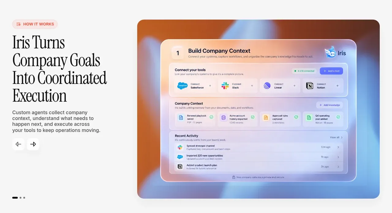
Design analysis
A split section pairs an editorial heading and navigation controls with a large rounded product interface visual, making the transformation concrete rather than purely verbal.
Prompt preview
## Reference images

Study these alongside the description below: hierarchy, rhythm, spacing, colour. Build for the product you are asked about, using this design language.

- Component: https://kage-design-assets.t3.tigrisfiles.io/components/iris/650a6ac7-5b2c-4108-91e1-31520e600e3c-1790748229-2.webp
- Full page it was cut from: https://kage-design-assets.t3.tigrisfiles.io/screenshots/iris/650a6ac7-5b2c-4108-91e1-31520e600e3c-1790748183746-full.webp
- Component on Kage: https://kage.design/component/iris-feature-grid

## Before you start
Ask what the user's product does, what transformation it creates, and what visual proof is available. Apply these principles to that product and brand.

Build a two-column feature section on a warm off-white background around `#f7f7f5`. The left column should contain a small coral-tinted eyebrow pill, a large editorial serif heading in near-black, a concise sans-serif explanation, and understated previous/next controls. The right column should contain a large rounded product visual or UI composition with a subtle warm-to-cool gradient frame, approximately `#d66b25` blending toward `#8db9ee`; keep the inner interface original and product-specific. Use a 34–45% / 55–66% column split, align both columns near the top, and give the visual a 16–20px radius.

Use generous section padding of roughly 72–112px vertically and 28–48px horizontally. Keep the heading line length narrow and the body copy at 15–17px. Navigation controls should be small, tactile, and accessible, with hover/focus feedback; if the content is a carousel, expose pagination and support swipe on mobile. Collapse to a single column on small screens, putting the text before the visual.

### Never
- Never copy the reference heading, interface screenshot, app icons, or product name.
- Never use decorative imagery without showing a believable product outcome.
- Never let carousel controls be the only way to access content.
More components

 Three-step process cards
godaylight.com · Feature grid
Three-step process cards
godaylight.com · Feature grid

 Use-case selector with vertical video preview
Spira Maxima · Feature grid
Use-case selector with vertical video preview
Spira Maxima · Feature grid

 Insights and enterprise model access
FastRouter.ai · Feature grid
Insights and enterprise model access
FastRouter.ai · Feature grid
 Solutions by organizational role
FastRouter.ai · Feature grid
Solutions by organizational role
FastRouter.ai · Feature grid
 Routing reliability and model collaboration
FastRouter.ai · Feature grid
Routing reliability and model collaboration
FastRouter.ai · Feature grid
 Goal-oriented product capabilities
FastRouter.ai · Feature grid
Goal-oriented product capabilities
FastRouter.ai · Feature grid