kage
kage
iris-agent.co
Design analysis
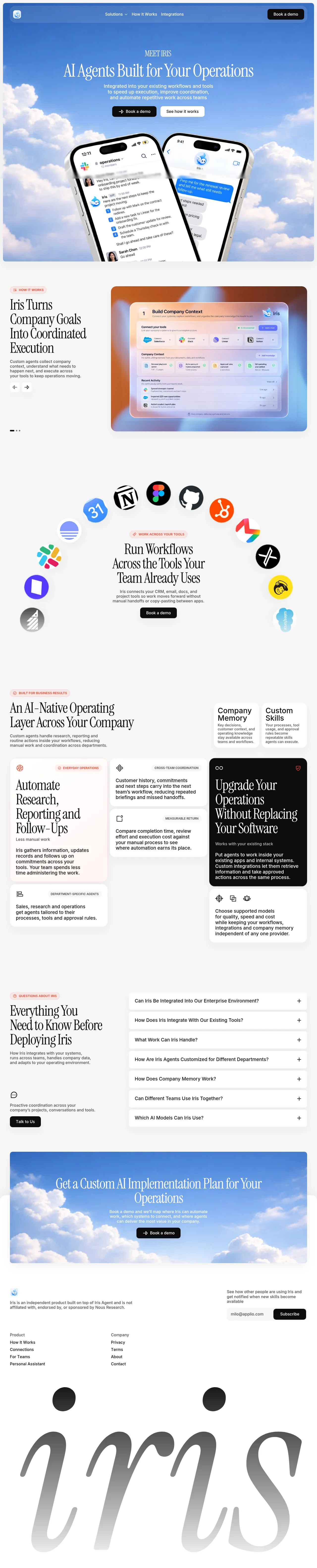
An AI-operations landing page that pairs a high-contrast editorial serif with photographic sky imagery bookending the page. Peach pill eyebrows and a coral accent thread through warm off-white sections, alternating airy text-led columns with a dense bento grid anchored by a single black card. It closes with a rounded photo CTA band and a giant cropped serif wordmark, giving the footer a typographic finale.
Prompt preview
## Reference images

Study these alongside the description below: hierarchy, rhythm, spacing, colour. Build for the product you are asked about, using this design language.

- Full page: https://kage-design-assets.t3.tigrisfiles.io/screenshots/iris/650a6ac7-5b2c-4108-91e1-31520e600e3c-1790748183746-full.webp
- Above the fold: https://kage-design-assets.t3.tigrisfiles.io/screenshots/iris/650a6ac7-5b2c-4108-91e1-31520e600e3c-1790748177701.webp
- Design on Kage: https://kage.design/designs/iris-landing-page

## Before you start
Ask the user what product they are building, who it is for, and what brand assets they already have (name, logo, colours, type). Wait for the answers before writing code. Everything below is applied to their product, not to the reference site.

## Page structure
Build a single marketing landing page with these sections in order:

1. **Floating nav** — a slim pill-shaped bar pinned near the top: logo mark left, three centred text links (one with a dropdown chevron), one solid black pill CTA right. It sits transparently over the hero photo.
2. **Hero** — full-bleed soft blue sky photo with white clouds. Centred stack: tiny letterspaced serif eyebrow, very large white serif headline, two-line sans subcopy, then two pill buttons (solid black with arrow icon; white/translucent secondary). Two tilted phone-shaped product mockups float below, cropped by the section edge.
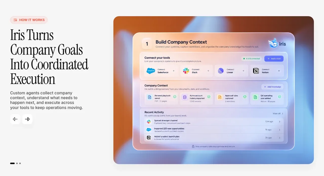
3. **How it works** — warm off-white section, two columns. Left: peach pill eyebrow, large black serif headline over four lines, short grey body copy, carousel arrow buttons and dot indicators underneath. Right: a large rounded card filled with a warm peach-to-blue gradient containing a glassy product-UI mock (tool-connection row, document list, activity feed). This is a carousel — arrows and dots swap the card content.
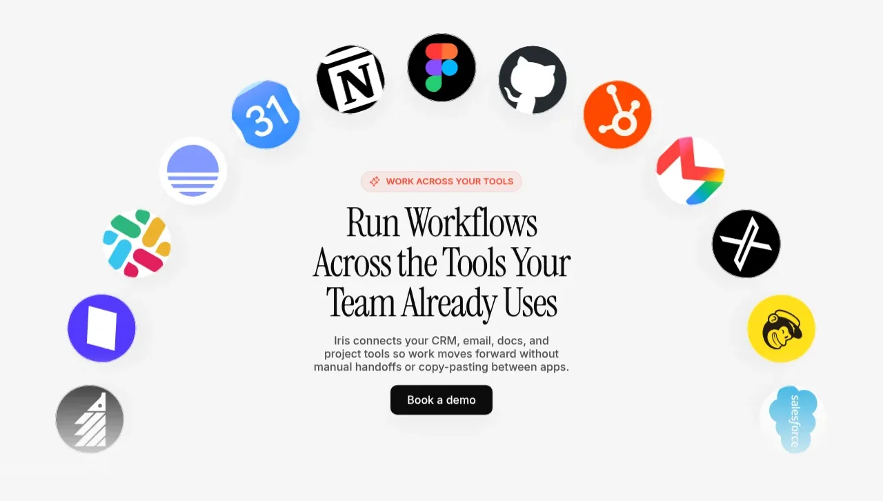
4. **Integrations arc** — centred section on the same light background. A loose semicircular arc of circular tool logos floats around the text block: peach pill eyebrow, serif headline, grey body, black pill CTA. Logo circles vary slightly in size for depth.
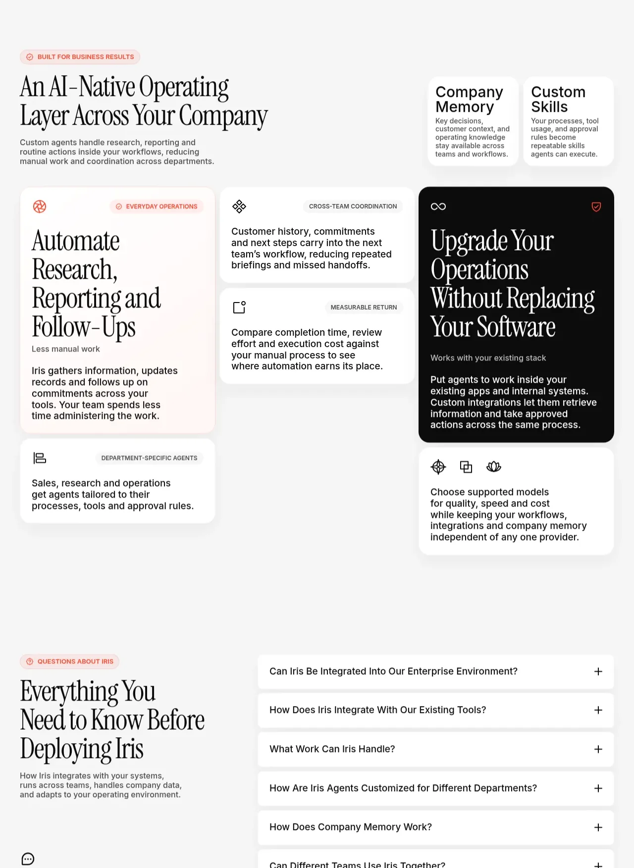
5. **Operating layer bento** — header row: pill eyebrow plus big serif headline and body on the left, two small white cards on the right (short title + two-line description each). Below, a bento grid: one large tinted feature card on the left, two stacked small cards in a middle column, one large black anchor card on the right, and a bottom row of two wide cards. Every card carries a small icon, an uppercase label pill and short copy.
6. **FAQ** — two columns. Left: pill eyebrow, serif headline, body copy, a small icon and a black "Talk to us" pill. Right: seven stacked accordion rows — white, 1px border, rounded, question left, plus icon right.
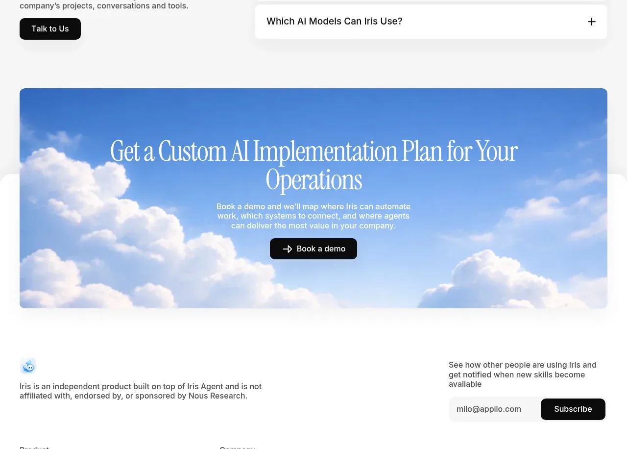
7. **CTA band** — rounded-corner card using the same sky photo as the hero: centred white serif headline, two-line subcopy, black pill button with arrow icon.
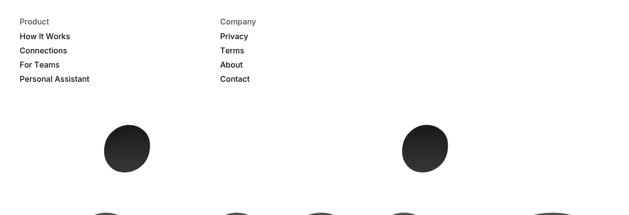
8. **Footer** — light background. Top row: logo and a one-line legal disclaimer left; newsletter blurb with an email input pill and black Subscribe button right. Two link columns (Product / Company). Then the product name set as a giant serif wordmark (~28vw) that fades from black to light grey and is cropped by the bottom edge of the page.

## Design language
- **Type pairing**: one high-contrast editorial display serif (Instrument Serif or similar) for every headline, in sentence case, tight leading (~1.05) and slightly negative tracking; one neutral grotesque sans (Inter or similar) for body, labels, buttons and UI. The serif carries the brand; the sans does the work.
- **Type scale**: display headlines `clamp(40px, 6vw, 76px)`; section headlines `clamp(30px, 4vw, 50px)`; body 15–16px at 1.6 line-height; eyebrow labels 11–12px uppercase with ~0.08em tracking.
- **Eyebrow system**: every section opens with a small pill — soft peach background `#fdeade`, coral text `#d96a45`, tiny icon, uppercase letterspaced label. This accent is the page's section-marker rhythm.
- **Colour**: photographic sky bands bookend the page — blues from `#6f9fe0` to `#cfe2f7` with white clouds. The working surface is warm off-white `#f5f5f2`. Text, buttons and the anchor card are near-black `#0d0d0d`; copy in muted grey `#6b6b6b`. One black card per bento grid provides maximum contrast.
- **Cards**: radius 16–24px, white on off-white with 1px `#ececea` borders and almost no shadow. Tinted peach cards (`#fbeee6`), white cards and one black card alternate for rhythm. Product mocks sit inside gradient-filled or glass panels with rounded corners.
- **Buttons**: fully rounded pills with generous 12–18px vertical padding. Primary is solid black with white text and a small arrow icon; secondary is white, or translucent white over photography.
- **Rhythm down the page**: photographic hero (airy, emotional) → editorial two-column carousel (calm, text-led) → centred logo arc (playful) → dense bento grid (informational) → airy FAQ list → photographic CTA band echoing the hero → typographic footer finale. Alternate density and colour temperature so no two adjacent sections feel alike.
- **Motion**: keep it quiet — carousel slides behind arrows and dots, accordion rows expand on click, pills darken slightly on hover, phone mockups drift slowly. No parallax, no heavy scroll animation.
- **Footer wordmark**: set the product name in the display serif at huge scale, apply a vertical black-to-grey gradient, and crop it at the page bottom. It is a signature, not navigation.
- **Integrations**: render partner marks as coloured circles (56–72px) in a loose arc around centred copy rather than a flat logo row.

## Never
- Do not use the reference product's name, wordmark, mascot or any of its copy.
- Do not reproduce the real logos shown in the reference (Slack, Salesforce, Notion, Figma, GitHub, HubSpot, Linear, Gmail, Mailchimp, etc.) — use the user's own integrations or neutral placeholder marks.
- Do not copy the phone mockup screens, the product-UI card content or the FAQ questions verbatim.
- Never present the result as the reference product or reuse its logo, illustrations or photography.
Components from this page
All components
 Top navigation
Iris · Navigation
Top navigation
Iris · Navigation
 AI operations hero
Iris · Hero
AI operations hero
Iris · Hero
 Workflow transformation feature
Iris · Feature grid
Workflow transformation feature
Iris · Feature grid
 Connected tools showcase
Iris · Logo cloud
Connected tools showcase
Iris · Logo cloud
 AI-native operating layer
Iris · Feature grid
AI-native operating layer
Iris · Feature grid
 Deployment FAQ
Iris · FAQ
Deployment FAQ
Iris · FAQ
 Custom implementation CTA
Iris · Call to action
Custom implementation CTA
Iris · Call to action
 Site footer and newsletter
Iris · Footer
Site footer and newsletter
Iris · Footer