 kage
kage
iris-agent.co
Design analysis
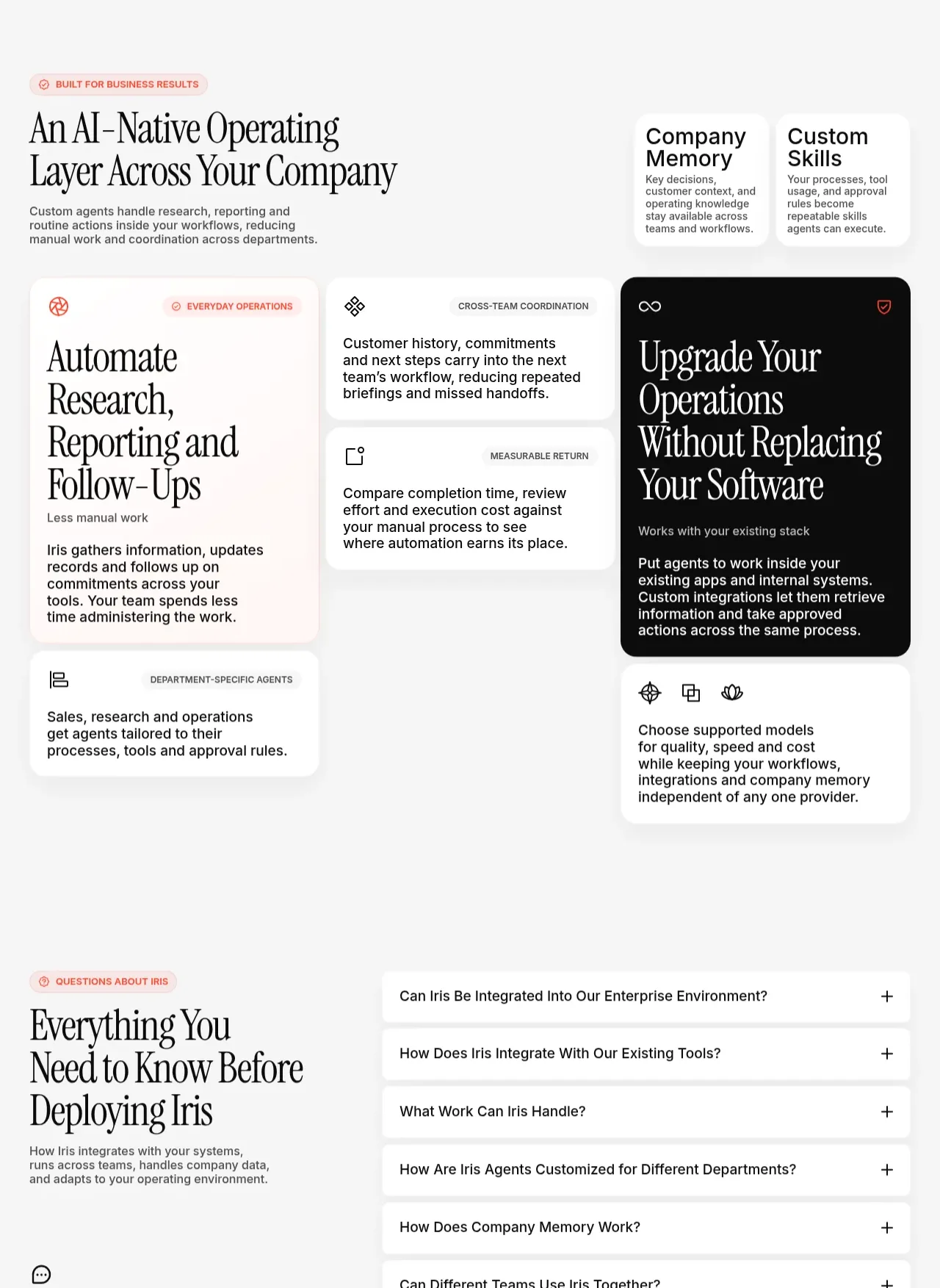
This dense capability section combines a strong editorial introduction with an asymmetric card mosaic, including a dark feature card that provides visual emphasis and a clear operational narrative.
Prompt preview
## Reference images

Study these alongside the description below: hierarchy, rhythm, spacing, colour. Build for the product you are asked about, using this design language.

- Component: https://kage-design-assets.t3.tigrisfiles.io/components/iris/650a6ac7-5b2c-4108-91e1-31520e600e3c-1790748229-4.webp
- Full page it was cut from: https://kage-design-assets.t3.tigrisfiles.io/screenshots/iris/650a6ac7-5b2c-4108-91e1-31520e600e3c-1790748183746-full.webp
- Component on Kage: https://kage.design/component/iris-feature-grid-2

## Before you start
Ask what capabilities the user's product offers, which outcome matters most, and what brand personality should guide the card system. Apply these principles to that product.

Build an asymmetric capabilities section on a warm off-white canvas. Start with a small coral eyebrow and a large editorial serif heading on the left, with a concise explanatory paragraph beneath. Add a compact two-item summary panel on the right for high-level principles or outcomes. Below, create a responsive card mosaic rather than a uniform grid: use one tall pale card, two stacked compact cards, one visually dominant near-black card, and one or two supporting cards. Each card should have a tiny category label or icon, a clear serif or sans-serif title, and short outcome-focused supporting text.

Use approximate colours: canvas `#f7f7f5`, pale cards `#fffdfa`, dark feature card `#080808`, primary text `#111111`, muted text `#66635f`, and restrained coral accent `#e37f73`. Use 16–20px corner radii, 1px translucent borders around light cards, soft shadows only where needed, and 24–40px internal padding. Establish a clear reading order and align card edges through CSS grid rows/columns; let the dark card span multiple rows for emphasis. On mobile, stack cards while preserving the dark card's prominence. Add hover elevation only to interactive cards.

### Never
- Never copy the reference card text, layout-specific illustrations, icons, or product name.
- Never create arbitrary cards without distinct user value.
- Never make the dark card inaccessible through low contrast or tiny type.
More components

 Three-step process cards
godaylight.com · Feature grid
Three-step process cards
godaylight.com · Feature grid

 Use-case selector with vertical video preview
Spira Maxima · Feature grid
Use-case selector with vertical video preview
Spira Maxima · Feature grid

 Insights and enterprise model access
FastRouter.ai · Feature grid
Insights and enterprise model access
FastRouter.ai · Feature grid
 Solutions by organizational role
FastRouter.ai · Feature grid
Solutions by organizational role
FastRouter.ai · Feature grid
 Routing reliability and model collaboration
FastRouter.ai · Feature grid
Routing reliability and model collaboration
FastRouter.ai · Feature grid
 Goal-oriented product capabilities
FastRouter.ai · Feature grid
Goal-oriented product capabilities
FastRouter.ai · Feature grid