 kage
kage
iris-agent.co

Design analysis
The hero uses a cloud-filled blue backdrop, an elegant centered headline, concise supporting copy, two CTAs, and an oversized pair of device mockups as the visual proof point.
Prompt preview
## Reference images

Study these alongside the description below: hierarchy, rhythm, spacing, colour. Build for the product you are asked about, using this design language.

- Component: https://kage-design-assets.t3.tigrisfiles.io/components/iris/650a6ac7-5b2c-4108-91e1-31520e600e3c-1790748228-1.webp
- Full page it was cut from: https://kage-design-assets.t3.tigrisfiles.io/screenshots/iris/650a6ac7-5b2c-4108-91e1-31520e600e3c-1790748183746-full.webp
- Component on Kage: https://kage.design/component/iris-hero

## Before you start
Ask what the user's product is, who it serves, and what its brand should feel like. Apply the following principles to that product and brand.

Create a full-width landing-page hero directly below the navigation. Use a vivid sky-blue photographic, gradient, or abstract atmospheric background approximating `#4f8bdc` with pale cloud-like highlights, but generate original visual treatment. Center a small uppercase eyebrow, a large high-contrast display headline, a short three-line value proposition, and two horizontally aligned CTAs. Use an editorial serif or high-character display face for the headline at roughly 48–64px desktop, paired with a clean sans-serif for body copy and buttons. Keep the copy column narrow, with strong vertical rhythm: eyebrow, headline, supporting text, then actions.

Place a large original product visualization beneath the actions, extending toward the bottom of the hero and partially overlapping the atmospheric background. It may be a responsive UI mockup, device composition, or abstract workflow visual, but it should clearly communicate the product. Use rounded corners, realistic depth, and enough contrast for legibility. The hero should have generous top and bottom padding and clip overflow cleanly. Primary CTA: near-black `#050505`, white label, 12px radius. Secondary CTA: warm white `#fffdf8`, dark label, 12px radius. On mobile stack the actions and scale the visual without clipping key content.

### Never
- Never copy the reference headline, product name, logo, device screenshot, or cloud imagery.
- Never use a generic stock hero that obscures the product value.
- Never let the visual compete with the headline hierarchy.
More components
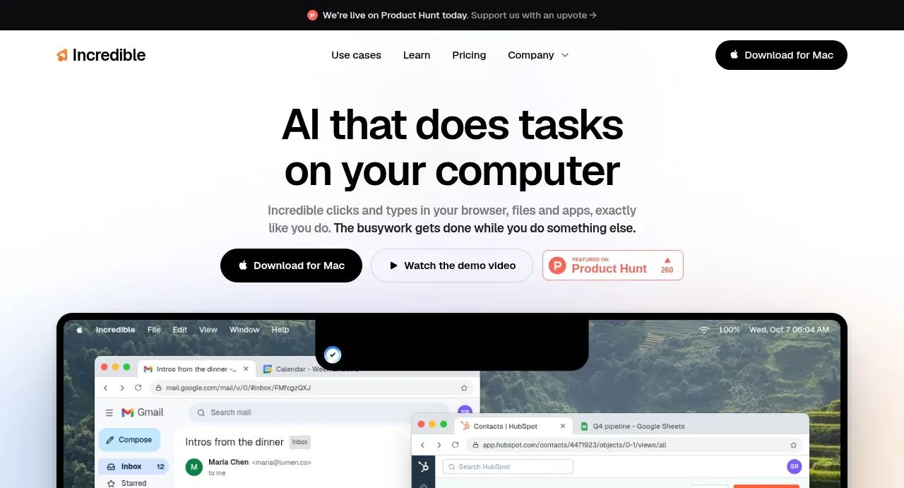
 AI workflow hero
Incredible · Hero
AI workflow hero
Incredible · Hero
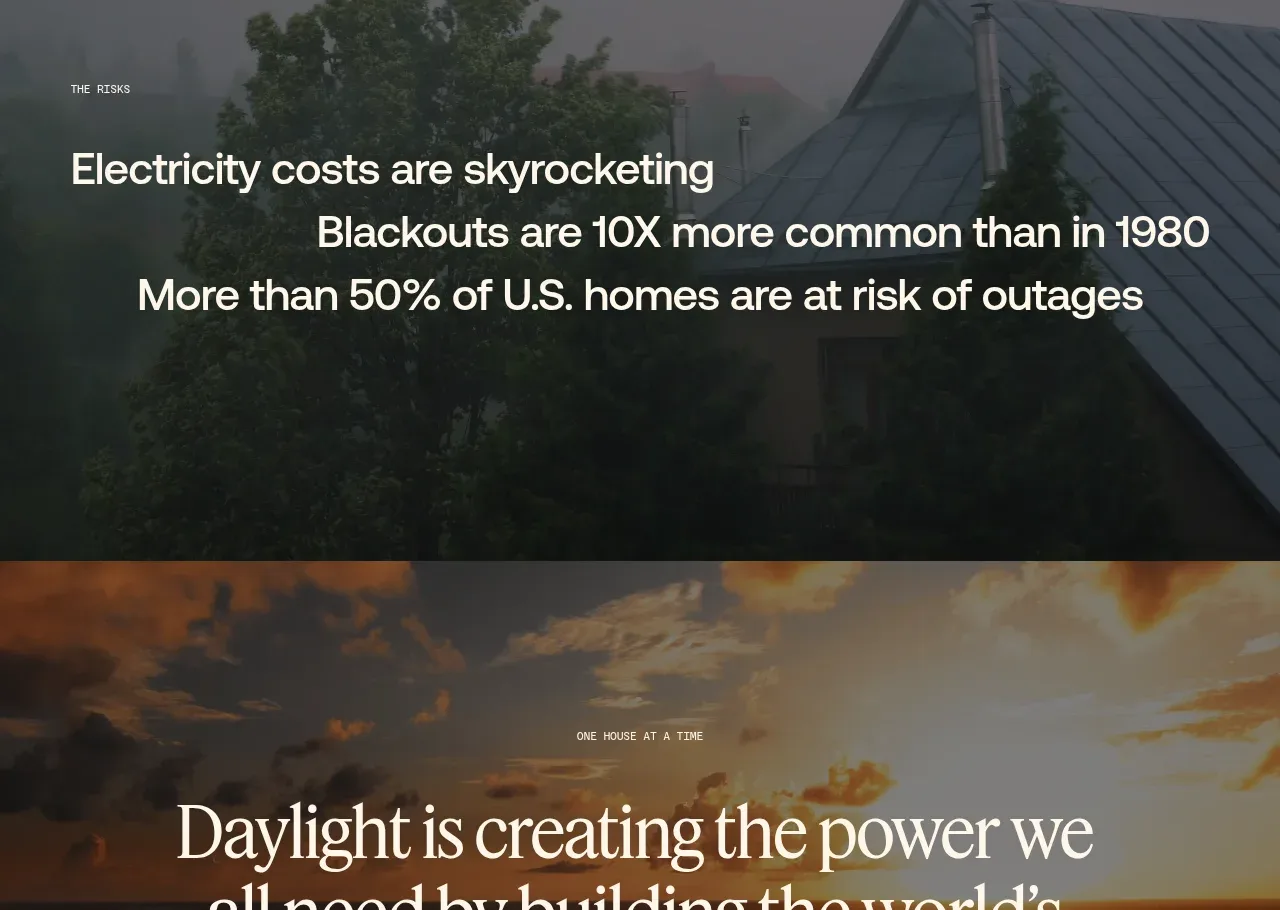
 Decentralized energy statement
godaylight.com · Hero
Decentralized energy statement
godaylight.com · Hero
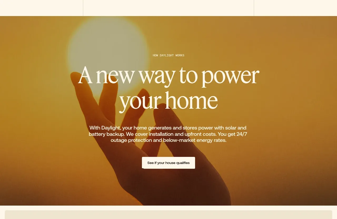 Warm mission statement panel
godaylight.com · Hero
Warm mission statement panel
godaylight.com · Hero
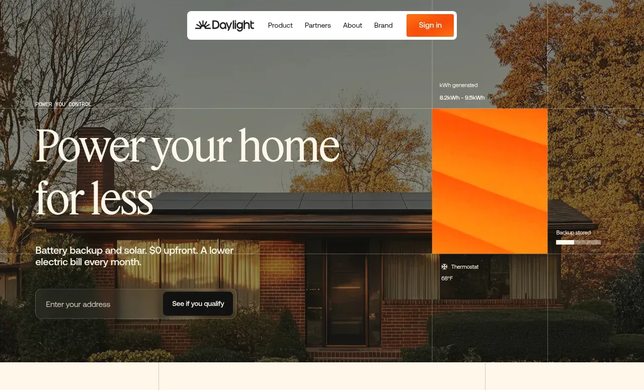 Photographic power-home hero
godaylight.com · Hero
Photographic power-home hero
godaylight.com · Hero
 Grid problem statement
godaylight.com · Hero
Grid problem statement
godaylight.com · Hero
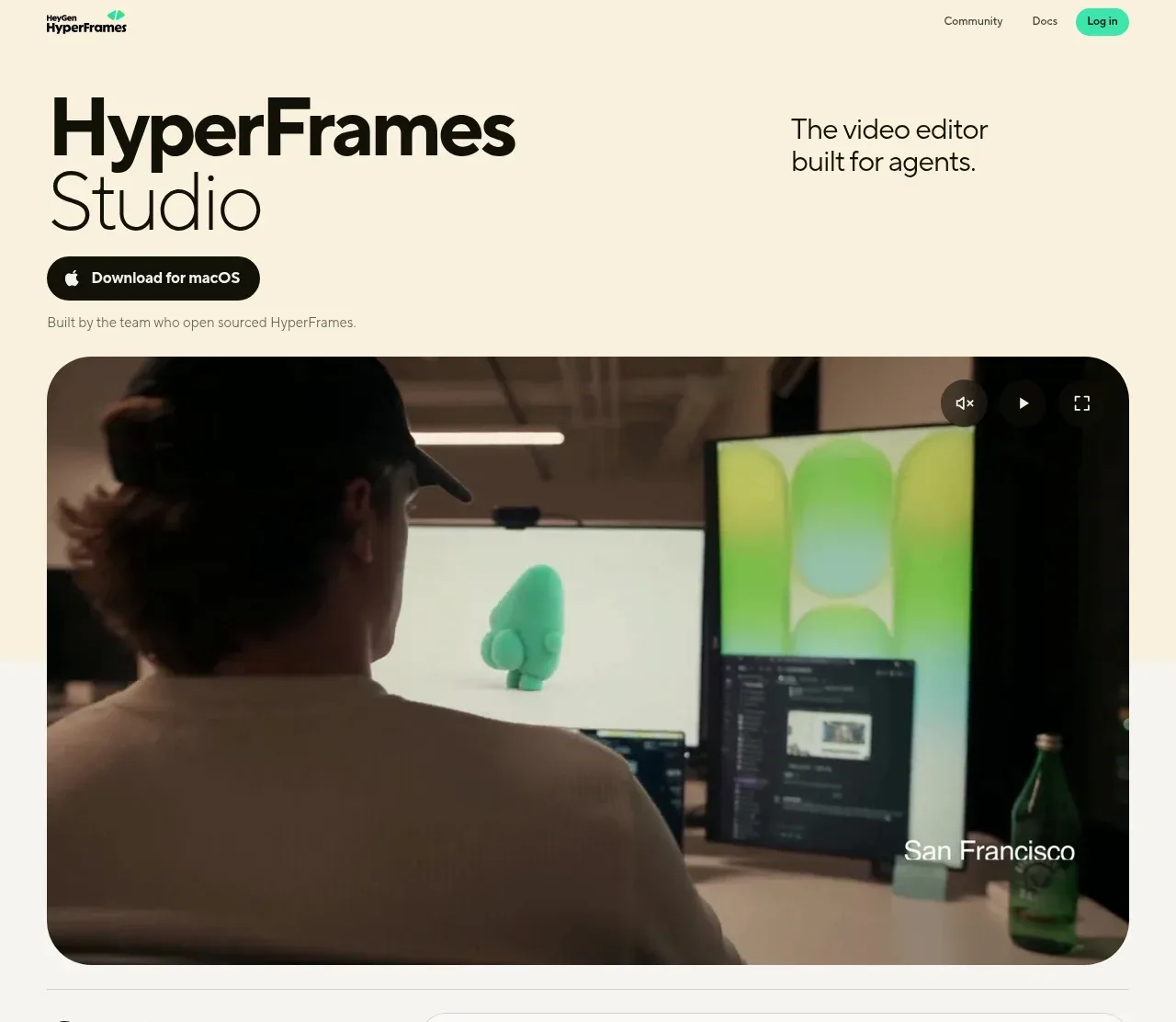
 Product hero with download action and video
HyperFrames Studio (Desktop) · Hero
Product hero with download action and video
HyperFrames Studio (Desktop) · Hero