kage
kage
is.team
Design analysis
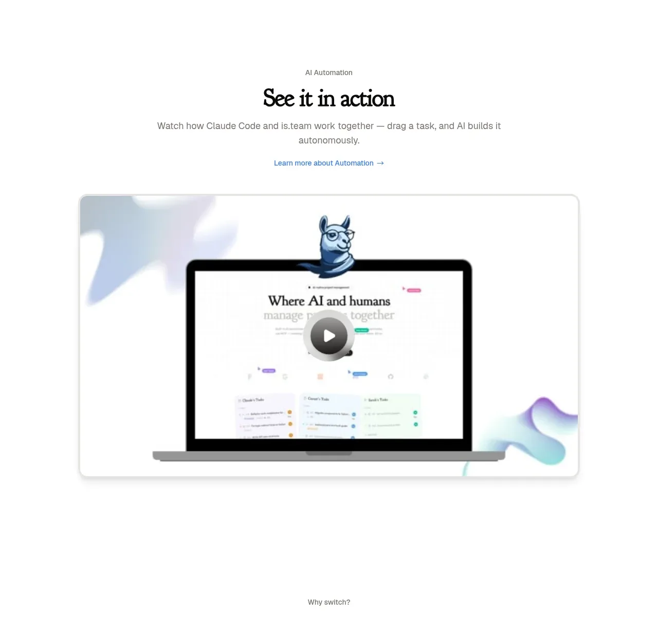
A centered product-demo section introduces automation with a short heading, supporting sentence, learn-more link, and a large rounded video preview. The video card is the visual anchor and uses a play control to invite exploration.
Prompt preview
## Reference images

Study these alongside the description below: hierarchy, rhythm, spacing, colour. Build for the product you are asked about, using this design language.

- Component: https://kage-design-assets.t3.tigrisfiles.io/components/is-team/5ec87905-607a-4eeb-afa3-a1b534169c52-1789538684-3.webp
- Full page it was cut from: https://kage-design-assets.t3.tigrisfiles.io/screenshots/is-team/5ec87905-607a-4eeb-afa3-a1b534169c52-1789538583775-full.webp
- Component on Kage: https://kage.design/component/is-team-card

## Before you start
Ask me what workflow or product capability I need to demonstrate, what users should learn from it, and what visual brand system to use. Build the section around that answer.

Create a centered demo section with a small eyebrow, an editorial heading, one or two lines of supporting copy, and a subtle text link underneath. Place a large responsive video-preview card below, with a 16:9-ish ratio, rounded 10–14px corners, a faint #D9D9D9 border, and a soft shadow. Use a real product screenshot or generated placeholder supplied by the user, but overlay a centered circular play button with near-black fill and a white triangle. Maintain generous whitespace above and below. Typography should use a 28–32px expressive heading, 13–15px body text in #777, and a small blue/green accent link. Add hover scale of 1–2%, visible focus treatment, and accessible video labeling.

Never use the reference's logo, product name, copy, illustrations, imagery, or exact screenshot.