 kage
kage
is.team
Design analysis
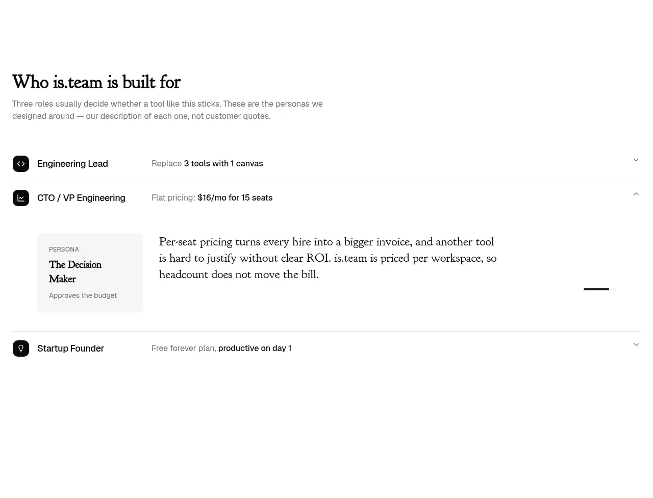
This section frames the product around three role-based outcomes using a simple accordion/list. One expanded row reveals a short explanation and a small persona card, keeping the page useful for multiple buyers without adding visual noise.
Prompt preview
## Reference images

Study these alongside the description below: hierarchy, rhythm, spacing, colour. Build for the product you are asked about, using this design language.

- Component: https://kage-design-assets.t3.tigrisfiles.io/components/is-team/5ec87905-607a-4eeb-afa3-a1b534169c52-1789538683-2.webp
- Full page it was cut from: https://kage-design-assets.t3.tigrisfiles.io/screenshots/is-team/5ec87905-607a-4eeb-afa3-a1b534169c52-1789538583775-full.webp
- Component on Kage: https://kage.design/component/is-team-feature-grid

## Before you start
Ask me about my product's main user roles, their buying concerns, and the outcome each role needs. Then use this interaction pattern with my content and brand.

Build a role-based audience section with a left-aligned heading and short explanatory copy, followed by three full-width accordion rows. Each row should have a small icon, persona title, one-line value proposition, and a right-side chevron. The active row expands into a two-column detail area: a small muted persona card on the left and an editorial paragraph on the right. Use a white background, thin #E7E7E7 separators, near-black #151515 text, muted #777 descriptions, and pale gray #F6F6F6 surfaces. Use a strong serif heading around 26–30px and compact 12–14px UI labels. Provide 20–24px horizontal padding, 18–24px row height spacing, animated height/opacity transitions, and clear focus/aria-expanded states.

Never use the reference's logo, product name, copy, illustrations, imagery, or exact persona names.
More components

 Authentication product capabilities
tiun. · Feature grid
Authentication product capabilities
tiun. · Feature grid
 Customer data and user management
tiun. · Feature grid
Customer data and user management
tiun. · Feature grid
 Problem and unified solution narrative
tiun. · Feature grid
Problem and unified solution narrative
tiun. · Feature grid
 Integration and agent workflow
tiun. · Feature grid
Integration and agent workflow
tiun. · Feature grid
 Billing and checkout capabilities
tiun. · Feature grid
Billing and checkout capabilities
tiun. · Feature grid

 Receiving money channels
Payflip · Feature grid
Receiving money channels
Payflip · Feature grid