 kage
kage
is.team
Design analysis
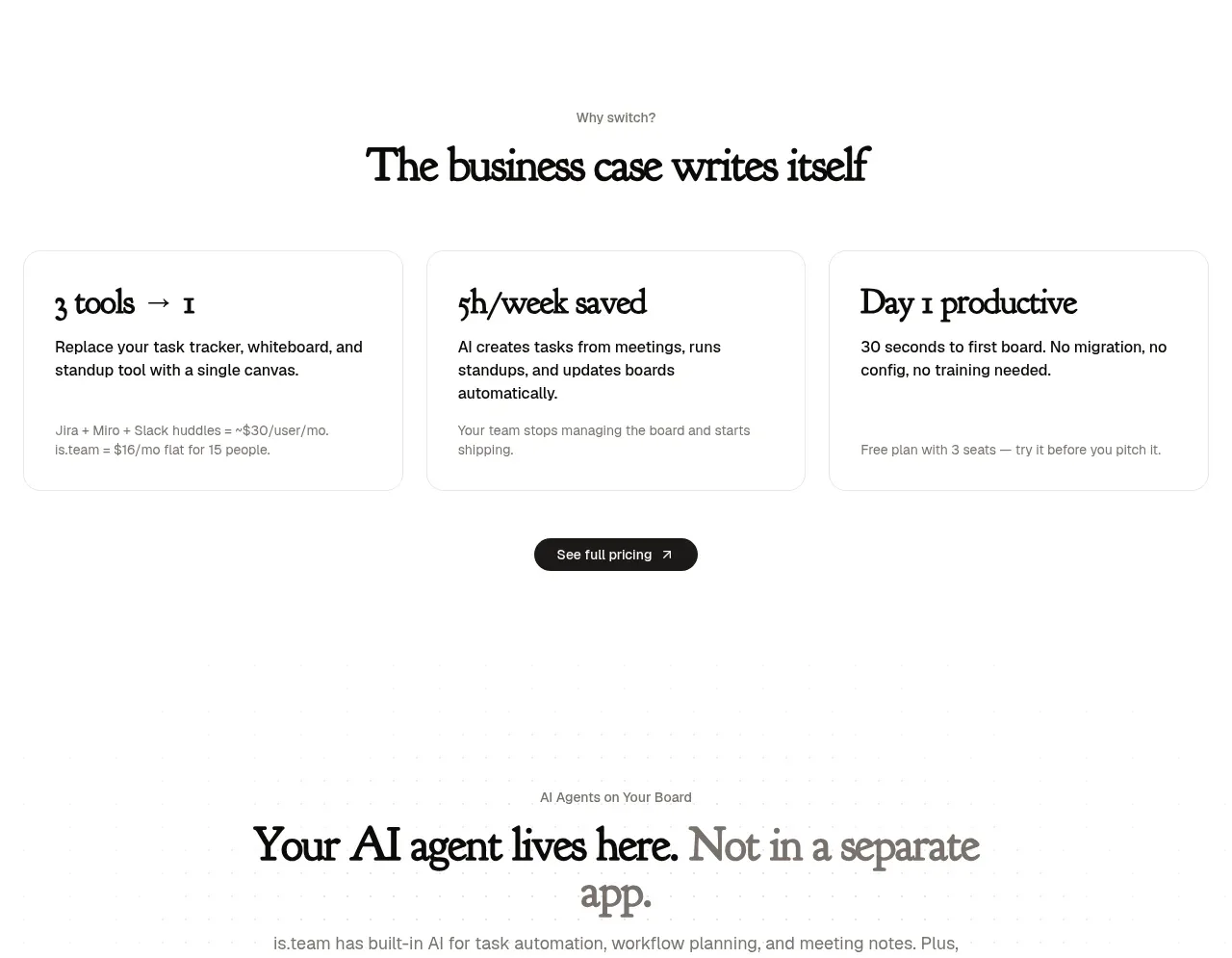
Three equal cards turn the business case into scannable outcomes: reduced tool sprawl, time saved, and faster productivity. The section ends with a single centered pricing/action button.
Prompt preview
## Reference images

Study these alongside the description below: hierarchy, rhythm, spacing, colour. Build for the product you are asked about, using this design language.

- Component: https://kage-design-assets.t3.tigrisfiles.io/components/is-team/5ec87905-607a-4eeb-afa3-a1b534169c52-1789538684-4.webp
- Full page it was cut from: https://kage-design-assets.t3.tigrisfiles.io/screenshots/is-team/5ec87905-607a-4eeb-afa3-a1b534169c52-1789538583775-full.webp
- Component on Kage: https://kage.design/component/is-team-feature-grid-2

## Before you start
Ask me which measurable outcomes matter most for my product and what evidence or pricing action should follow them. Adapt this three-card structure to my story.

Build an outcomes section with a small eyebrow, a centered serif heading, and three equal-width cards in a row. Each card needs a large benefit statement, a concise explanation, and a tiny supporting footnote or qualifier. Use white cards on a near-white #FCFCFC background, 1px #ECECEC borders, 10–12px radius, 20–24px internal padding, and a very subtle shadow or none. Make the benefit number or phrase 22–26px in a display serif and body copy 12–13px in #555. Place one compact dark pill CTA centered beneath the cards. Cards should stack on mobile and gain a slight border-color change on hover.

Never use the reference's logo, product name, copy, illustrations, imagery, or exact metrics.
More components

 Authentication product capabilities
tiun. · Feature grid
Authentication product capabilities
tiun. · Feature grid
 Customer data and user management
tiun. · Feature grid
Customer data and user management
tiun. · Feature grid
 Problem and unified solution narrative
tiun. · Feature grid
Problem and unified solution narrative
tiun. · Feature grid
 Integration and agent workflow
tiun. · Feature grid
Integration and agent workflow
tiun. · Feature grid
 Billing and checkout capabilities
tiun. · Feature grid
Billing and checkout capabilities
tiun. · Feature grid

 Receiving money channels
Payflip · Feature grid
Receiving money channels
Payflip · Feature grid