 kage
kage
is.team
Design analysis
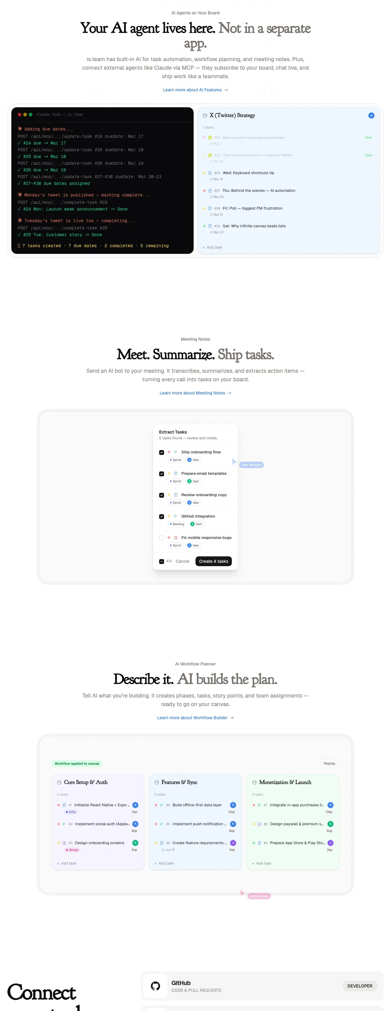
Three vertically stacked capability bands explain how the product lives in the team's workspace: agents, meeting notes, and workflow planning. Each band pairs editorial copy with a large product visual, creating a narrative product tour.
Prompt preview
## Reference images

Study these alongside the description below: hierarchy, rhythm, spacing, colour. Build for the product you are asked about, using this design language.

- Component: https://kage-design-assets.t3.tigrisfiles.io/components/is-team/5ec87905-607a-4eeb-afa3-a1b534169c52-1789538684-5.webp
- Full page it was cut from: https://kage-design-assets.t3.tigrisfiles.io/screenshots/is-team/5ec87905-607a-4eeb-afa3-a1b534169c52-1789538583775-full.webp
- Component on Kage: https://kage.design/component/is-team-feature-grid-3

## Before you start
Ask me which three capabilities best explain my product, what order tells the strongest story, and what screenshots or media I can provide. Then build a reusable product-tour section.

Create a three-part feature narrative. Each part has a small eyebrow, an editorial serif heading with one emphasized or muted phrase, a short explanatory paragraph, a learn-more link, and a large rounded product visual beneath or beside it. Alternate alignment or visual treatment between parts so the page does not feel repetitive, while preserving a single centered content column. Use white space generously: roughly 72–120px vertical separation between stories. Product frames should use 10–14px radius, #E6E6E6 borders, faint shadows, and realistic but user-supplied UI imagery. Use near-black #111 headings, #777 body text, and restrained blue/green/pink accents only for links or UI highlights. On mobile, stack copy before media. Add subtle reveal-on-scroll and image hover zoom only if it does not distract.

Never use the reference's logo, product name, copy, illustrations, imagery, or exact UI screenshots.
More components

 Authentication product capabilities
tiun. · Feature grid
Authentication product capabilities
tiun. · Feature grid
 Customer data and user management
tiun. · Feature grid
Customer data and user management
tiun. · Feature grid
 Problem and unified solution narrative
tiun. · Feature grid
Problem and unified solution narrative
tiun. · Feature grid
 Integration and agent workflow
tiun. · Feature grid
Integration and agent workflow
tiun. · Feature grid
 Billing and checkout capabilities
tiun. · Feature grid
Billing and checkout capabilities
tiun. · Feature grid

 Receiving money channels
Payflip · Feature grid
Receiving money channels
Payflip · Feature grid