 kage
kage
is.team
Design analysis
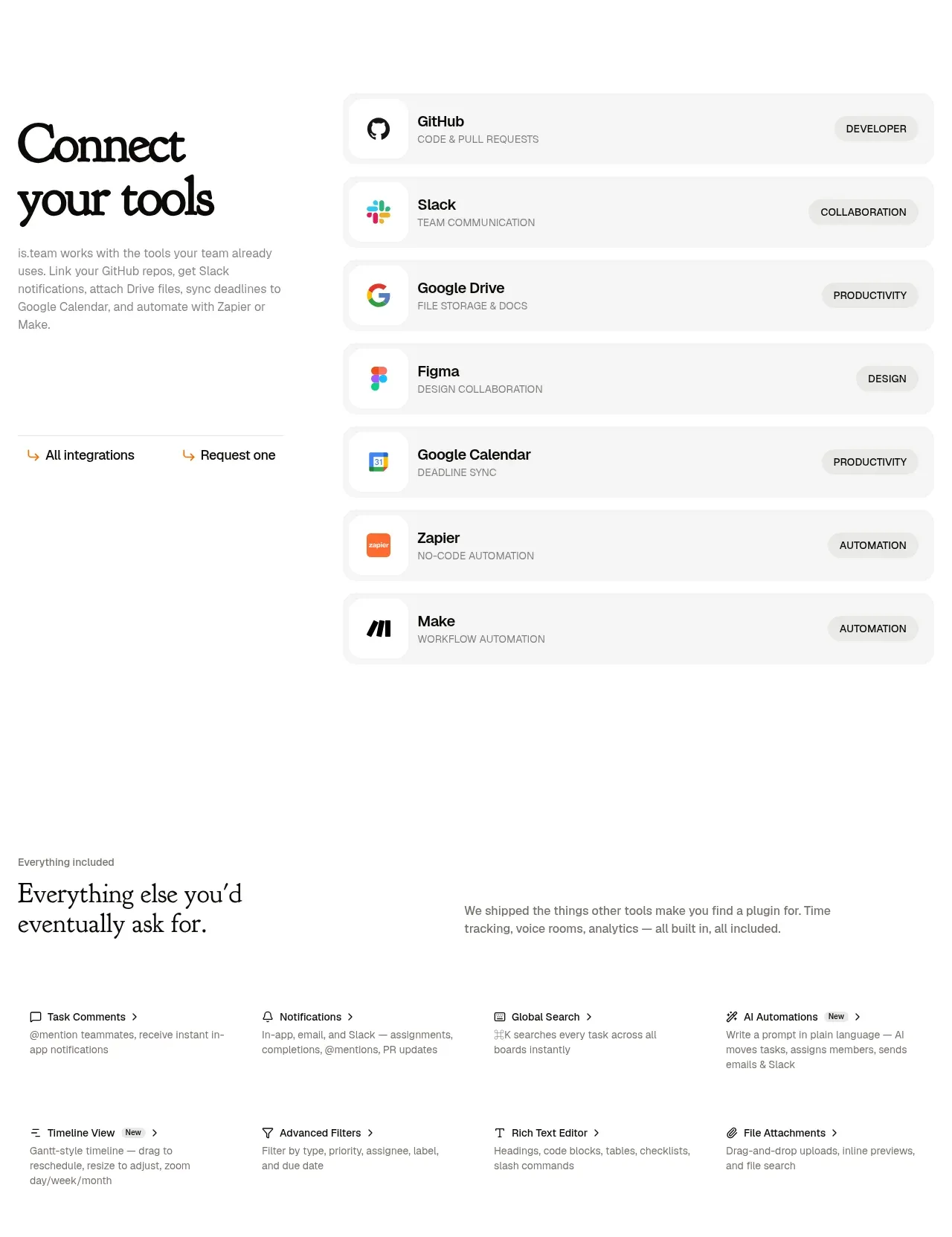
A split layout combines an editorial introduction and two utility links with a dense, vertically stacked integration directory. Each integration row exposes the tool name, category, and lightweight icon.
Prompt preview
## Reference images

Study these alongside the description below: hierarchy, rhythm, spacing, colour. Build for the product you are asked about, using this design language.

- Component: https://kage-design-assets.t3.tigrisfiles.io/components/is-team/5ec87905-607a-4eeb-afa3-a1b534169c52-1789538685-6.webp
- Full page it was cut from: https://kage-design-assets.t3.tigrisfiles.io/screenshots/is-team/5ec87905-607a-4eeb-afa3-a1b534169c52-1789538583775-full.webp
- Component on Kage: https://kage.design/component/is-team-feature-grid-4

## Before you start
Ask me which external tools my product integrates with, how they should be grouped, and whether users need search or filtering. Apply this layout to my integration ecosystem.

Build an integrations section with a two-column desktop layout. Keep an oversized serif heading and short explanation on the left, followed by small text links such as “view all” and “request one.” On the right, render a vertical list of integration rows with a small icon, bold tool name, uppercase or compact category label, and a pill-like category badge aligned right. Use a pale #FAFAFA row fill, 1px #EEEEEE borders, 8–10px radius, 10–14px vertical gaps, and 16px horizontal padding. Keep the overall background white and the type hierarchy quiet: 14–15px names, 10px metadata, #777 secondary text. Add hover background change, keyboard focus, and optional search/filter controls above the list. Stack into one column on mobile.

Never use the reference's logo, product name, copy, illustrations, imagery, or exact integration names.
More components

 Authentication product capabilities
tiun. · Feature grid
Authentication product capabilities
tiun. · Feature grid
 Customer data and user management
tiun. · Feature grid
Customer data and user management
tiun. · Feature grid
 Problem and unified solution narrative
tiun. · Feature grid
Problem and unified solution narrative
tiun. · Feature grid
 Integration and agent workflow
tiun. · Feature grid
Integration and agent workflow
tiun. · Feature grid
 Billing and checkout capabilities
tiun. · Feature grid
Billing and checkout capabilities
tiun. · Feature grid

 Receiving money channels
Payflip · Feature grid
Receiving money channels
Payflip · Feature grid