 kage
kage
is.team
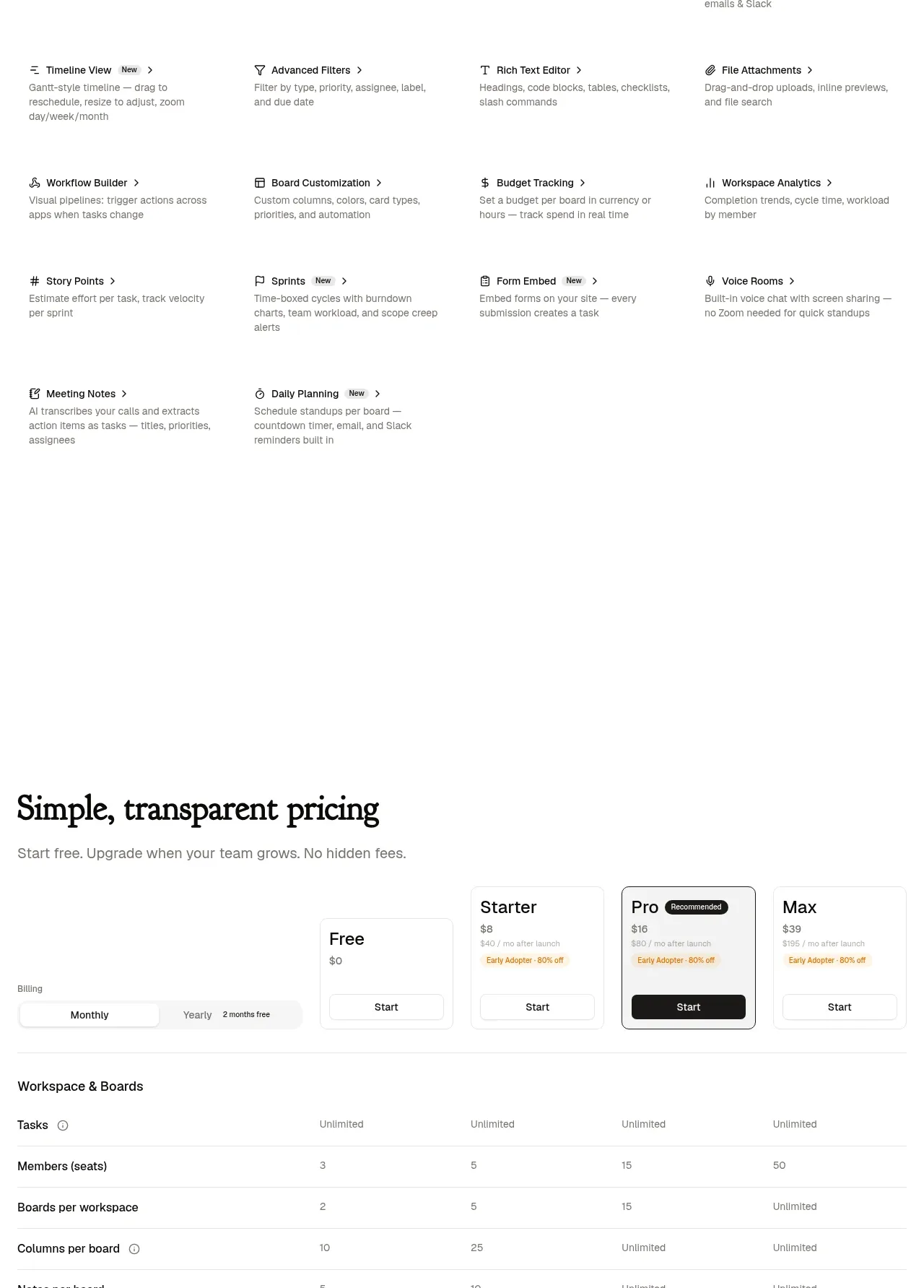
Design analysis
A broad “everything included” section uses many small text-only feature items in a four-column grid. It communicates breadth efficiently without competing with the more visual product stories.
Prompt preview
## Reference images

Study these alongside the description below: hierarchy, rhythm, spacing, colour. Build for the product you are asked about, using this design language.

- Component: https://kage-design-assets.t3.tigrisfiles.io/components/is-team/5ec87905-607a-4eeb-afa3-a1b534169c52-1789538686-7.webp
- Full page it was cut from: https://kage-design-assets.t3.tigrisfiles.io/screenshots/is-team/5ec87905-607a-4eeb-afa3-a1b534169c52-1789538583775-full.webp
- Component on Kage: https://kage.design/component/is-team-feature-grid-5

## Before you start
Ask me for the complete set of included capabilities, which deserve emphasis, and the tone of my product brand. Then organize my information using this pattern.

Create a dense feature-inventory section. Start with a small eyebrow and a two-column intro: a large editorial heading on the left and a short explanatory paragraph on the right. Below, use a four-column grid of compact feature items. Every item should have a tiny monochrome icon or symbol, a concise bold title with a subtle arrow, and one muted one- or two-line description. Use generous row gaps but compact item internals; on tablet use two columns and on mobile one. Palette: white background, #141414 headings, #6F6F6F descriptions, #EAEAEA separators only where useful, with one restrained accent color. Use 12–14px titles and 11–12px descriptions, and allow titles to wrap naturally. Add hover emphasis to the title and icon without large cards.

Never use the reference's logo, product name, copy, illustrations, imagery, or exact feature names.
More components

 Authentication product capabilities
tiun. · Feature grid
Authentication product capabilities
tiun. · Feature grid
 Customer data and user management
tiun. · Feature grid
Customer data and user management
tiun. · Feature grid
 Problem and unified solution narrative
tiun. · Feature grid
Problem and unified solution narrative
tiun. · Feature grid
 Integration and agent workflow
tiun. · Feature grid
Integration and agent workflow
tiun. · Feature grid
 Billing and checkout capabilities
tiun. · Feature grid
Billing and checkout capabilities
tiun. · Feature grid

 Receiving money channels
Payflip · Feature grid
Receiving money channels
Payflip · Feature grid