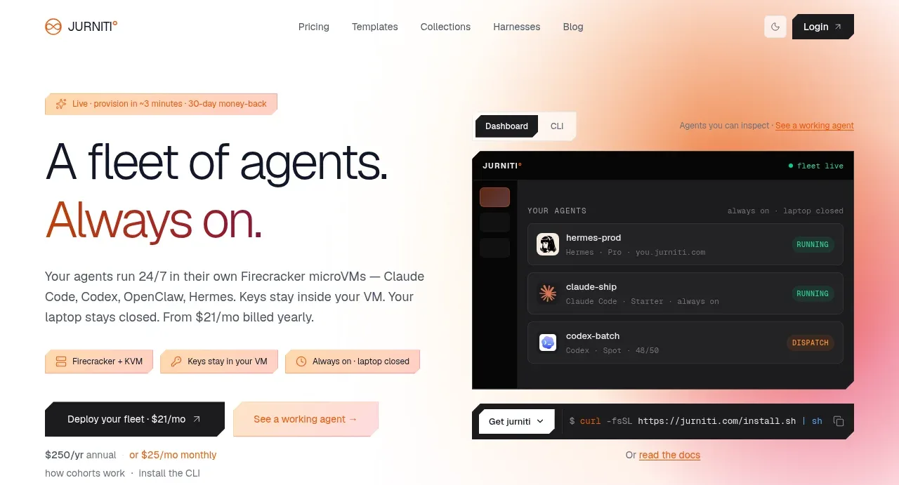
kage
kage
is.team
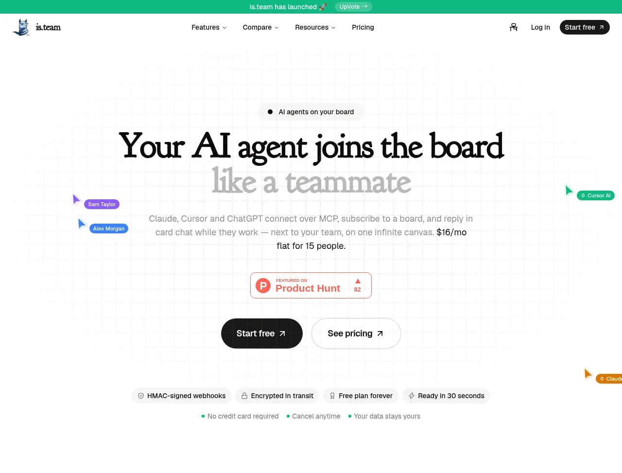
Design analysis
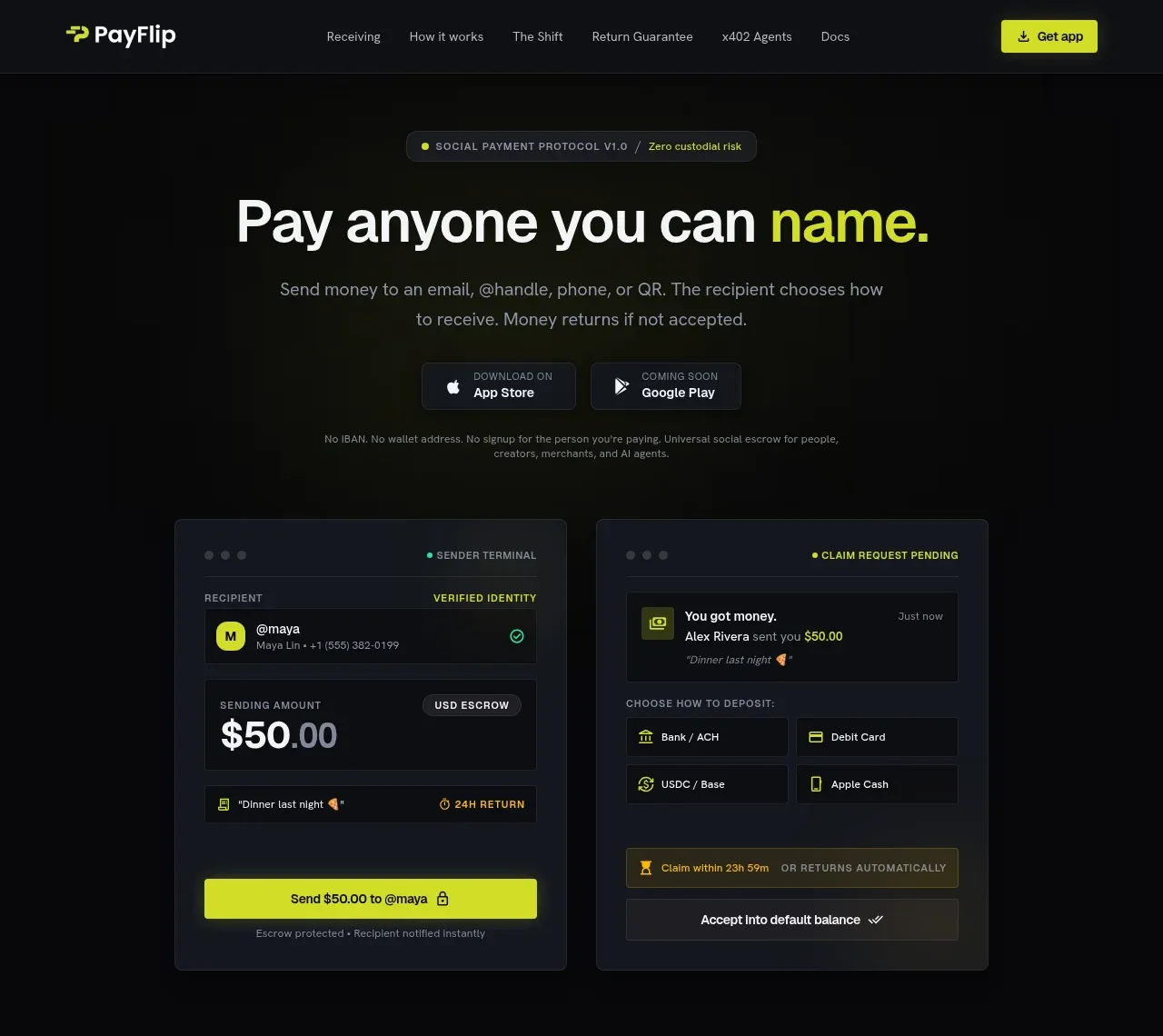
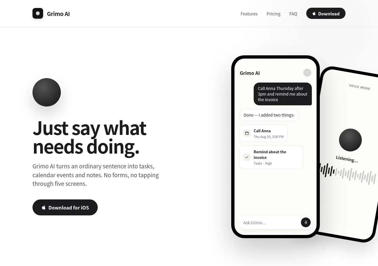
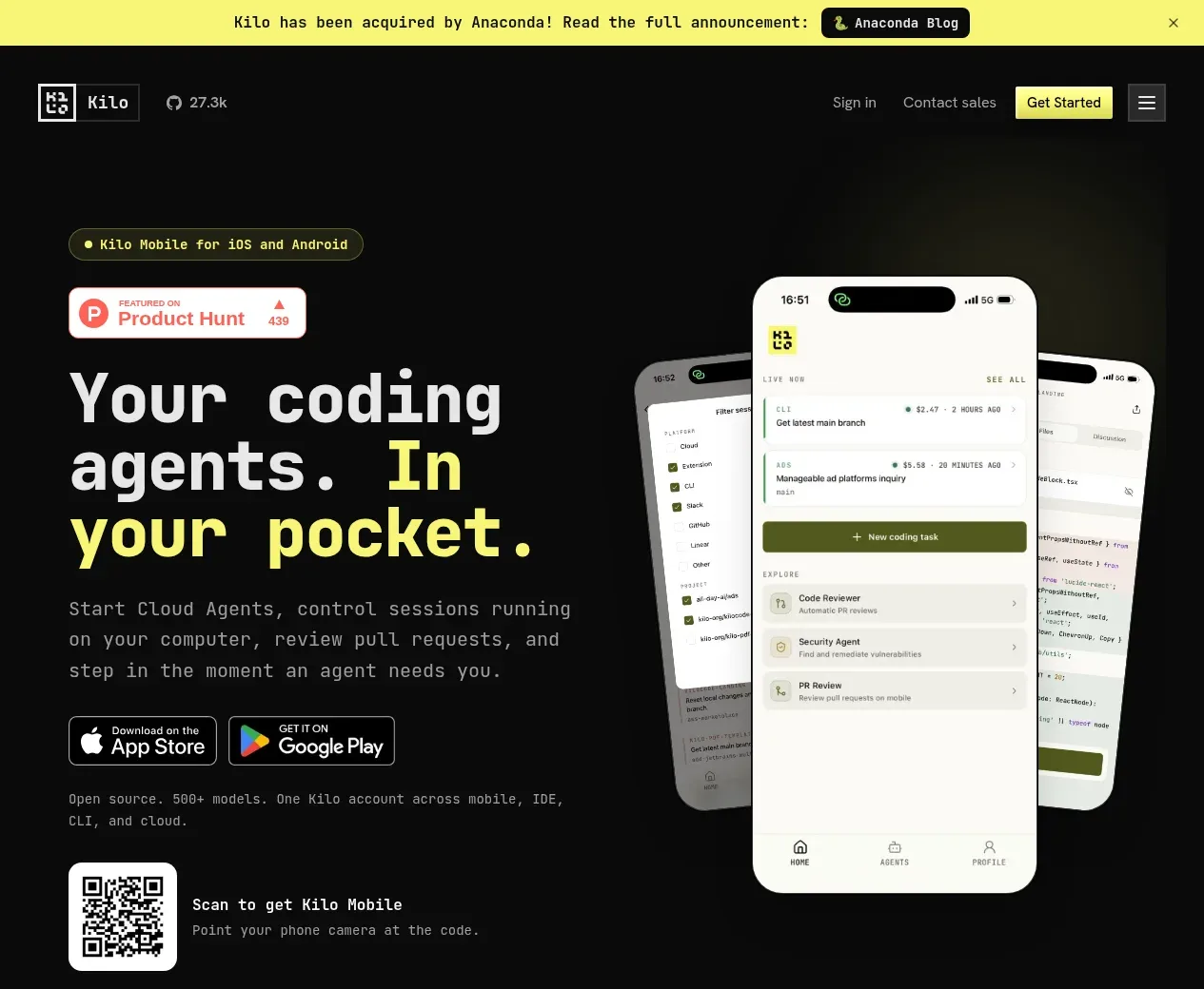
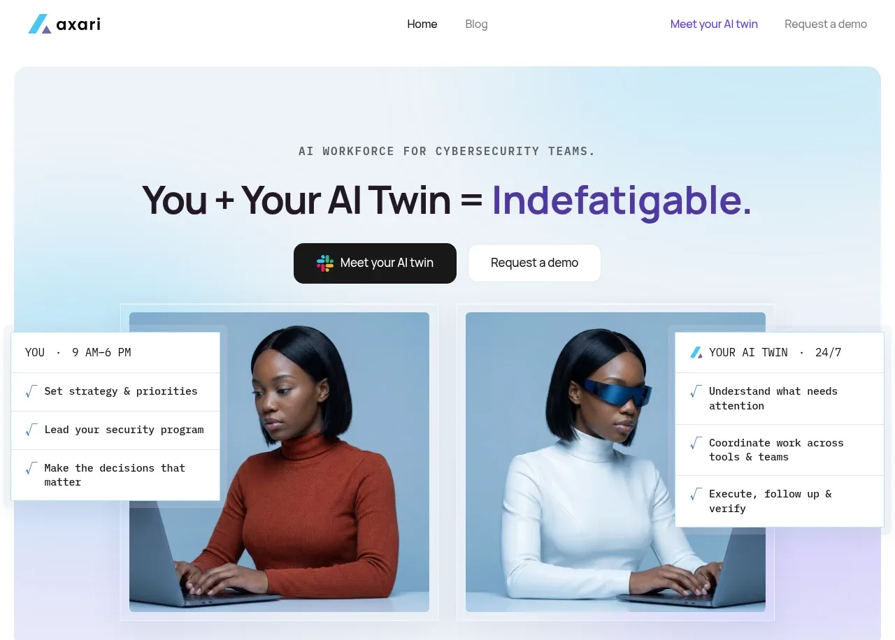
The hero uses a centered editorial headline with a softer second line, concise product explanation, two clear actions, social proof, and a compact trust row. Large empty space makes the central promise feel confident rather than crowded.
Prompt preview
## Reference images

Study these alongside the description below: hierarchy, rhythm, spacing, colour. Build for the product you are asked about, using this design language.

- Component: https://kage-design-assets.t3.tigrisfiles.io/components/is-team/5ec87905-607a-4eeb-afa3-a1b534169c52-1789538683-1.webp
- Full page it was cut from: https://kage-design-assets.t3.tigrisfiles.io/screenshots/is-team/5ec87905-607a-4eeb-afa3-a1b534169c52-1789538583775-full.webp
- Component on Kage: https://kage.design/component/is-team-hero

## Before you start
Ask me what my product is, who the ideal customer is, and what brand voice, colors, and conversion goal I want. Apply the following structure to that product.

Create a centered hero directly below the navigation. Use a small rounded eyebrow, then a large two-line editorial headline with a high-contrast serif or distinctive display face; make the second line lighter gray to create hierarchy. Add a narrow supporting paragraph below, a small credibility badge or proof marker, and two horizontally aligned CTAs: one filled near-black button and one outlined button. Finish with a low-contrast trust strip containing 4–5 short benefits with tiny icons. Keep the palette white and near-black with gray #8A8A8A, a small accent green around #17B77B, and optionally a warm yellow highlight. Use a centered max-width of roughly 520px, 20–28px gaps between text groups, 44–48px button height, 999px radius, and restrained 13–15px body copy. Add subtle hover elevation and keyboard-visible focus states.

Never use the reference's logo, product name, copy, illustrations, imagery, or exact claims.