 kage
kage
jurniti.com
Design analysis
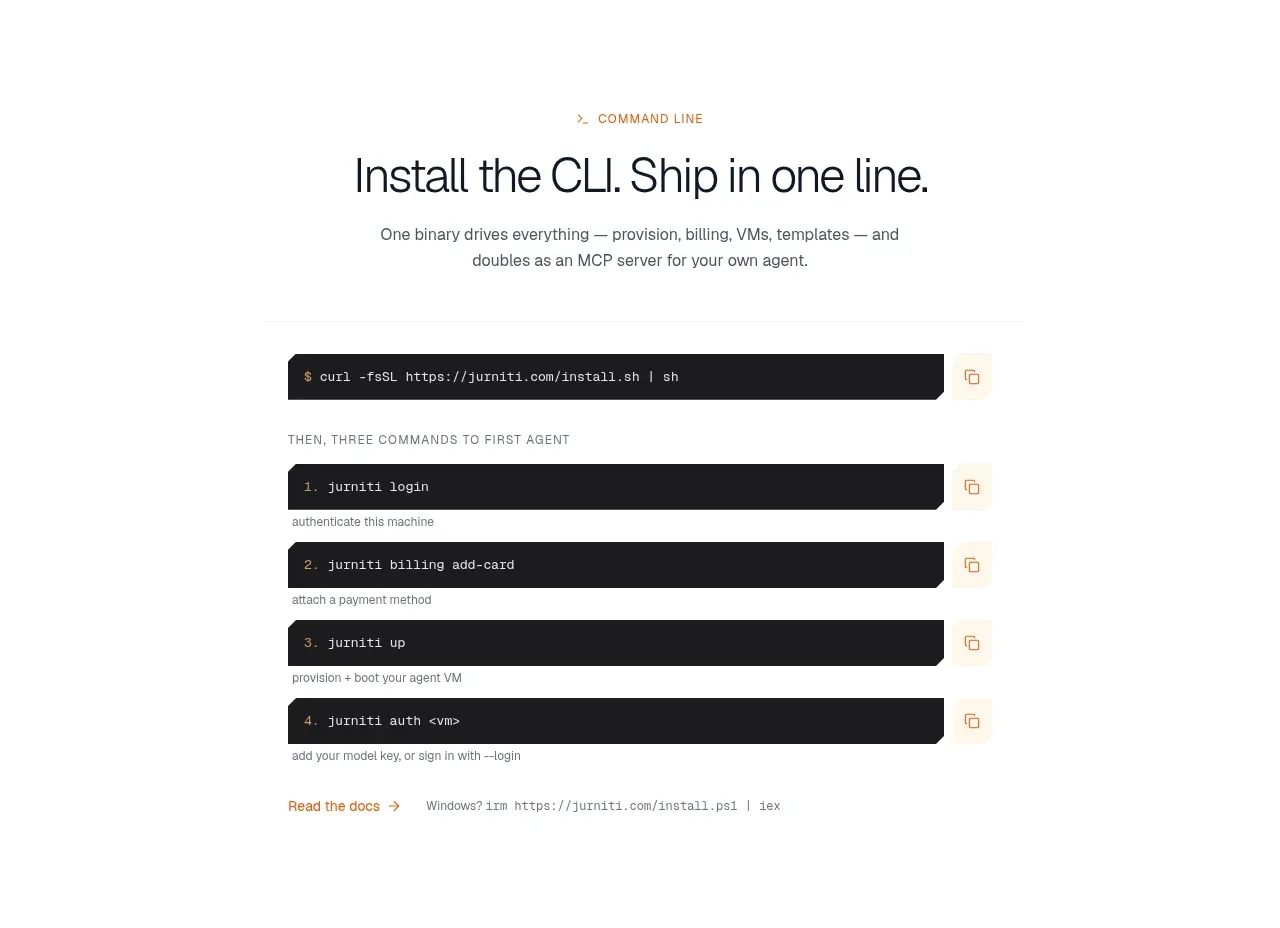
A centered quickstart section explains the first three commands and displays a large dark terminal panel. The high-contrast code block turns an abstract setup promise into an immediately actionable path.
Prompt preview
## Reference images

Study these alongside the description below: hierarchy, rhythm, spacing, colour. Build for the product you are asked about, using this design language.

- Component: https://kage-design-assets.t3.tigrisfiles.io/components/jurniti/cfab9c3f-60ef-4e80-9a31-cc939c39468c-1789538636-10.webp
- Full page it was cut from: https://kage-design-assets.t3.tigrisfiles.io/screenshots/jurniti/cfab9c3f-60ef-4e80-9a31-cc939c39468c-1789538542122-full.webp
- Component on Kage: https://kage.design/component/jurniti-code-block

## Before you start
Ask what the user's product setup flow is, what commands or steps are safe to show, and what brand style should frame the tutorial. Build an original quickstart block.

### Design language
- Center a small eyebrow, a 36–48px headline, and a concise paragraph above the code panel.
- Use a dark terminal surface #1d1d1f or #202020 with 10px radius, 20–28px padding, subtle top chrome, and monospace text in #e8e3d9 with restrained syntax accents such as #d78b64.
- Keep the panel width around 640–760px on desktop, with readable 12–14px code and horizontal scrolling on mobile.
- Add a small caption or step legend above/below the terminal and use clear line spacing. Avoid showing secrets; use placeholders for credentials.
- Include a copy button with an accessible label, tooltip, and a visible success state.

### Never
- Never use logos, product names, copy, illustrations, or imagery from the reference.
More components
 CLI installation steps
jurniti · Code block
CLI installation steps
jurniti · Code block

 React email development
resend.com · Code block
React email development
resend.com · Code block

 No-lock-in code comparison
Thousand · Code block
No-lock-in code comparison
Thousand · Code block

 Framed multi-panel code block
tailwindcss.com · Code block
Framed multi-panel code block
tailwindcss.com · Code block

 Framework-agnostic code showcase
astro.build · Code block
Framework-agnostic code showcase
astro.build · Code block

 Open-source proof and developer testimonials
trigger.dev · Code block
Open-source proof and developer testimonials
trigger.dev · Code block