 kage
kage
jurniti.com
Design analysis
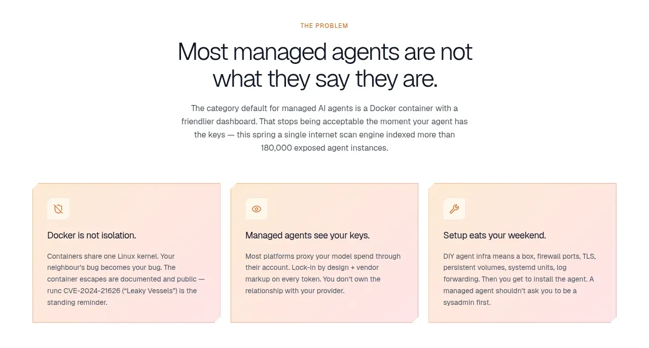
A centered problem statement introduces three evenly sized peach cards that translate abstract pain points into concrete, scannable objections. The cards use small icons, short headings, and compact explanatory text.
Prompt preview
## Reference images

Study these alongside the description below: hierarchy, rhythm, spacing, colour. Build for the product you are asked about, using this design language.

- Component: https://kage-design-assets.t3.tigrisfiles.io/components/jurniti/cfab9c3f-60ef-4e80-9a31-cc939c39468c-1789538632-2.webp
- Full page it was cut from: https://kage-design-assets.t3.tigrisfiles.io/screenshots/jurniti/cfab9c3f-60ef-4e80-9a31-cc939c39468c-1789538542122-full.webp
- Component on Kage: https://kage.design/component/jurniti-feature-grid

## Before you start
Ask what user problems the product solves and what brand tone should shape the examples. Build an original problem section using these reusable rules.

### Design language
- Center a small eyebrow, a strong 32–44px section heading, and a concise explanation above a three-column card row.
- Use a max-width container around 1000–1120px and 56–80px vertical spacing between the intro and cards.
- Give cards a warm blush surface #fbe8df or #ffe9df, 1px border #ead2c8, 8–12px radius, and 24–28px internal padding.
- Use small line icons, 16–18px card titles, and 12–14px body copy with relaxed line height; keep each card similar in height.
- Allow a very subtle shadow or inset highlight, but preserve a quiet editorial feel.
- Stack cards vertically on mobile and keep the intro readable at roughly 60–70 characters per line.

### Never
- Never use logos, product names, copy, illustrations, or imagery from the reference.
More components

 Authentication product capabilities
tiun. · Feature grid
Authentication product capabilities
tiun. · Feature grid
 Customer data and user management
tiun. · Feature grid
Customer data and user management
tiun. · Feature grid
 Problem and unified solution narrative
tiun. · Feature grid
Problem and unified solution narrative
tiun. · Feature grid
 Integration and agent workflow
tiun. · Feature grid
Integration and agent workflow
tiun. · Feature grid
 Billing and checkout capabilities
tiun. · Feature grid
Billing and checkout capabilities
tiun. · Feature grid

 Receiving money channels
Payflip · Feature grid
Receiving money channels
Payflip · Feature grid