 kage
kage
jurniti.com
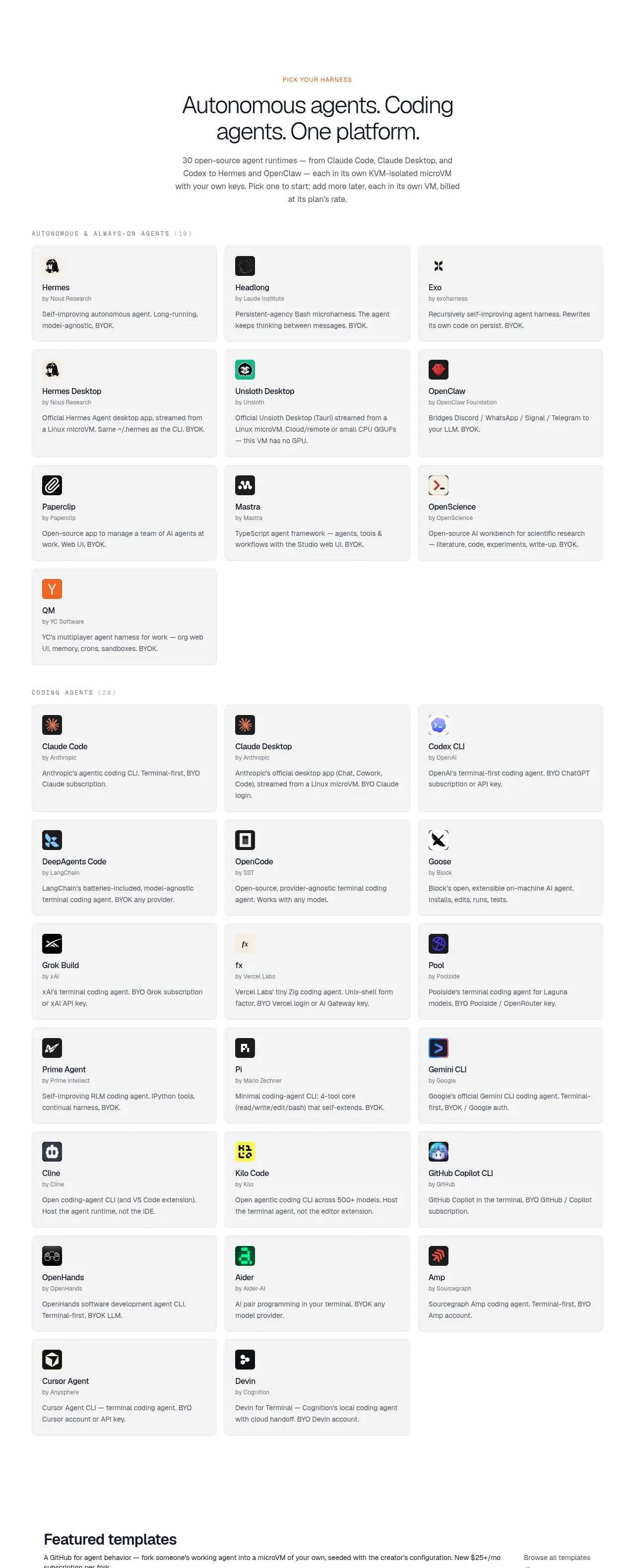
Design analysis
The largest catalog section organizes many agents into labeled groups and a dense three-column grid of pale cards. Consistent card anatomy makes a large inventory easy to scan without feeling like a table.
Prompt preview
## Reference images

Study these alongside the description below: hierarchy, rhythm, spacing, colour. Build for the product you are asked about, using this design language.

- Component: https://kage-design-assets.t3.tigrisfiles.io/components/jurniti/cfab9c3f-60ef-4e80-9a31-cc939c39468c-1789538632-3.webp
- Full page it was cut from: https://kage-design-assets.t3.tigrisfiles.io/screenshots/jurniti/cfab9c3f-60ef-4e80-9a31-cc939c39468c-1789538542122-full.webp
- Component on Kage: https://kage.design/component/jurniti-feature-grid-2

## Before you start
Ask what entities the user's product needs to catalog, how they should be grouped, and what brand system to use. Then build an original directory rather than copying the reference inventory.

### Design language
- Introduce the section with a centered eyebrow and a 34–48px headline, followed by a short explanatory paragraph.
- Organize content into named categories with small uppercase labels, then use a responsive three-column grid on desktop, two columns on tablet, and one on mobile.
- Use low-contrast gray cards #f5f5f4, 1px border #e8e7e5, 8px radius, and 18–22px padding; keep card heights consistent within each row.
- Each card should have a compact icon or avatar, entity name, publisher/meta line, and two-line description. Use 13–15px titles and 11–13px metadata/body text.
- Separate category groups with 28–40px gaps and keep the overall container around 1000–1120px wide.
- Add hover feedback through a slightly darker border and small translate/shadow, while preserving keyboard focus states.

### Never
- Never use logos, product names, copy, illustrations, or imagery from the reference.
More components

 Authentication product capabilities
tiun. · Feature grid
Authentication product capabilities
tiun. · Feature grid
 Customer data and user management
tiun. · Feature grid
Customer data and user management
tiun. · Feature grid
 Problem and unified solution narrative
tiun. · Feature grid
Problem and unified solution narrative
tiun. · Feature grid
 Integration and agent workflow
tiun. · Feature grid
Integration and agent workflow
tiun. · Feature grid
 Billing and checkout capabilities
tiun. · Feature grid
Billing and checkout capabilities
tiun. · Feature grid

 Receiving money channels
Payflip · Feature grid
Receiving money channels
Payflip · Feature grid