 kage
kage
jurniti.com
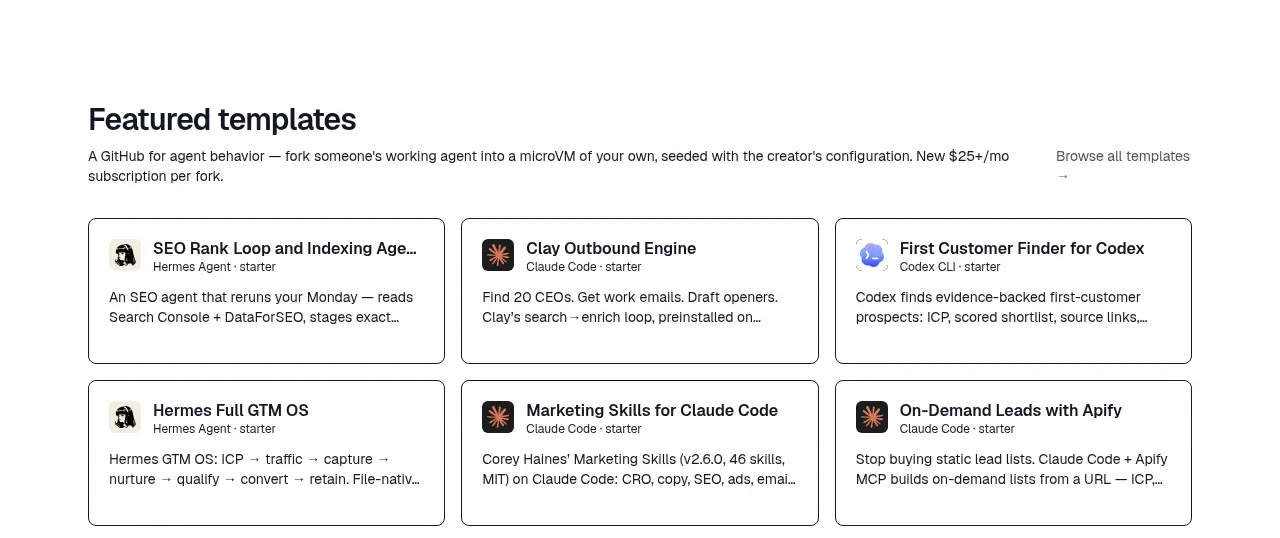
Design analysis
A compact template shelf follows the directory, using six bordered cards in two rows. It turns the catalog into ready-to-use starting points and includes a quiet browse-all affordance.
Prompt preview
## Reference images

Study these alongside the description below: hierarchy, rhythm, spacing, colour. Build for the product you are asked about, using this design language.

- Component: https://kage-design-assets.t3.tigrisfiles.io/components/jurniti/cfab9c3f-60ef-4e80-9a31-cc939c39468c-1789538633-4.webp
- Full page it was cut from: https://kage-design-assets.t3.tigrisfiles.io/screenshots/jurniti/cfab9c3f-60ef-4e80-9a31-cc939c39468c-1789538542122-full.webp
- Component on Kage: https://kage.design/component/jurniti-feature-grid-3

## Before you start
Ask what reusable templates or workflows the user's product offers and what visual identity should distinguish them. Use the following rules to create a new template shelf.

### Design language
- Place a left-aligned section title and short supporting sentence in a compact header, with a subtle browse action aligned right.
- Use a three-column grid of bordered cards, collapsing to one column on mobile.
- Keep cards white or cream #fffdf8 with a 1px charcoal or warm-gray border #8f8a83, 8px radius, and 16px padding.
- Include a small thumbnail/icon, a 14–16px title, a tiny category/meta line, and a concise description; maintain equal card heights.
- Use restrained accent colours, such as terracotta #a84d32 or muted yellow #efc56c, only for labels and hover states.

### Never
- Never use logos, product names, copy, illustrations, or imagery from the reference.
More components

 Authentication product capabilities
tiun. · Feature grid
Authentication product capabilities
tiun. · Feature grid
 Customer data and user management
tiun. · Feature grid
Customer data and user management
tiun. · Feature grid
 Problem and unified solution narrative
tiun. · Feature grid
Problem and unified solution narrative
tiun. · Feature grid
 Integration and agent workflow
tiun. · Feature grid
Integration and agent workflow
tiun. · Feature grid
 Billing and checkout capabilities
tiun. · Feature grid
Billing and checkout capabilities
tiun. · Feature grid

 Receiving money channels
Payflip · Feature grid
Receiving money channels
Payflip · Feature grid