 kage
kage
jurniti.com
Design analysis
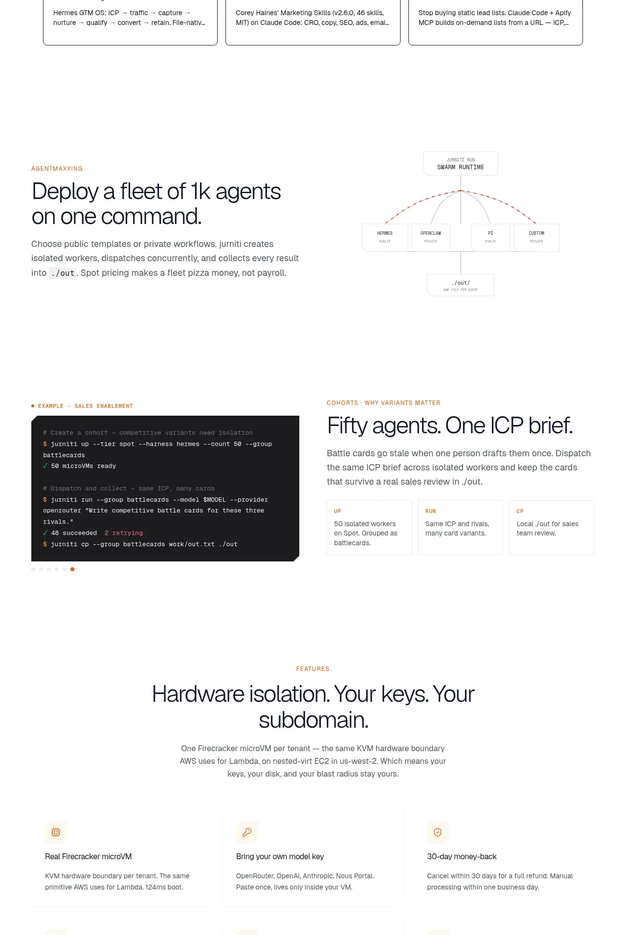
Several alternating product-story bands explain fleet deployment, cohort control, and infrastructure features. The layouts switch between prose, diagrams, terminal code, and concise supporting metrics.
Prompt preview
## Reference images

Study these alongside the description below: hierarchy, rhythm, spacing, colour. Build for the product you are asked about, using this design language.

- Component: https://kage-design-assets.t3.tigrisfiles.io/components/jurniti/cfab9c3f-60ef-4e80-9a31-cc939c39468c-1789538634-5.webp
- Full page it was cut from: https://kage-design-assets.t3.tigrisfiles.io/screenshots/jurniti/cfab9c3f-60ef-4e80-9a31-cc939c39468c-1789538542122-full.webp
- Component on Kage: https://kage.design/component/jurniti-feature-grid-4

## Before you start
Ask what workflow or product story must be explained, what technical proof matters, and what brand should guide the visuals. Build an original sequence of explainer bands.

### Design language
- Use a series of alternating two-column bands inside a max-width container, with 96–144px vertical padding and generous whitespace between stories.
- Pair a small uppercase eyebrow with a 36–52px headline, 15–17px explanatory copy, and a focused supporting visual.
- Alternate text left/right to create rhythm; keep copy blocks around 420–500px wide.
- Use cream #fffaf0, white, pale gray #f3f3f1, terracotta #a84d32, and charcoal #1c1c1c. Technical visuals may use dark panels with monospace text and 8px radius.
- Diagrams should be simple and schematic: thin warm-gray connectors, modest labels, and no decorative complexity. Code blocks should have clear padding, syntax contrast, and horizontal scrolling on mobile.
- Add small stat callouts or captions below visuals when they clarify scale or outcome.

### Never
- Never use logos, product names, copy, illustrations, or imagery from the reference.
More components

 Authentication product capabilities
tiun. · Feature grid
Authentication product capabilities
tiun. · Feature grid
 Customer data and user management
tiun. · Feature grid
Customer data and user management
tiun. · Feature grid
 Problem and unified solution narrative
tiun. · Feature grid
Problem and unified solution narrative
tiun. · Feature grid
 Integration and agent workflow
tiun. · Feature grid
Integration and agent workflow
tiun. · Feature grid
 Billing and checkout capabilities
tiun. · Feature grid
Billing and checkout capabilities
tiun. · Feature grid

 Receiving money channels
Payflip · Feature grid
Receiving money channels
Payflip · Feature grid