 kage
kage
jurniti.com
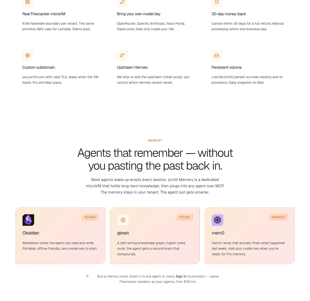
Design analysis
A centered statement about infrastructure is followed by a spacious two-row capability grid. Each item has a small line icon, a clear label, and a brief explanation with no heavy card chrome.
Prompt preview
## Reference images

Study these alongside the description below: hierarchy, rhythm, spacing, colour. Build for the product you are asked about, using this design language.

- Component: https://kage-design-assets.t3.tigrisfiles.io/components/jurniti/cfab9c3f-60ef-4e80-9a31-cc939c39468c-1789538634-6.webp
- Full page it was cut from: https://kage-design-assets.t3.tigrisfiles.io/screenshots/jurniti/cfab9c3f-60ef-4e80-9a31-cc939c39468c-1789538542122-full.webp
- Component on Kage: https://kage.design/component/jurniti-feature-grid-5

## Before you start
Ask which capabilities deserve emphasis for the user's product and how its brand should feel. Create a calm capability grid using these principles.

### Design language
- Center an eyebrow, a 34–48px headline, and a 14–16px description at the top of the section.
- Use a three-column grid with two rows on desktop and a single column on mobile; allow generous 40–64px row gaps.
- Avoid large cards: use open white space, small 18–20px line icons in a warm accent #c27b45, 16px labels, and 12–14px gray body text #68635d.
- Maintain consistent left alignment within each item and a max-width near 1080px.
- Use hover states sparingly, such as icon colour and a slight text emphasis.

### Never
- Never use logos, product names, copy, illustrations, or imagery from the reference.
More components

 Authentication product capabilities
tiun. · Feature grid
Authentication product capabilities
tiun. · Feature grid
 Customer data and user management
tiun. · Feature grid
Customer data and user management
tiun. · Feature grid
 Problem and unified solution narrative
tiun. · Feature grid
Problem and unified solution narrative
tiun. · Feature grid
 Integration and agent workflow
tiun. · Feature grid
Integration and agent workflow
tiun. · Feature grid
 Billing and checkout capabilities
tiun. · Feature grid
Billing and checkout capabilities
tiun. · Feature grid

 Receiving money channels
Payflip · Feature grid
Receiving money channels
Payflip · Feature grid