 kage
kage
jurniti.com
Design analysis
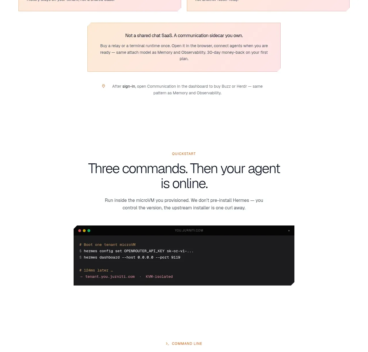
This section mirrors the observability pattern for communication: two integration cards followed by a centered upgrade or availability callout. Repetition creates a coherent capability family while the content changes.
Prompt preview
## Reference images

Study these alongside the description below: hierarchy, rhythm, spacing, colour. Build for the product you are asked about, using this design language.

- Component: https://kage-design-assets.t3.tigrisfiles.io/components/jurniti/cfab9c3f-60ef-4e80-9a31-cc939c39468c-1789538636-9.webp
- Full page it was cut from: https://kage-design-assets.t3.tigrisfiles.io/screenshots/jurniti/cfab9c3f-60ef-4e80-9a31-cc939c39468c-1789538542122-full.webp
- Component on Kage: https://kage.design/component/jurniti-feature-grid-8

## Before you start
Ask what communication channels or collaboration integrations the user's product supports and what visual identity to apply. Create a new integration section using these rules.

### Design language
- Use a centered eyebrow, 36–48px headline, and 14–16px supporting paragraph with strong vertical breathing room.
- Present two equal wide cards in a responsive grid; use a warm blush background #fbe8df, thin #ecd3c8 border, 10px radius, and 24px padding.
- Include an icon, optional availability badge, title, and short explanation with a clear hierarchy.
- Follow with a centered narrower notice card for upgrade, plan, or availability information. Give it a slightly different cream/pink tone and a single understated CTA.
- Keep interaction lightweight: cards may lift 2–3px on hover and links should have visible focus rings.

### Never
- Never use logos, product names, copy, illustrations, or imagery from the reference.
More components

 Authentication product capabilities
tiun. · Feature grid
Authentication product capabilities
tiun. · Feature grid
 Customer data and user management
tiun. · Feature grid
Customer data and user management
tiun. · Feature grid
 Problem and unified solution narrative
tiun. · Feature grid
Problem and unified solution narrative
tiun. · Feature grid
 Integration and agent workflow
tiun. · Feature grid
Integration and agent workflow
tiun. · Feature grid
 Billing and checkout capabilities
tiun. · Feature grid
Billing and checkout capabilities
tiun. · Feature grid

 Receiving money channels
Payflip · Feature grid
Receiving money channels
Payflip · Feature grid