kage
kage
jurniti.com
Design analysis
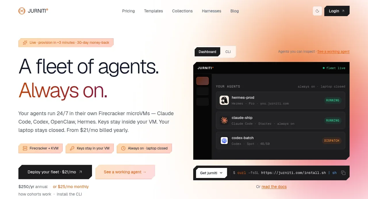
The hero pairs a large two-line proposition and supporting copy with deployment buttons on the left, while a dark product dashboard visual anchors the right. A soft peach-to-pink glow gives the otherwise minimal page an immediate focal point.
Prompt preview
## Reference images

Study these alongside the description below: hierarchy, rhythm, spacing, colour. Build for the product you are asked about, using this design language.

- Component: https://kage-design-assets.t3.tigrisfiles.io/components/jurniti/cfab9c3f-60ef-4e80-9a31-cc939c39468c-1789538632-1.webp
- Full page it was cut from: https://kage-design-assets.t3.tigrisfiles.io/screenshots/jurniti/cfab9c3f-60ef-4e80-9a31-cc939c39468c-1789538542122-full.webp
- Component on Kage: https://kage.design/component/jurniti-hero

## Before you start
Ask what the user's product does, who the hero should persuade, and what its brand is. Apply the following principles to create an original hero for that product.

### Design language
- Use a two-column hero beneath the navigation, with the text column slightly wider than the visual column on mobile but balanced on desktop.
- Give the section generous vertical padding, approximately 72–112px, and contain it within a max width of 1100–1200px.
- Create a short eyebrow, an oversized 52–72px headline with a tight line height, a concise 16–18px supporting paragraph, and one primary plus one secondary CTA.
- Use near-black text #171717, a warm terracotta accent around #a84d32, cream #fffaf0, and a soft peach/pink ambient gradient such as #ffe3d1 to #f7c4c7 behind the visual.
- The visual should be a product-specific interface mockup or abstract system diagram with dark charcoal surfaces #161616, subtle borders, and 8–12px radius; do not overfill it with decoration.
- Keep the first CTA dark and high contrast; make the secondary CTA light peach with a fine border. Include tiny reassurance text below the actions if useful.
- On small screens, stack text above visual and preserve the headline hierarchy.

### Never
- Never use logos, product names, copy, illustrations, or imagery from the reference.