 kage
kage
trykeet.com
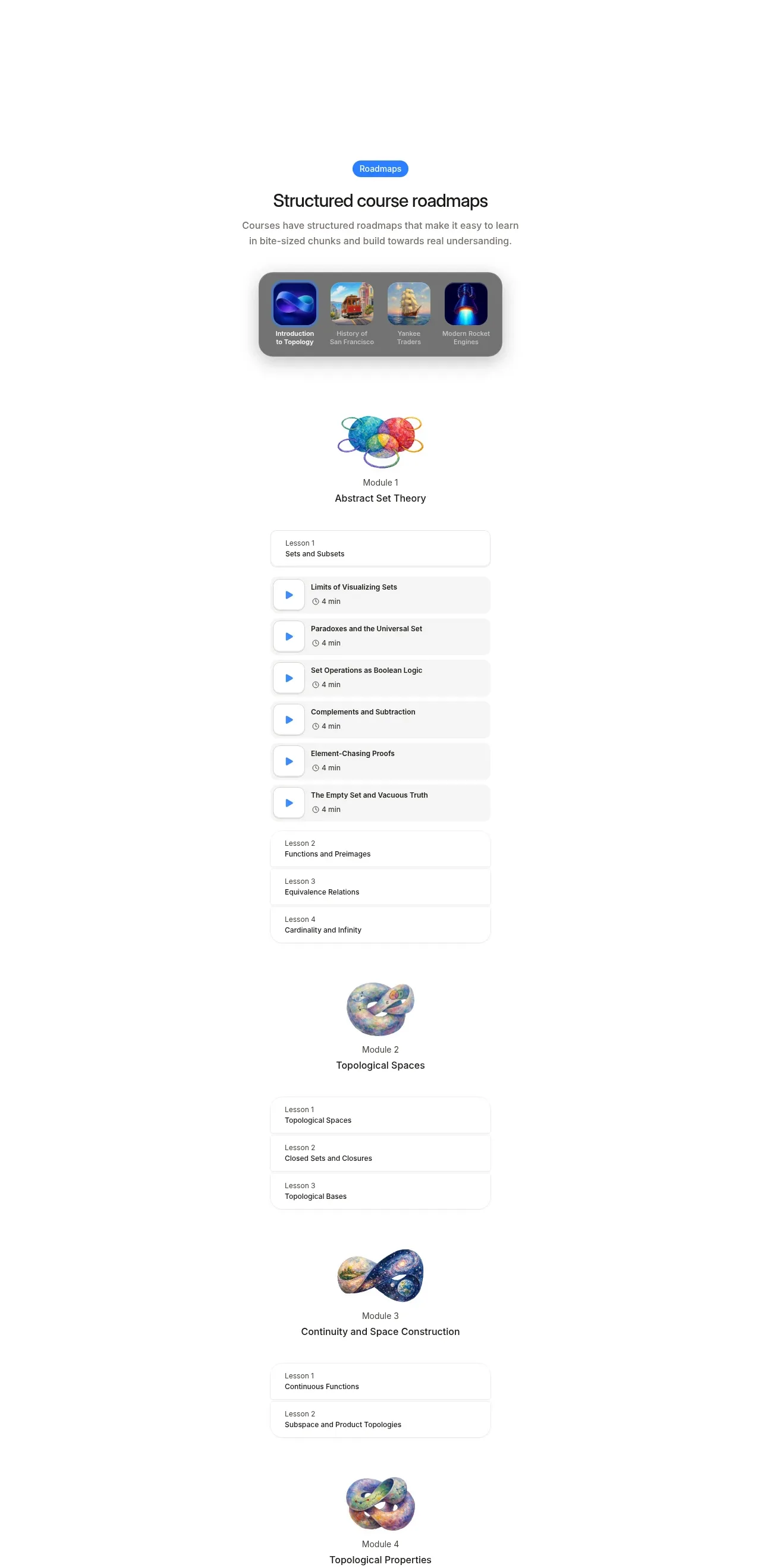
Design analysis
A long roadmap section explains structured progression through a compact course selector, then stacks module illustrations, lesson groups, and playable rows. Repeated card geometry creates a calm, scannable curriculum despite the section's length.
Prompt preview
## Reference images

Study these alongside the description below: hierarchy, rhythm, spacing, colour. Build for the product you are asked about, using this design language.

- Component: https://kage-design-assets.t3.tigrisfiles.io/components/keet/3f4c1a62-9831-48e4-b5b3-36349228cf18-1790229827-5.webp
- Full page it was cut from: https://kage-design-assets.t3.tigrisfiles.io/screenshots/keet/3f4c1a62-9831-48e4-b5b3-36349228cf18-1790229767831-full.webp
- Component on Kage: https://kage.design/component/keet-feature-grid-3

## Before you start
Ask what users progress through in the product, how many stages it has, and what content metadata matters. Ask for the user's brand system and then create an original roadmap using these structural principles.

Build a long, centered roadmap section. Begin with a small accent badge, a clear heading, and a short explanation of how the product organizes progression. Add a compact horizontal course or category selector in a rounded gray container, using 4–5 square thumbnails or abstract icons and short labels. Keep this selector around 280–320px wide on desktop and make it horizontally scrollable on mobile.

Below it, render a vertical curriculum with 2–5 modules. Each module should have a small visual marker or icon, an eyebrow such as a stage number, a module title, and a stack of lesson rows. Use a narrow column around 260–320px. Lesson rows should be white, with 1px #e5e5e5 borders, 10–14px radius, 12–16px padding, a title, optional duration/status metadata, and a small play or completion affordance. Group rows with 8–12px gaps and use subtle shadows only where they clarify grouping. Use #f7f7f7 for grouped surfaces, #202020 for headings, #6f6f6f for metadata, and one bright brand accent such as #2d83df. Preserve substantial whitespace between modules so the roadmap feels navigable rather than dense.

Support expand/collapse for modules, active lesson states, hover and keyboard focus, and responsive stacking. Keep decorative module art abstract and optional; prioritize the information architecture and scanability.

### Never
- Never use logos, product names, copy, illustrations, or imagery from the reference.
- Never copy the exact lesson titles, module names, thumbnails, or artwork.
- Never make long lists impossible to navigate on small screens.
More components

 Spend visibility and daily-cost breakdown
Subscrr · Feature grid
Spend visibility and daily-cost breakdown
Subscrr · Feature grid
 Reminders and simple setup flow
Subscrr · Feature grid
Reminders and simple setup flow
Subscrr · Feature grid

 Security and permissions cards
NotchPop · Feature grid
Security and permissions cards
NotchPop · Feature grid
 Focused feature cards
NotchPop · Feature grid
Focused feature cards
NotchPop · Feature grid
 Interactive product demonstration
NotchPop · Feature grid
Interactive product demonstration
NotchPop · Feature grid
 Quiet information cards
NotchPop · Feature grid
Quiet information cards
NotchPop · Feature grid