kage
kage
trykeet.com
Design analysis
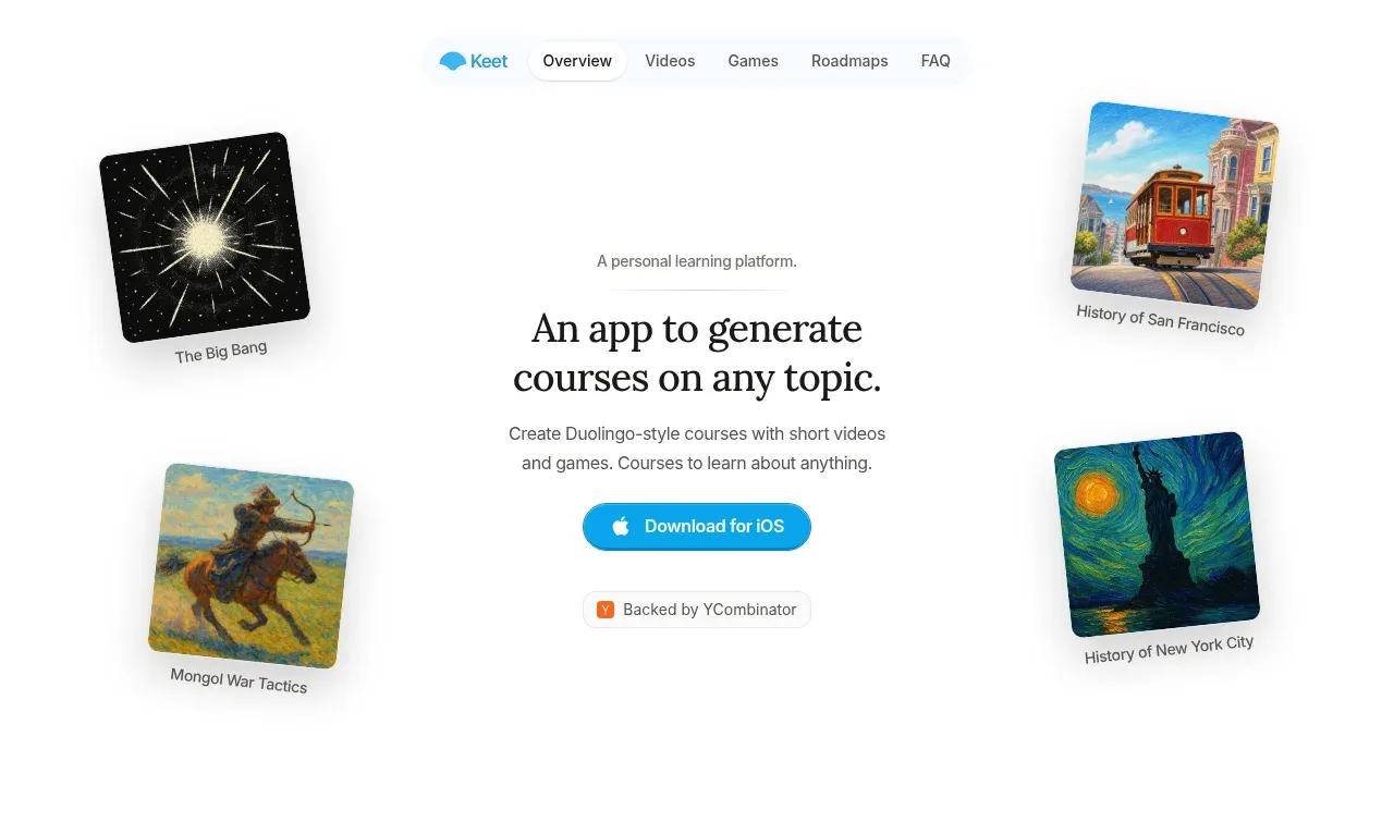
The hero uses a centered proposition and one bright app-store CTA, surrounded by four tilted topic-card artworks that create an exploratory, playful learning mood. The short eyebrow and two-line headline establish hierarchy without crowding the fold.
Prompt preview
## Reference images

Study these alongside the description below: hierarchy, rhythm, spacing, colour. Build for the product you are asked about, using this design language.

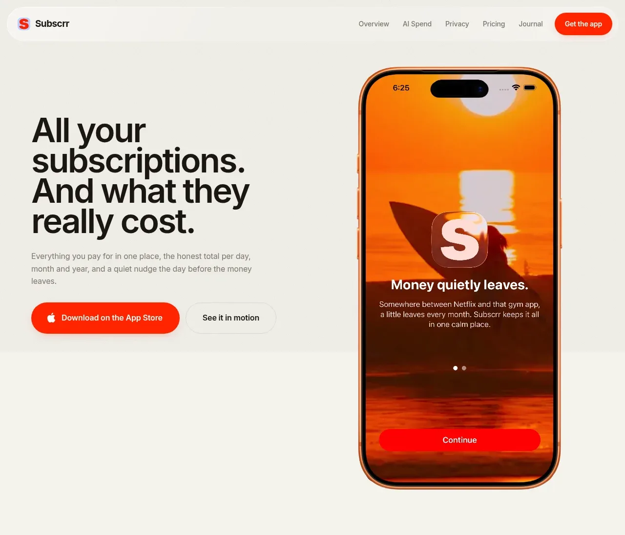
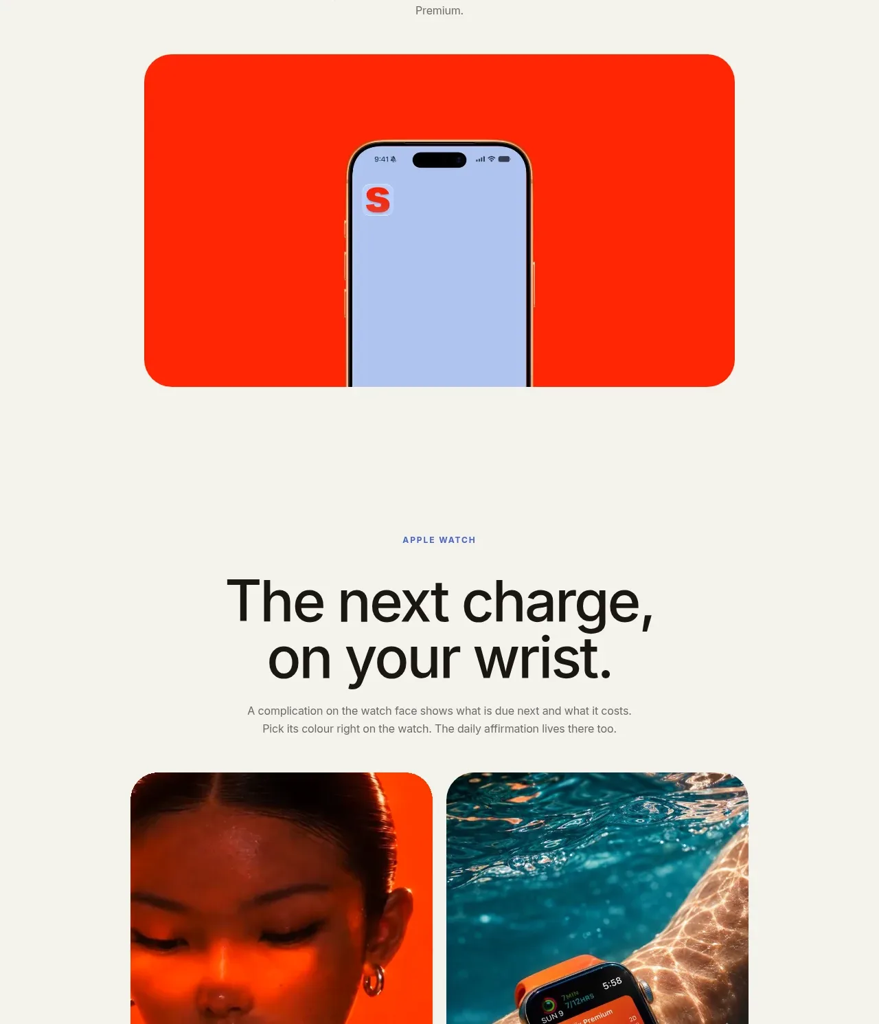
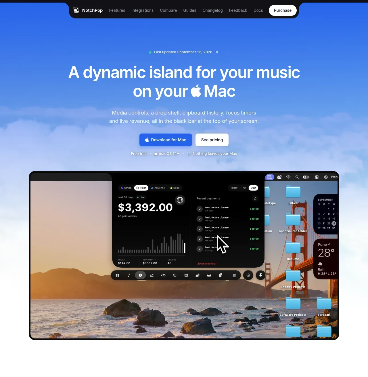
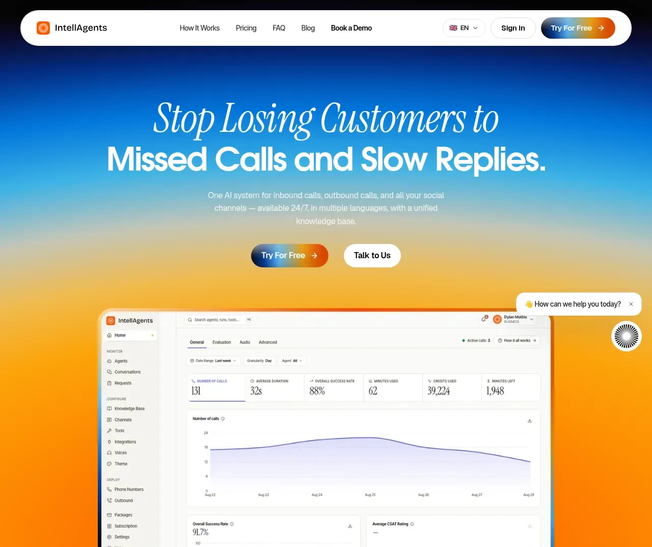
- Component: https://kage-design-assets.t3.tigrisfiles.io/components/keet/3f4c1a62-9831-48e4-b5b3-36349228cf18-1790229826-1.webp
- Full page it was cut from: https://kage-design-assets.t3.tigrisfiles.io/screenshots/keet/3f4c1a62-9831-48e4-b5b3-36349228cf18-1790229767831-full.webp
- Component on Kage: https://kage.design/component/keet-hero

## Before you start
Ask what the user's product is, what action the hero should drive, and which brand colors and imagery are appropriate. Then build a fresh hero using these principles for that product.

Create a spacious, white hero section from directly below the navigation through the first primary call to action. Center a narrow content column, with a small muted eyebrow, a large editorial headline of 2–3 lines, one concise supporting paragraph, and a bright rounded primary button. Use a warm near-black headline around #171717, gray body text around #666666, and a saturated cyan/blue CTA around #18a9d3 with white text; adjust these hues to the user's brand. Use a display serif or distinctive headline face only if it suits the brand, paired with a neutral sans-serif body. Suggested hierarchy: eyebrow 12–14px, headline 34–46px with tight leading, body 14–16px, CTA 14px medium weight.

If the product benefits from visual proof, arrange 3–4 small topic/product cards around the central copy, with generous negative space, subtle shadows, 14–18px corners, and slight rotations of about -5 to 5 degrees. Keep them decorative and secondary; do not let them obscure the message. Include a small trust/status badge beneath the CTA only when useful. On mobile, move the artwork below the copy in a simple grid and remove rotations if they impair readability.

### Never
- Never use logos, product names, copy, illustrations, or imagery from the reference.
- Never copy the exact headline, app-store badge, topic cards, or artwork style.
- Never add multiple competing primary buttons.