 kage
kage
kerno.io
Design analysis
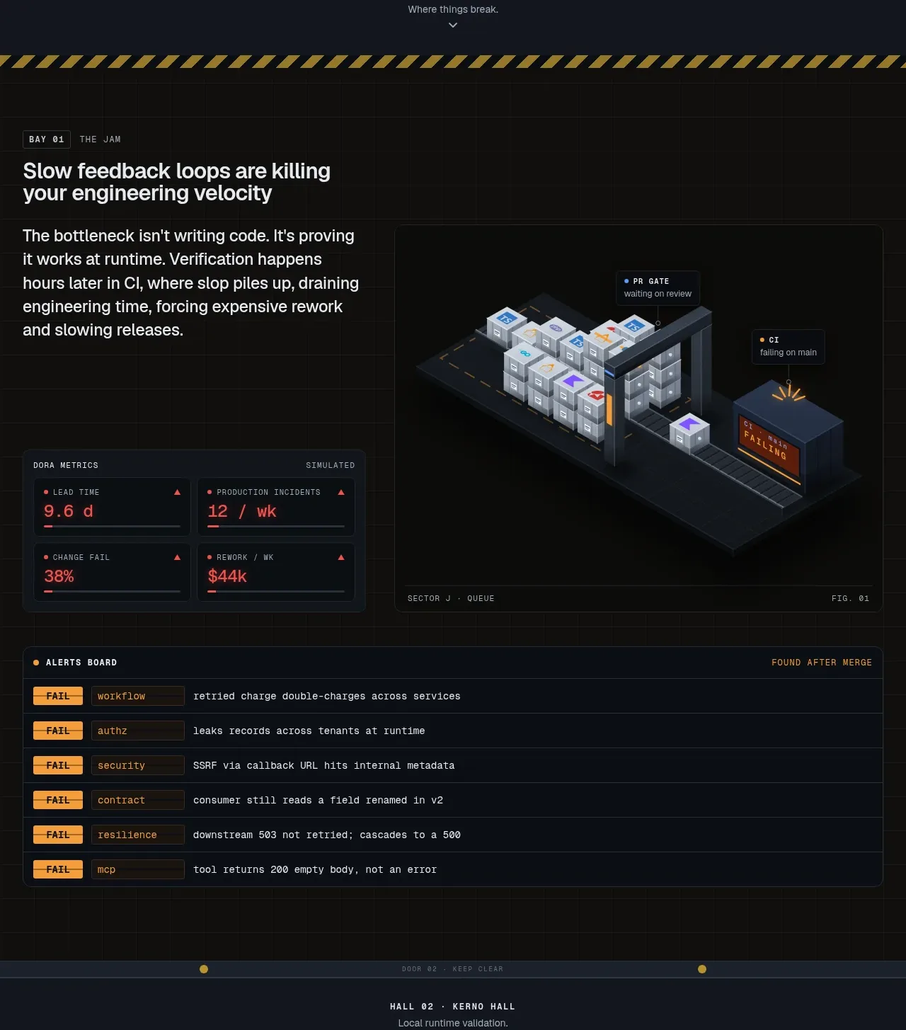
This feature band explains a painful operational problem with a text-led introduction, a large system illustration, metric chips, and an alert table. It works because the narrative moves from problem to visible operational evidence.
Prompt preview
## Reference images

Study these alongside the description below: hierarchy, rhythm, spacing, colour. Build for the product you are asked about, using this design language.

- Component: https://kage-design-assets.t3.tigrisfiles.io/components/kerno-1-0/454d79dc-d228-4b14-889b-ec4f181556d7-1792130638-3.webp
- Full page it was cut from: https://kage-design-assets.t3.tigrisfiles.io/screenshots/kerno-1-0/454d79dc-d228-4b14-889b-ec4f181556d7-1792130514699-full.webp
- Component on Kage: https://kage.design/component/kerno-1-0-feature-grid

## Before you start
Ask what recurring problem the user's product solves, what workflow it improves, and which real artifacts can represent that workflow. Build an original version for those answers.

Build a feature section that starts with a small section label and a concise problem-focused heading, then uses a two-column composition: explanatory copy and compact metric panels on the left, a large original workflow visualization on the right. Follow it with a full-width alert or event table that demonstrates the problem at operational detail. Use a near-black warm-neutral background (#0b0d0d), panels in #11151a, hairline borders in #252b30, and a single warning accent such as amber (#e6a63a) alongside a cool success color (#44c59a). Use 24–30px headings, 12–14px body copy, and 9–10px monospaced labels. Keep image and table edges aligned, use 16–24px section spacing, and make the table horizontally scrollable on mobile. Status pills, timestamps, and event labels should be scannable, not decorative.

Never use the reference illustration, alert text, metrics, labels, product name, or exact layout artwork.
More components

 Data-to-action engine
Salience · Feature grid
Data-to-action engine
Salience · Feature grid
 Actionable alert workflow
Salience · Feature grid
Actionable alert workflow
Salience · Feature grid
 Trust proof and core outcomes
Salience · Feature grid
Trust proof and core outcomes
Salience · Feature grid
 Three-step implementation flow
Salience · Feature grid
Three-step implementation flow
Salience · Feature grid
 What analytics misses
Salience · Feature grid
What analytics misses
Salience · Feature grid

 Workflow features and capabilities
CrewTower Mod for Claude Code · Feature grid
Workflow features and capabilities
CrewTower Mod for Claude Code · Feature grid