 kage
kage
kerno.io
Design analysis
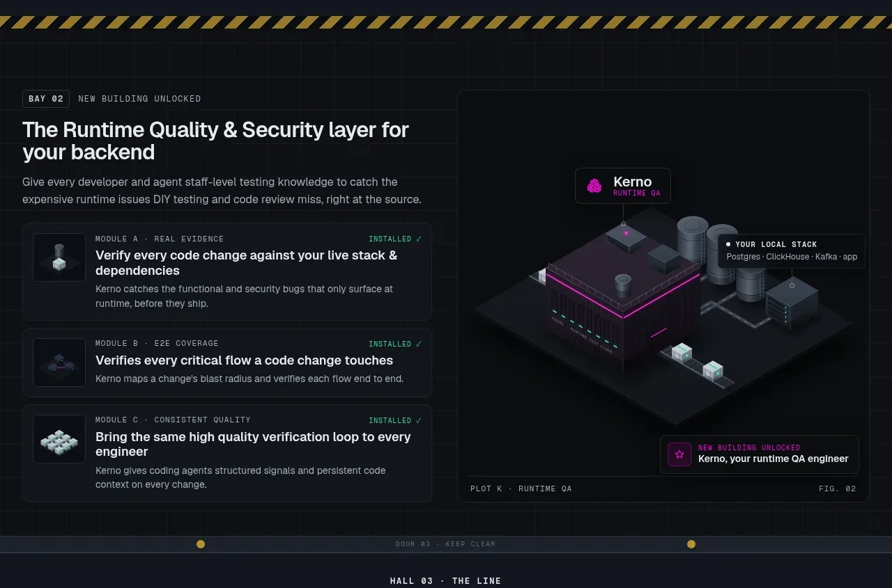
A compact product capability section places a stacked list of verification capabilities beside a framed system diagram. The repeated rows make the feature set easy to scan while the visual gives the abstraction a concrete form.
Prompt preview
## Reference images

Study these alongside the description below: hierarchy, rhythm, spacing, colour. Build for the product you are asked about, using this design language.

- Component: https://kage-design-assets.t3.tigrisfiles.io/components/kerno-1-0/454d79dc-d228-4b14-889b-ec4f181556d7-1792130639-4.webp
- Full page it was cut from: https://kage-design-assets.t3.tigrisfiles.io/screenshots/kerno-1-0/454d79dc-d228-4b14-889b-ec4f181556d7-1792130514699-full.webp
- Component on Kage: https://kage.design/component/kerno-1-0-feature-grid-2

## Before you start
Ask what the user's product's core capabilities are, which ones are most important, and what visual metaphor could explain them. Apply the same hierarchy with original content.

Create a two-column capability section on a dark navy canvas (#0c1016): a left column with an eyebrow, heading, supporting copy, and three or four bordered feature rows; a right column with a framed abstract product diagram. Each row should have a small thumbnail or status marker, a short title, and one sentence of explanation, plus a subtle installed/available state where useful. Use 1px borders (#252d37), 6px radii, muted gray text, and a vivid brand accent (#d400ae or the user's accent) only for active states. Headings should be 24–30px; row titles 12–14px; metadata 9–10px mono. Align the diagram's frame with the row list and keep the visual secondary to the capability explanation. Stack the columns on mobile and preserve the row hierarchy.

Never copy the reference capability names, diagram, labels, logo, text, or exact visual assets.
More components

 Data-to-action engine
Salience · Feature grid
Data-to-action engine
Salience · Feature grid
 Actionable alert workflow
Salience · Feature grid
Actionable alert workflow
Salience · Feature grid
 Trust proof and core outcomes
Salience · Feature grid
Trust proof and core outcomes
Salience · Feature grid
 Three-step implementation flow
Salience · Feature grid
Three-step implementation flow
Salience · Feature grid
 What analytics misses
Salience · Feature grid
What analytics misses
Salience · Feature grid

 Workflow features and capabilities
CrewTower Mod for Claude Code · Feature grid
Workflow features and capabilities
CrewTower Mod for Claude Code · Feature grid