 kage
kage
kerno.io
Design analysis
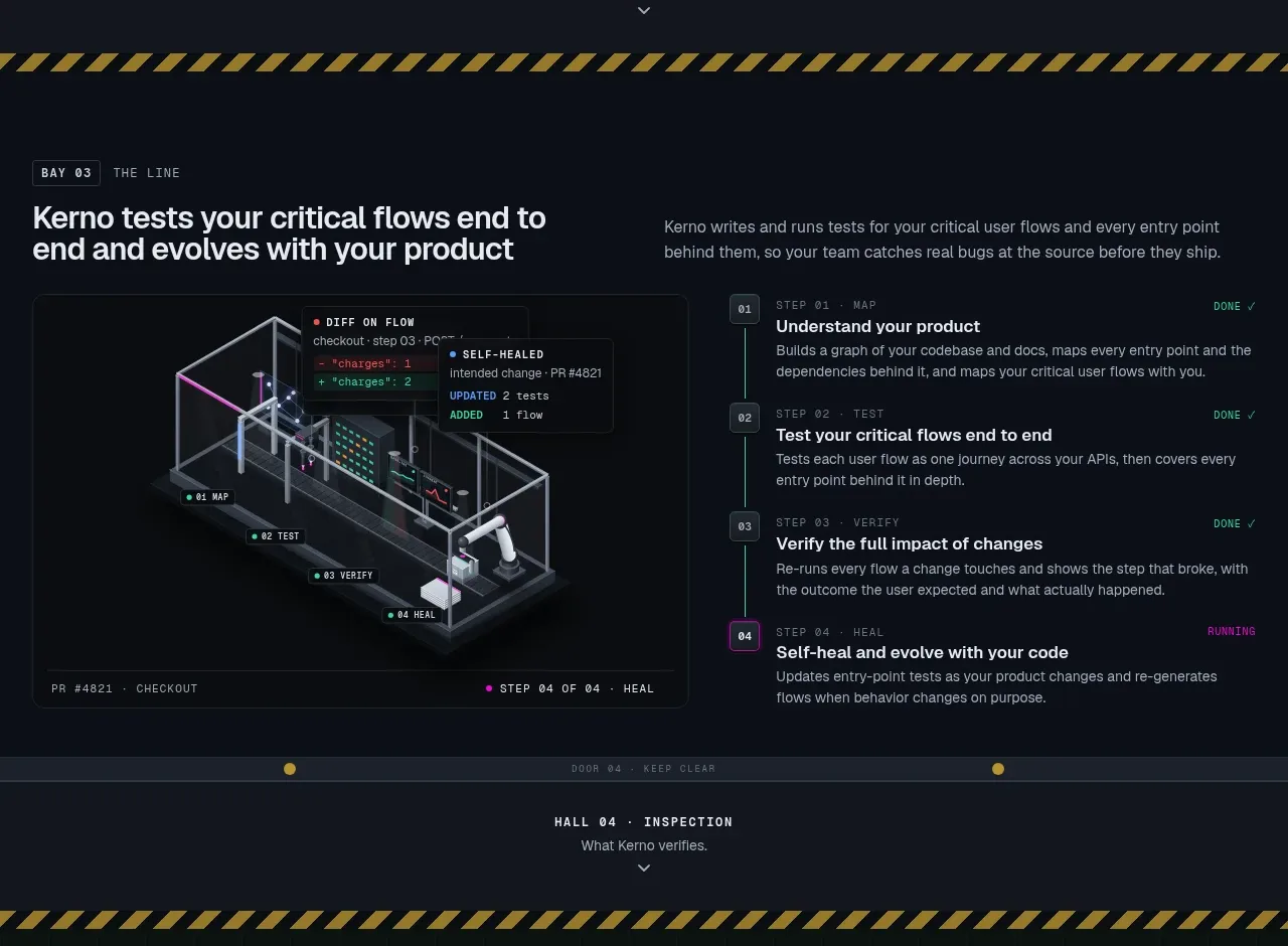
This section turns the product promise into a numbered end-to-end workflow: a visual map on the left and sequential steps on the right. Numbering, completion states, and a clear reading order make a complex process feel manageable.
Prompt preview
## Reference images

Study these alongside the description below: hierarchy, rhythm, spacing, colour. Build for the product you are asked about, using this design language.

- Component: https://kage-design-assets.t3.tigrisfiles.io/components/kerno-1-0/454d79dc-d228-4b14-889b-ec4f181556d7-1792130639-5.webp
- Full page it was cut from: https://kage-design-assets.t3.tigrisfiles.io/screenshots/kerno-1-0/454d79dc-d228-4b14-889b-ec4f181556d7-1792130514699-full.webp
- Component on Kage: https://kage.design/component/kerno-1-0-feature-grid-3

## Before you start
Ask what the user's product workflow is from initial input to successful outcome, who performs each step, and what completion states matter. Then create an original flow using that information.

Design a process-explainer section with a heading and short setup copy above a two-column body. Put an abstract flow/map visualization in a bordered panel on the left and a vertically ordered list of four or five numbered steps on the right. Each step needs a compact number, a short action title, one explanatory sentence, and an optional state such as complete or current. Use #0a0e14 as the background, #111720 panels, #27313c borders, white-gray headings (#e3e8eb), and one bright accent for active progress. Use a mono face for numbers and metadata, 12–14px for step titles, and 11–12px for descriptions. Connect steps subtly with a vertical rule; do not overuse animation. On small screens, place the map first and convert the steps to a full-width list.

Never use the reference workflow, text, screenshot, illustration, product name, or exact step labels.
More components

 Data-to-action engine
Salience · Feature grid
Data-to-action engine
Salience · Feature grid
 Actionable alert workflow
Salience · Feature grid
Actionable alert workflow
Salience · Feature grid
 Trust proof and core outcomes
Salience · Feature grid
Trust proof and core outcomes
Salience · Feature grid
 Three-step implementation flow
Salience · Feature grid
Three-step implementation flow
Salience · Feature grid
 What analytics misses
Salience · Feature grid
What analytics misses
Salience · Feature grid

 Workflow features and capabilities
CrewTower Mod for Claude Code · Feature grid
Workflow features and capabilities
CrewTower Mod for Claude Code · Feature grid