 kage
kage
kerno.io
Design analysis
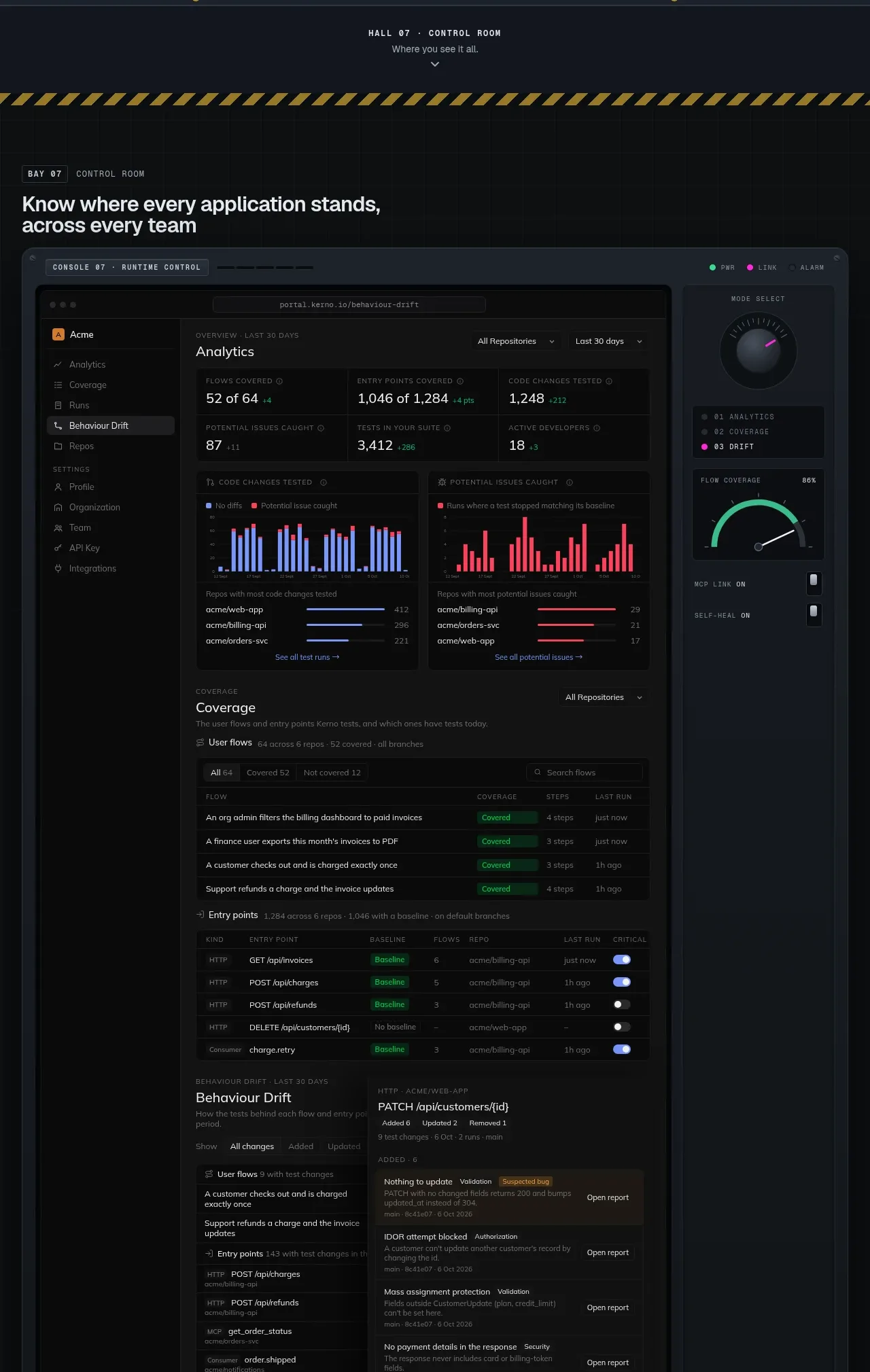
A large dashboard showcase is framed as a control room, with navigation chrome, summary metrics, charts, tables, and a side control panel. The high information density is organized by strong panels and a consistent dark visual system.
Prompt preview
## Reference images

Study these alongside the description below: hierarchy, rhythm, spacing, colour. Build for the product you are asked about, using this design language.

- Component: https://kage-design-assets.t3.tigrisfiles.io/components/kerno-1-0/454d79dc-d228-4b14-889b-ec4f181556d7-1792130641-8.webp
- Full page it was cut from: https://kage-design-assets.t3.tigrisfiles.io/screenshots/kerno-1-0/454d79dc-d228-4b14-889b-ec4f181556d7-1792130514699-full.webp
- Component on Kage: https://kage.design/component/kerno-1-0-feature-grid-6

## Before you start
Ask what the user's product dashboard needs to help people decide, monitor, or act, and what data is real or safe to mock. Build a fresh dashboard concept around those needs.

Create a full-width dashboard showcase inside a framed application shell. Use a dark outer frame (#151c24) with a near-black inner canvas (#080b0e), a compact top bar, a narrow left navigation rail, a primary analytics area, and an optional right-side control panel. Include a row of summary metrics, two small charts, a coverage or activity table, and a detailed change/event list below. Establish hierarchy through panels, not excessive color: borders #252c31, primary text #dbe2e6, secondary text #7f8b94, success #32c98a, warning #e0a43c, and one vivid brand accent. Use 10–12px UI text, 9px mono table headers, and 20–26px section titles. Keep chart colors accessible and provide labels or legends; never rely on color alone. On mobile, collapse the rail, stack panels, and make tables horizontally scrollable. Include realistic loading, empty, and hover states where appropriate.

Never use the reference dashboard screenshot, product name, data, labels, charts, icons, or exact UI copy.
More components

 Data-to-action engine
Salience · Feature grid
Data-to-action engine
Salience · Feature grid
 Actionable alert workflow
Salience · Feature grid
Actionable alert workflow
Salience · Feature grid
 Trust proof and core outcomes
Salience · Feature grid
Trust proof and core outcomes
Salience · Feature grid
 Three-step implementation flow
Salience · Feature grid
Three-step implementation flow
Salience · Feature grid
 What analytics misses
Salience · Feature grid
What analytics misses
Salience · Feature grid

 Workflow features and capabilities
CrewTower Mod for Claude Code · Feature grid
Workflow features and capabilities
CrewTower Mod for Claude Code · Feature grid