 kage
kage
kerno.io
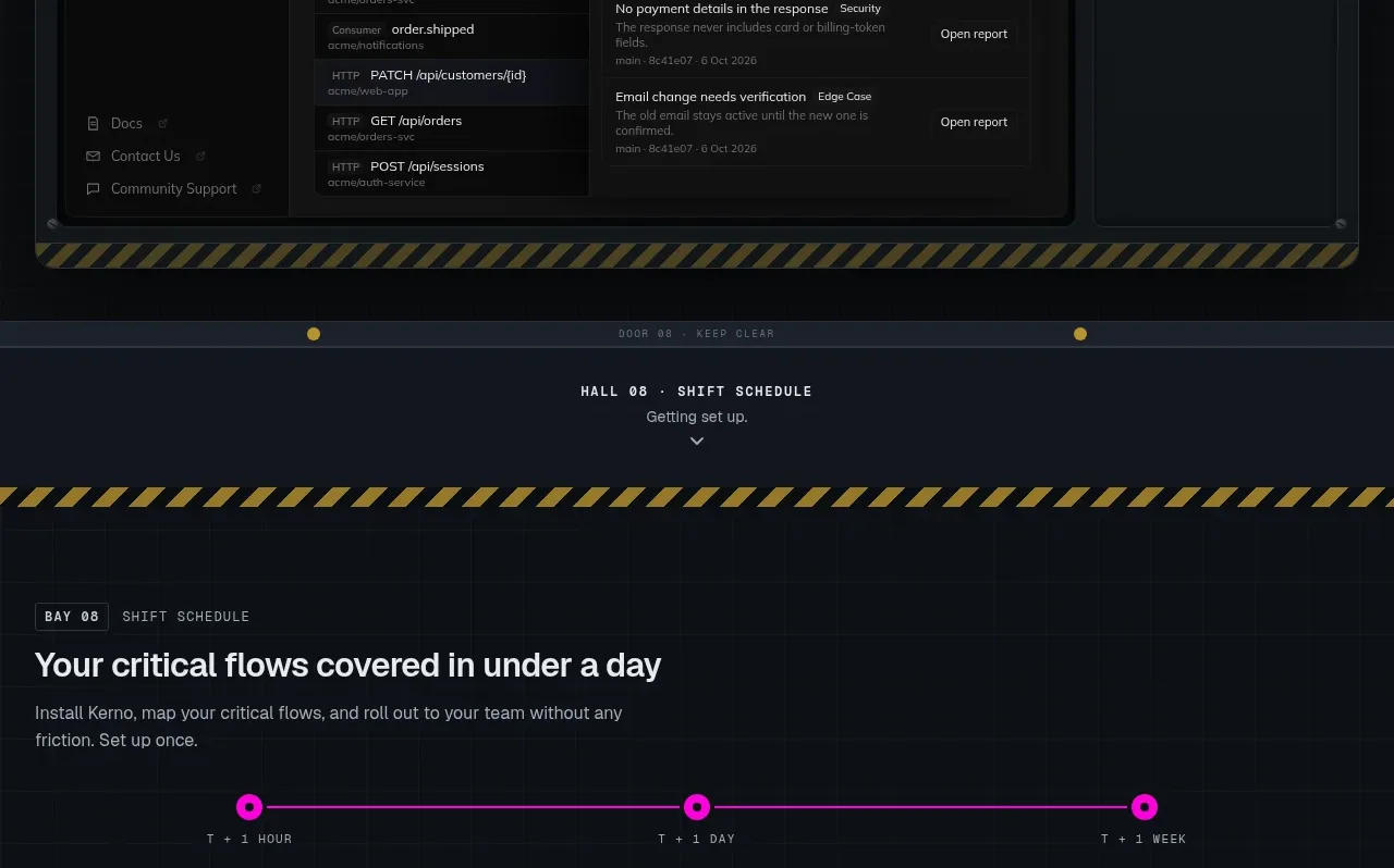
Design analysis
A simple horizontal timeline explains adoption in three stages, each combining a small product visual with a title and practical description. The progression is easy to understand at a glance.
Prompt preview
## Reference images

Study these alongside the description below: hierarchy, rhythm, spacing, colour. Build for the product you are asked about, using this design language.

- Component: https://kage-design-assets.t3.tigrisfiles.io/components/kerno-1-0/454d79dc-d228-4b14-889b-ec4f181556d7-1792130641-9.webp
- Full page it was cut from: https://kage-design-assets.t3.tigrisfiles.io/screenshots/kerno-1-0/454d79dc-d228-4b14-889b-ec4f181556d7-1792130514699-full.webp
- Component on Kage: https://kage.design/component/kerno-1-0-feature-grid-7

## Before you start
Ask how a user adopts the user's product, how many meaningful stages exist, and what success looks like at each stage. Use those answers to make the timeline concrete.

Design a rollout timeline section with a short heading and supporting copy above a horizontal progress line. Place three equal cards along the line, each with a stage label, small original visual or icon, title, and two-line explanation. Use a near-black blue background (#0b1017), cards #111720, borders #252e38, and a bright accent such as #e000b0 for the active line and markers. Use 24–28px heading text, 10px mono stage labels, 15–17px card titles, and 11–12px supporting copy. Make the timeline line visually subordinate to the cards and use generous 20–28px gaps. On mobile, turn the line vertical or use a stacked numbered sequence, preserving the same ordering and state affordances.

Never use the reference stage names, imagery, copy, product name, or exact illustrations.
More components

 Data-to-action engine
Salience · Feature grid
Data-to-action engine
Salience · Feature grid
 Actionable alert workflow
Salience · Feature grid
Actionable alert workflow
Salience · Feature grid
 Trust proof and core outcomes
Salience · Feature grid
Trust proof and core outcomes
Salience · Feature grid
 Three-step implementation flow
Salience · Feature grid
Three-step implementation flow
Salience · Feature grid
 What analytics misses
Salience · Feature grid
What analytics misses
Salience · Feature grid

 Workflow features and capabilities
CrewTower Mod for Claude Code · Feature grid
Workflow features and capabilities
CrewTower Mod for Claude Code · Feature grid