kage
kage
kilo.ai
Design analysis
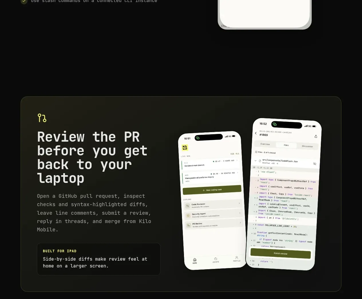
A bordered, tinted showcase card combines a large feature statement and supporting inset with two angled phone visuals.
Prompt preview
## Reference images

Study these alongside the description below: hierarchy, rhythm, spacing, colour. Build for the product you are asked about, using this design language.

- Component: https://kage-design-assets.t3.tigrisfiles.io/components/kilo-code-for-ios-and-android/a36b68a0-c268-4b03-b068-c86b233a401a-1789538728-5.webp
- Full page it was cut from: https://kage-design-assets.t3.tigrisfiles.io/screenshots/kilo-code-for-ios-and-android/a36b68a0-c268-4b03-b068-c86b233a401a-1789538626553-full.webp
- Component on Kage: https://kage.design/component/kilo-code-for-ios-and-android-card

## Before you start
Ask the user what complex workflow deserves a showcase panel, which product screens can be used, and what brand colors are appropriate, then apply the principles below to that product rather than copying this reference.

Create a large rounded showcase panel inside the page container. Use a very subtle olive/charcoal gradient (#171a12 to #10110f), a 1px border (#33372b), 18–22px radius, and 40px internal padding. On desktop, reserve roughly half the panel for a small icon, large 46–54px heading, supporting paragraph, and a compact inset callout; use the other half for two overlapping device or interface previews with restrained rotation. Keep all visuals clipped within the panel and provide a static fallback on mobile. Use accent yellow-green for labels and strong hierarchy, not for large surfaces.

Never: use logos, product names, copy, illustrations, or imagery from the reference.