 kage
kage
kilo.ai
Design analysis
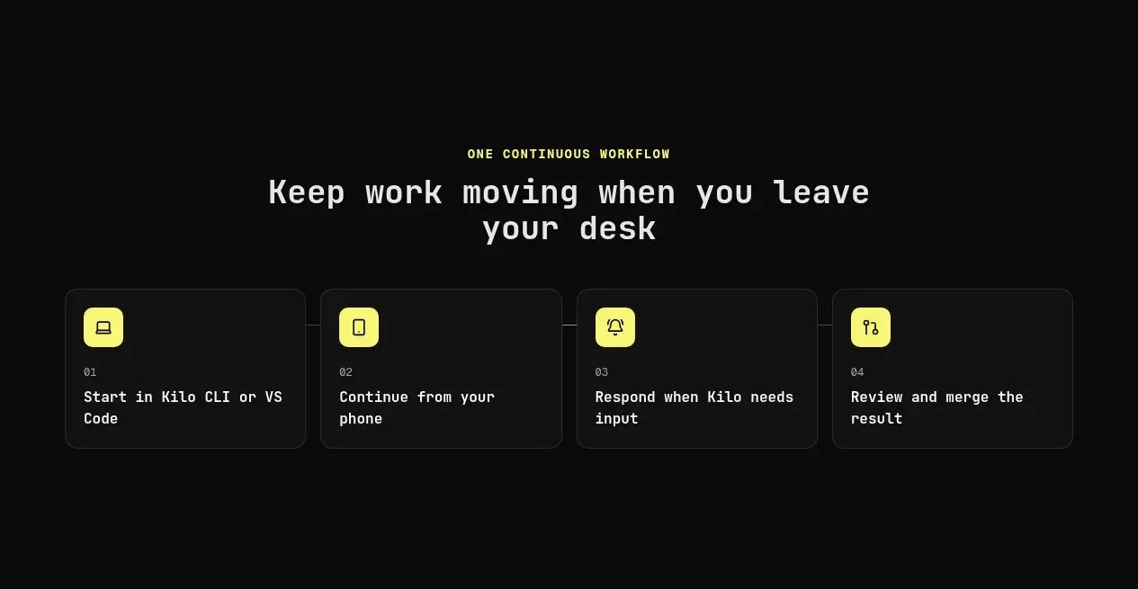
A centered section heading introduces four compact numbered cards that explain the workflow from desktop initiation through mobile review.
Prompt preview
## Reference images

Study these alongside the description below: hierarchy, rhythm, spacing, colour. Build for the product you are asked about, using this design language.

- Component: https://kage-design-assets.t3.tigrisfiles.io/components/kilo-code-for-ios-and-android/a36b68a0-c268-4b03-b068-c86b233a401a-1789538727-2.webp
- Full page it was cut from: https://kage-design-assets.t3.tigrisfiles.io/screenshots/kilo-code-for-ios-and-android/a36b68a0-c268-4b03-b068-c86b233a401a-1789538626553-full.webp
- Component on Kage: https://kage.design/component/kilo-code-for-ios-and-android-feature-grid

## Before you start
Ask the user what workflow they want to explain and what brand personality should shape the cards, then apply the principles below to that product rather than copying this reference.

Build a dark workflow explainer with a centered eyebrow and two-line heading, followed by four equal-width cards in a single row on large screens and a responsive grid or horizontal scroll on small screens. Each card should use a small accent icon tile, a tiny step number, and a short action-oriented title. Give cards #111211 backgrounds, 1px borders around #2a2c29, 10–12px radius, 24px padding, and consistent 16–20px gaps. Use high-contrast headings, muted descriptions where needed, and enough vertical whitespace above and below the grid. Add subtle hover elevation or border-color change.

Never: use logos, product names, copy, illustrations, or imagery from the reference.
More components

 Authentication product capabilities
tiun. · Feature grid
Authentication product capabilities
tiun. · Feature grid
 Customer data and user management
tiun. · Feature grid
Customer data and user management
tiun. · Feature grid
 Problem and unified solution narrative
tiun. · Feature grid
Problem and unified solution narrative
tiun. · Feature grid
 Integration and agent workflow
tiun. · Feature grid
Integration and agent workflow
tiun. · Feature grid
 Billing and checkout capabilities
tiun. · Feature grid
Billing and checkout capabilities
tiun. · Feature grid

 Receiving money channels
Payflip · Feature grid
Receiving money channels
Payflip · Feature grid