 kage
kage
kilo.ai
Design analysis
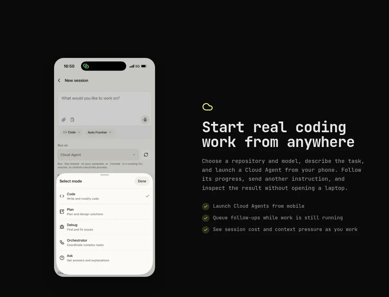
A split feature band places a tall phone screen on the left and explanatory copy with a checklist on the right.
Prompt preview
## Reference images

Study these alongside the description below: hierarchy, rhythm, spacing, colour. Build for the product you are asked about, using this design language.

- Component: https://kage-design-assets.t3.tigrisfiles.io/components/kilo-code-for-ios-and-android/a36b68a0-c268-4b03-b068-c86b233a401a-1789538728-3.webp
- Full page it was cut from: https://kage-design-assets.t3.tigrisfiles.io/screenshots/kilo-code-for-ios-and-android/a36b68a0-c268-4b03-b068-c86b233a401a-1789538626553-full.webp
- Component on Kage: https://kage.design/component/kilo-code-for-ios-and-android-feature-grid-2

## Before you start
Ask the user what capability this feature should communicate, what product visual is available, and what brand system to use, then apply the principles below to that product rather than copying this reference.

Create a two-column feature section with generous vertical padding. Place a single tall product/device visual in one column and a compact content block in the other; alternate the image side when useful across a page. Include a small line icon or eyebrow, a large 42–54px heading, a short paragraph, and three checklist benefits using small accent check markers. Keep the background near-black (#090a09), use off-white text and #9b9d97 body copy, and reserve an acid-lime accent (#dfe85b) for icons and checks. Align the copy vertically around the visual center, maintain a 48–72px column gap, and avoid cropping important product UI. On narrow screens stack the visual above the copy.

Never: use logos, product names, copy, illustrations, or imagery from the reference.
More components

 Authentication product capabilities
tiun. · Feature grid
Authentication product capabilities
tiun. · Feature grid
 Customer data and user management
tiun. · Feature grid
Customer data and user management
tiun. · Feature grid
 Problem and unified solution narrative
tiun. · Feature grid
Problem and unified solution narrative
tiun. · Feature grid
 Integration and agent workflow
tiun. · Feature grid
Integration and agent workflow
tiun. · Feature grid
 Billing and checkout capabilities
tiun. · Feature grid
Billing and checkout capabilities
tiun. · Feature grid

 Receiving money channels
Payflip · Feature grid
Receiving money channels
Payflip · Feature grid