 kage
kage
kilo.ai
Design analysis
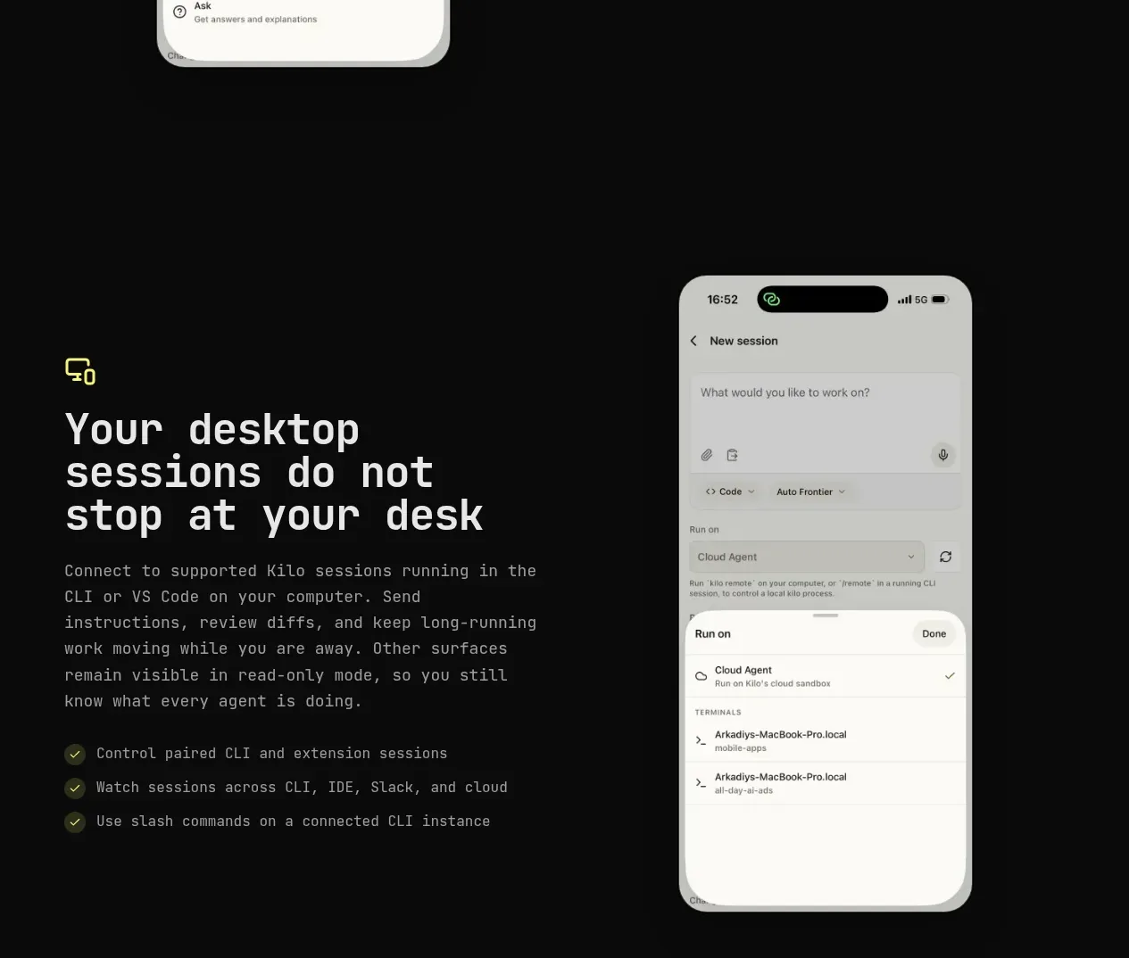
The next alternating split feature explains that desktop sessions continue while the user is away, with copy left and a phone visual right.
Prompt preview
## Reference images

Study these alongside the description below: hierarchy, rhythm, spacing, colour. Build for the product you are asked about, using this design language.

- Component: https://kage-design-assets.t3.tigrisfiles.io/components/kilo-code-for-ios-and-android/a36b68a0-c268-4b03-b068-c86b233a401a-1789538728-4.webp
- Full page it was cut from: https://kage-design-assets.t3.tigrisfiles.io/screenshots/kilo-code-for-ios-and-android/a36b68a0-c268-4b03-b068-c86b233a401a-1789538626553-full.webp
- Component on Kage: https://kage.design/component/kilo-code-for-ios-and-android-feature-grid-3

## Before you start
Ask the user what continuity or cross-device feature they need to showcase and what visual assets their product has, then apply the principles below to that product rather than copying this reference.

Build an alternating split feature band: text on the left and a product visual on the right. Use a small accent icon, a strong multi-line heading around 44–52px, a readable paragraph, and three short checklist points. Keep the device image large enough to be legible but allow it to sit slightly beyond the content baseline for a designed editorial feel. Use an 800px max-width container, 100–140px vertical spacing, a black background, subtle green-yellow accents, and a technical monospaced display style paired with calm body text. Preserve responsive reading order and stack cleanly below 768px.

Never: use logos, product names, copy, illustrations, or imagery from the reference.
More components

 Authentication product capabilities
tiun. · Feature grid
Authentication product capabilities
tiun. · Feature grid
 Customer data and user management
tiun. · Feature grid
Customer data and user management
tiun. · Feature grid
 Problem and unified solution narrative
tiun. · Feature grid
Problem and unified solution narrative
tiun. · Feature grid
 Integration and agent workflow
tiun. · Feature grid
Integration and agent workflow
tiun. · Feature grid
 Billing and checkout capabilities
tiun. · Feature grid
Billing and checkout capabilities
tiun. · Feature grid

 Receiving money channels
Payflip · Feature grid
Receiving money channels
Payflip · Feature grid