 kage
kage
kilo.ai
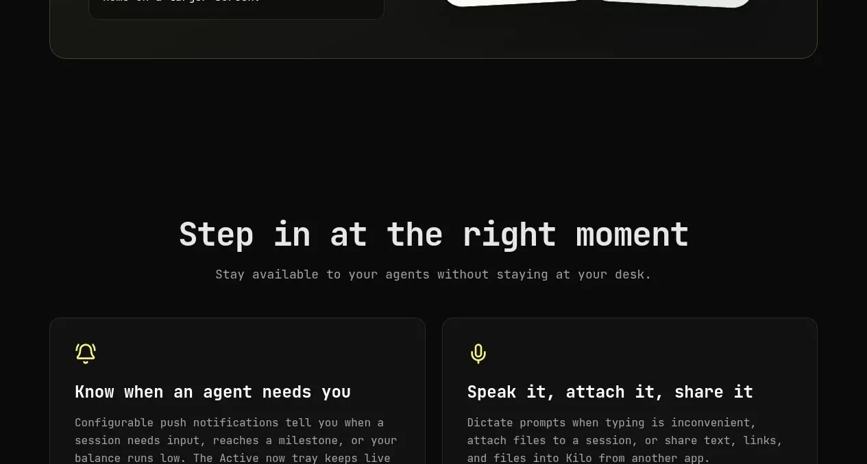
Design analysis
A centered heading and subtitle lead into two broad cards describing notifications and alternate input methods.
Prompt preview
## Reference images

Study these alongside the description below: hierarchy, rhythm, spacing, colour. Build for the product you are asked about, using this design language.

- Component: https://kage-design-assets.t3.tigrisfiles.io/components/kilo-code-for-ios-and-android/a36b68a0-c268-4b03-b068-c86b233a401a-1789538729-6.webp
- Full page it was cut from: https://kage-design-assets.t3.tigrisfiles.io/screenshots/kilo-code-for-ios-and-android/a36b68a0-c268-4b03-b068-c86b233a401a-1789538626553-full.webp
- Component on Kage: https://kage.design/component/kilo-code-for-ios-and-android-feature-grid-4

## Before you start
Ask the user what two moment-of-need actions matter most for their product and what interaction details are real, then apply the principles below to that product rather than copying this reference.

Build a centered section with a concise heading and supporting line, followed by two equal cards. Each card should have an accent icon, a short bold title, and a compact explanatory paragraph. Use dark #111211 cards, thin #292b28 borders, 12px radius, 28px padding, and a 20px gap. Keep the heading around 40–48px, body copy around 14–16px, and use a restrained lime accent for icons. Add hover/focus feedback while keeping the cards readable and not overly decorative; stack them on mobile.

Never: use logos, product names, copy, illustrations, or imagery from the reference.
More components

 Authentication product capabilities
tiun. · Feature grid
Authentication product capabilities
tiun. · Feature grid
 Customer data and user management
tiun. · Feature grid
Customer data and user management
tiun. · Feature grid
 Problem and unified solution narrative
tiun. · Feature grid
Problem and unified solution narrative
tiun. · Feature grid
 Integration and agent workflow
tiun. · Feature grid
Integration and agent workflow
tiun. · Feature grid
 Billing and checkout capabilities
tiun. · Feature grid
Billing and checkout capabilities
tiun. · Feature grid

 Receiving money channels
Payflip · Feature grid
Receiving money channels
Payflip · Feature grid