 kage
kage
kilo.ai
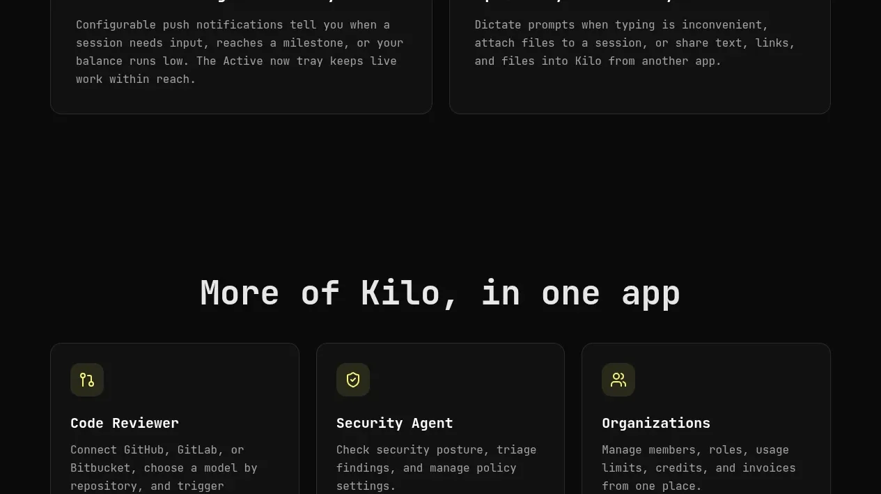
Design analysis
Three compact cards surface adjacent capabilities, each with an icon, short description, and accent text link.
Prompt preview
## Reference images

Study these alongside the description below: hierarchy, rhythm, spacing, colour. Build for the product you are asked about, using this design language.

- Component: https://kage-design-assets.t3.tigrisfiles.io/components/kilo-code-for-ios-and-android/a36b68a0-c268-4b03-b068-c86b233a401a-1789538729-7.webp
- Full page it was cut from: https://kage-design-assets.t3.tigrisfiles.io/screenshots/kilo-code-for-ios-and-android/a36b68a0-c268-4b03-b068-c86b233a401a-1789538626553-full.webp
- Component on Kage: https://kage.design/component/kilo-code-for-ios-and-android-feature-grid-5

## Before you start
Ask the user which related capabilities should be promoted and how they should relate to the current product, then apply the principles below to that product rather than copying this reference.

Create a centered section heading above a three-column related-capabilities grid. Each card uses a small tinted icon tile, a concise title, two or three lines of muted description, and a bottom-aligned text link with an arrow. Use #111211 surfaces, 1px #292b28 borders, 10–12px corners, 24px padding, and 16px gaps. Make card heights equal and links align to the same baseline. Use responsive two-column then one-column layouts, plus visible keyboard focus states.

Never: use logos, product names, copy, illustrations, or imagery from the reference.
More components

 Authentication product capabilities
tiun. · Feature grid
Authentication product capabilities
tiun. · Feature grid
 Customer data and user management
tiun. · Feature grid
Customer data and user management
tiun. · Feature grid
 Problem and unified solution narrative
tiun. · Feature grid
Problem and unified solution narrative
tiun. · Feature grid
 Integration and agent workflow
tiun. · Feature grid
Integration and agent workflow
tiun. · Feature grid
 Billing and checkout capabilities
tiun. · Feature grid
Billing and checkout capabilities
tiun. · Feature grid

 Receiving money channels
Payflip · Feature grid
Receiving money channels
Payflip · Feature grid